


Justice League logo: Your guide to the Justice League symbols
The Justice League logo is one of the most recognizable emblems in the comic book universe and a meaningful symbol for any fan of superheroes. Created in 1960, the Justice League is the original superhero team in the eyes of many.
This group brought some of the biggest names in the superhero landscape together in the fight against evil. The lineup features a range of well-known characters, including the Flash, Wonder Woman, and even Batman.
As the Justice League has evolved over the years, with new variations appearing in comic books and the DC Cinematic Universe, the Justice League emblem has also transformed.
Here’s your guide to the many Justice League logos.
The original Justice League logo: The rise of Justice League
The Justice League logo was created soon after the first variation of the Justice League was introduced, in 1960.
Brought to life by DC Comics in “The Brave and the Bold #28”, the Justice League was imagined by Gardner Fox as a revival of a similar team from DC Comics in the 1940s, the Justice Society of America.
The Justice League is an all-star collection of established characters from DC Comics’ portfolio. Each character has their own story and background, but they also assemble regularly to tackle formidable villains.
According to the history of DC, the Justice League was officially designed to boost the sales of various characters through cross-promotions.
The original Justice League didn’t have much of an emblem to speak of. However, the comic book did introduce a title-style wordmark for the team. This image highlighted the name “Justice League of America” in bold font, colored red, white, and blue, to symbolize patriotism.
On the other side of the Justice League wordmark, we also saw a series of five red stars. This referenced the five superheroes often working together in the team.
The new Justice League logo
As the Justice League has continued to evolve, Justice League logo history has moved in a number of directions. Today, there are three variations of the Justice league symbol. The first is the updated version of the comic book logo, which was upgraded for the team’s 60th anniversary.
The updated logo became bolder, brighter, and more refined to celebrate the long-standing nature of the Justice League. This image features the words “Justice League” in white, with red outlines to give the image depth.
The words are also placed on a blue background in the shape of an extended shield to highlight them as the planet’s defenders.
Rather than a series of ten red stars in this image, we also see a single white and red star, perhaps used to refine, and simplify the image.
While this new logo is now evident on several Justice League comic books and merchandised products, there’s an entirely different set of logos for the Cinematic Universe.
The cinematic Justice League symbol
The cinematic version of the Justice League logo builds on the design we know from the comic book landscape. However, this variation is intended specifically for a more modern, visual universe.
2017
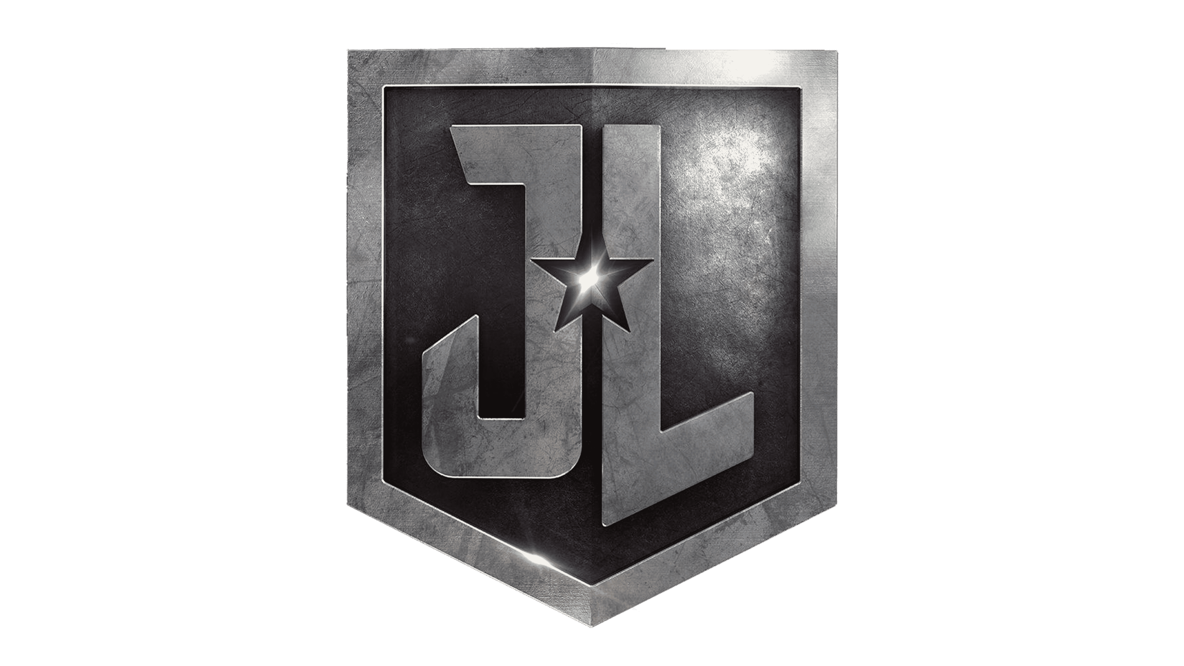
The first Justice League logo for the Cinematic Universe was introduced in 2017, with the arrival of the new movie. The bold lettering is very similar to the typeface we see in the Justice League comic book logo. The letters are also placed on a shield-style background, similar to the new comic symbol.
Using only the letters “JL” instead of the full name helps to refine and simplify the logo, making it easier to place on several different items and products. The designers also set a single star between the two letters to maintain some of the team’s historical imagery.
The star in this image is clearly a symbol of power and wonder, highlighting the unique abilities of the characters within the Justice League. The image’s thick lines and monochrome coloring also help to portray a sense of strength and modernity.
2021
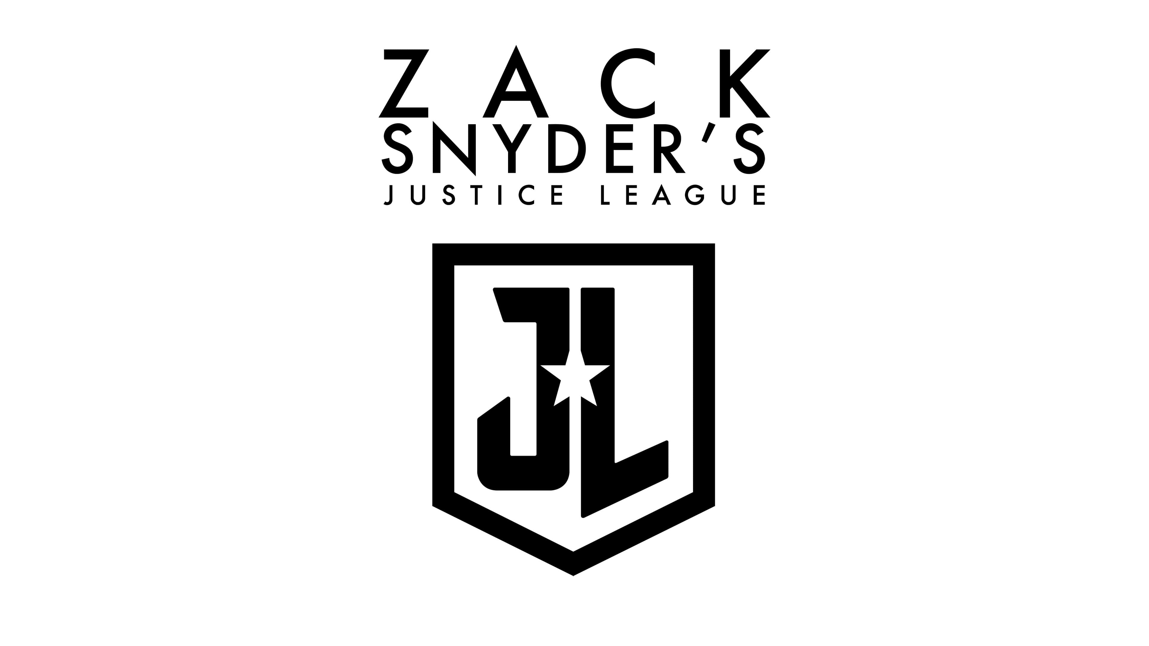
A slightly different variation of the Justice League logo was introduced in 2021 after a secondary cut of the movie was released. This design isn’t intended to replace the original image. Instead, it highlights a different version of the film.
The Zack Snyder Justice League emblem was chosen to depict the “Zack Snyder cut” of the famous movie. This is a much longer story version with significantly more reference to the comic book franchise. This could be why the designers chose such a simplified image.
The logo is similar to the 2017 image but in black and white, with a wordmark above the shield to differentiate it from the previous cut.
Elements of the Justice League symbol
The elements of the Justice League symbol today depend on whether you’re looking at the comic book title or the official emblem chosen for the movie. In virtually all versions, we see a combination of bold and confident typography, a shield-style shape, and a singular star.
Using the same elements throughout multiple versions of the Justice League symbol creates a sense of cohesion throughout the branding.
What color is the Justice League logo?
The Justice League logo colors depend on the image version you’re looking at.
Clearly, the Zack Snyder cut logo is the simplest, with just the colors black and white on display. The original Justice League movie logo uses gradient shades of grey to highlight texture, combined with a bright white star in the middle.
While the official colors for the Justice League updated comic book logo aren’t available online, we can clearly see the focus on patriotism. This version of the logo combines a white font with a red outline, on a blue shield.
The following resources will give you a closer look at the Justice League logo.
- Justice League logo PNG
- Justice League logo vector
- Justice League logo transparent
- Justice League logo wallpaper
What font does the Justice League logo use?
Most variations of the Justice League logo use a very similar font. The Justice League logo fonts feature bold, sans-serif elements that convey confidence and strength. The typeface was designed specifically for the Justice League, though you can find a similar design here.
Celebrating the Justice League logo today
The Justice League logo has evolved over the years to support the changing nature of the Justice League team. As the characters in this group begin to explore new environments, and the Cinematic Universe appears for the first time, the Justice League symbol has transformed.
Today, the symbol is bold, eye-catching, and even patriotic, with its bright white star. Though the exact variation of the Justice League logo you see will depend on where you encounter the characters, all of these images have the same inspirational impact.
Fabrik: A branding agency for our times.

Clarity starts with a conversation.
Thanks—we’ll get back to you shortly.
Whether you're navigating a rebrand, merger, or simply need a clearer identity—we’re here to help. No hard sell, just honest advice from people who know the sector.
Let’s start with a simple question…
Prefer to email? Drop us a line.
Fabrik’s been helping organisations rethink and reshape their brands for over 25 years. We’ve guided companies through mergers, rebrands and new launches. Whatever stage you’re at, we’ll meet you there.