Demon’s domain: A tale of the Doom logo history and evolution

The Doom logo is one of the most recognizable and well-known emblems in video gaming. Since it first emerged in 1993, the Doom logo and the accompanying franchise have captured the attention of millions of players around the globe. The title even inspired a 2005 movie.
Although the Doom franchise has been around for several decades, the Doom logo hasn’t undergone a huge number of major changes.
Despite introducing new title cards and game box designs for each iteration of the Doom franchise, many aspects of the game’s brand identity have remained consistent.
This may be one of the reasons why many people consider the Doom logo one of the most iconic emblems in the video gaming space.
Today, we will take a closer look at the origins of the Doom logo, its history, and its evolution over the years.
Why is Doom Eternal so famous? An introduction to Doom
Doom was first introduced into the video game market in 1993 by ID Software for MS-DOS. The first-person shooter game placed players in the shoes of a space marine, fighting their way through hordes of demons trying to escape from hell.
According to the creators of the title, the concept for Doom came from John Carmack, who was apparently inspired by Dungeons & Dragons, as well as the movies “Aliens” and “Evil Dead II.”
Originally, the game was relatively small, consisting of just nine levels. It was also initially distributed as a free shareware game for players who wanted to test out the action before purchasing the full title via mail order. An updated and expanded version of Doom was also released in 1995.
Cited by many as one of the greatest video games ever made, Doom sold an estimated 3.5 million copies by 1999, even at a time when gaming was still a relatively new concept. In 1995, experts believed more computers had the Doom game installed than Microsoft’s Windows 95.
Doom helped to define the FPS genre in the early years and inspired a number of additional, similar titles over the years. What’s more, the developers of Doom created a number of follow-up games for the title, releasing Doom 2 IN 1994 and Doom 3 in 2004.
For a number of years, the Doom franchise seemed to disappear until a new title was introduced in 2016, followed by the most recent game, Doom Eternal. Doom Eternal achieved phenomenal success, mixing the components of the traditional, world-changing Doom series with new game mechanics.
Doom logo history: The evolution of the Doom symbol
For many fans of the Doom franchise, the official “Doom logo” will always be the symbol originally introduced in 1993. Although various new emblems have been introduced over the years, alongside follow-up games in the franchise, the 1993 Doom logo is still the most recognizable.

1993
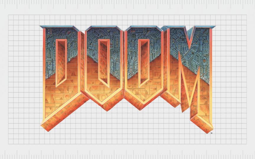
Doom logo history began in 1993 when the franchise was introduced to the public for the first time. While the wordmark logo might seem a little old-fashioned by today’s standards, it was extremely modern at the time.
The characters of the logo are aligned on the top but jagged on the bottom, giving the emblem a more ominous vibe.
The uppercase letters used in the wordmark feature a split design. On the top half of the characters, we see a blue/grey background carved with various unusual symbols. On the bottom half, the letters are depicted in a yellow-orange shade.
The three-dimensional logo seems to showcase the intersection between hell and the world in which the futuristic game takes place.

1994
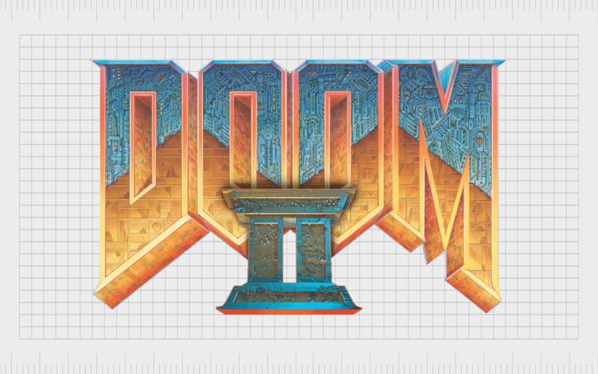
When Doom 2 was introduced in 1994, the designers for the game’s title maintained a lot of the same elements from the previous emblem. The Roman Numeral for “2” was created by Steven Maines and was specially designed to look three-dimensional, almost like a set of two pillars.
The “II” element in the Doom 2 logo matches the color palette for the background wordmark perfectly and leverages a similar use of texture to give the design more depth.
2004
Ten years after Doom 2, the third installment in the Doom franchise was released. This Doom game was published by Activision and was presented as a survival horror game. The characters in the wordmark used for this logo are very similar to those in the previous designs.
However, the texture of the letters and the coloring has been changed slightly. In this variation of the logo, the disconnect between the two colors in the logo isn’t as obvious.
Instead, it appears as though the word is reflecting the heat of a fire beneath it. This could be yet another reference to the game’s depiction of hell. Instead of a Roman numeral for a number, this Doom logo also includes a smaller “3” placed in the top-right corner of the emblem.
2016
In 2016, ID Software and Bethesda Softworks released a new Doom game, sometimes referred to as the fourth in the franchise. However, the companies didn’t include any actual number in the game title itself. This logo variation is a far more simplified version of the previous Doom wordmarks.
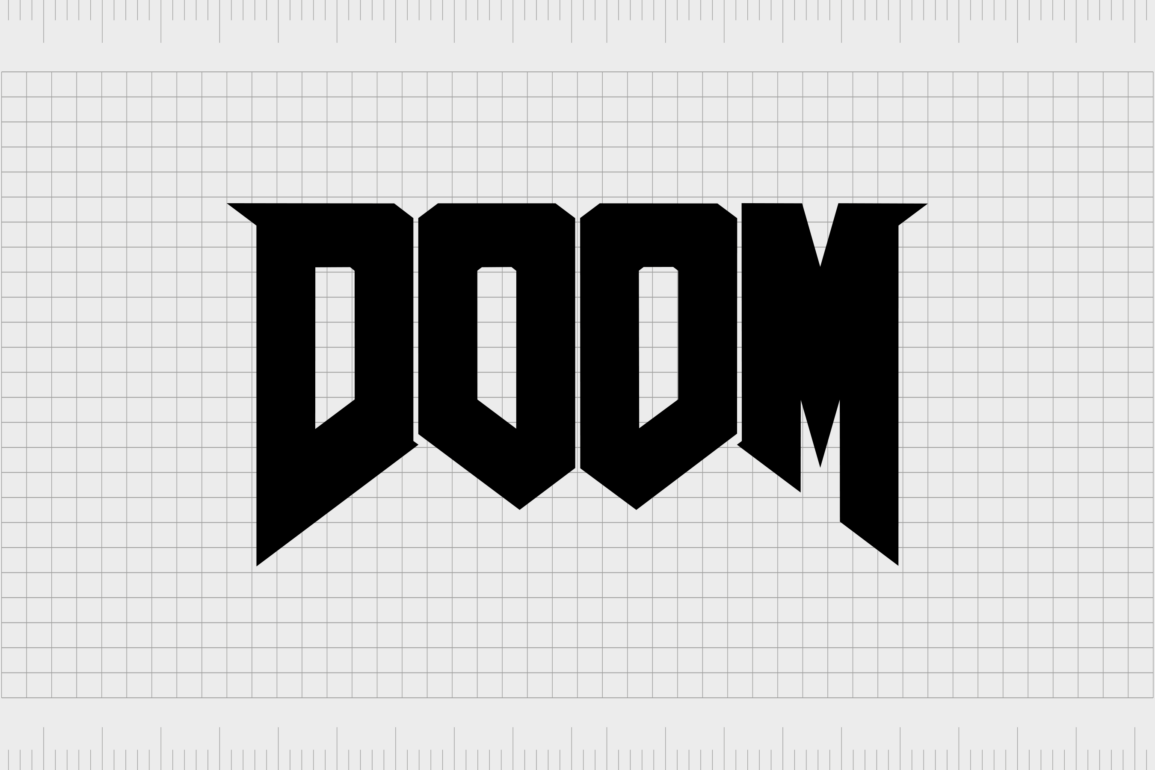
Though the shape of the logo and the style of the letters remain the same, the three-dimensional elements have been removed. The color has also been changed to a textured white. Some versions of the logo also depicted the same design in black.
2020
The most recent version of the Doom logo, the Doom Eternal logo, was introduced in 2020. This design continues the use of the same unique font choice introduced throughout the franchise. Once again, the letters are simpler in this logo.
However, the white texture has been replaced with an almost metallic style. The letters also have a little shadowing, giving them back some extra depth.
The Doom Eternal logo is also the only emblem in the Doom lineup to include another word besides “Doom.” The word “Eternal” is presented in white on a red, banner-style background. The banner is intended to mimic the styling of some of the architecture and weaponry in the game.
The Doom game logo: Colors and fonts
Today, the Doom logo stands as one of the most iconic video game emblems of all time. For many gaming fans, Doom is one of the most important titles ever to be released. It helped to spark the creation of a brand-new genre for gamers.
What’s more, as new Doom games have been released throughout the years, each has received substantial critical acclaim.
Although aspects of the Doom logo have changed throughout the years, the styling of the typeface used in the emblem has remained very consistent.
Doom’s logo always seems to be positioned as though we’re looking up at it from below. This might be the designer’s way of representing the view of the creatures from hell, ascending on the players in the title.
If you want to take a closer look at the Doom logo, you can find some useful resources here:
What color is the Doom logo?
Over the years, the evolution of the Doom franchise has brought various different color palettes into the Doom landscape. We’ve seen the Doom logo represented in a host of unique shades and textures.
However, the original Doom logo colors are still some of the most memorable and eye-catching.
For the original Doom logo color palette, the designers chose a combination of blue and grey colors for the top of the wordmark, with gold, yellow and orange elements on the bottom. Usually, this three-dimensional design was placed on a red background.
What font does the Doom logo use?
While the coloring in the Doom logo might have changed a number of times over the years, the font choice has remained relatively consistent. The only major change made to the typography across different game titles was in its positioning as a 2D or 3D typeface.
The Doom logo font is specific to the game and was created by the designers themselves. However, it shares many components with the AmazDoom typeface if you’re looking to create something similar.
The domineering Doom logo
The Doom logo has earned its place in the video game Hall of Fame over the years. Not only is the logo itself truly iconic, but it’s also representative of a game franchise many people consider crucial to the evolution of the entertainment landscape.
Despite a few changes to its coloring and styling over the years, the Doom logo has maintained a lot of consistency.
The wordmark’s commanding, almost aggressive positioning, with its large, blocky characters, highlights just how significant this game is.
Doom logo FAQs:
What is the Doom logo?
The Doom logo is simply a wordmark spelling out the name of the game franchise in large capital letters. The upper part of the original logo is grey/blue, while the bottom half is depicted in orange and yellow. The design also featured a lot of unique detail and texture.
Who designed the Doom logo?
Don Ivan Punchatz was hired to create the package art and logo for the Doom game. His son Gregor Punchatz also helped to create the designs for some of the monsters in the video game.
What are the demons called in Doom?
Doom enemies are often called “monsters” or “demons.” There are many different styles of monsters, from zombies and mecha zombies to soldiers, imps, gargoyles, and lost souls. There are also specific types of demons, such as the “Pinky” or “Bull Demon.”
Fabrik: A branding agency for our times.
Clarity starts with a conversation.
Thanks—we’ll get back to you shortly.
Whether you're navigating a rebrand, merger, or simply need a clearer identity—we’re here to help. No hard sell, just honest advice from people who know the sector.
Let’s start with a simple question…
Prefer to email? Drop us a line.
Fabrik’s been helping organisations rethink and reshape their brands for over 25 years. We’ve guided companies through mergers, rebrands and new launches. Whatever stage you’re at, we’ll meet you there.


