

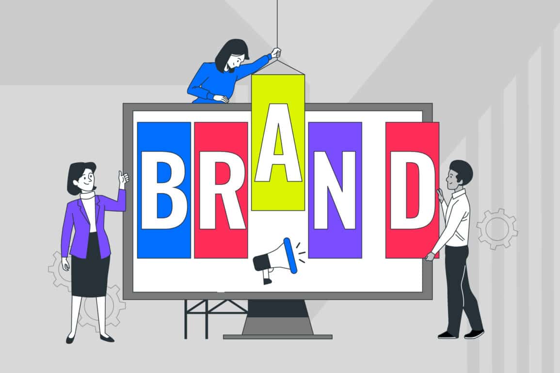


Not just a crest: Evolving your Royal College’s visual identity

Modernising your Royal College’s visual identity can feel daunting—especially when tradition runs deep. You’re not a start-up chasing the latest trend. Your crest carries centuries of meaning. Your colours tell stories of achievement and excellence.
But the truth is, prestige alone no longer guarantees presence in today’s digital-first landscape. Your brand needs to perform—online, on screen, and on scroll.
The challenge isn’t whether to evolve your visual identity, but how to do it confidently while staying true to your heritage and professional standing.
Strategic evolution of visual identity for Royal Colleges requires careful balance between honouring tradition and meeting contemporary expectations.
Why visual identity still matters (and more than ever)
Your identity is more than your crest. It’s how people see, remember and trust you in an increasingly crowded educational landscape.
Visual identity for Royal Colleges reinforces the reputation you’ve built over decades or centuries. When prospective members, students, or partners encounter your brand—whether through a LinkedIn post, conference presentation, or email signature—consistency equals credibility.
First impressions often happen digitally now, not through printed prospectuses or formal ceremonies. Your evolving visual identity must perform seamlessly across email headers, video calls, social media platforms, and mobile devices.
Poor execution here can undermine even the strongest academic credentials.
Modern audiences expect professional institutions to demonstrate digital fluency alongside traditional expertise. A visual identity that struggles online suggests an organisation that might struggle with contemporary challenges.
Strategic college branding isn’t about following trends—it’s about ensuring your authority translates effectively across every touchpoint. Professional institution branding must balance gravitas with accessibility, creating immediate recognition whilst maintaining institutional dignity.
Digital-first identity demands consideration of colour contrast, readability across devices, and visual consistency throughout your communications ecosystem. Your heritage can enhance rather than hinder this process when approached with strategic thinking and clear execution.
Heritage ≠ stuck in the past
You don’t need to ditch tradition—you need to design around it with purpose and clarity.
Evolving visual identity doesn’t mean abandoning what makes your Royal College distinctive. The most successful college branding projects enhance heritage rather than erase it. Think strategic refinement, not wholesale revolution.
Your history is an asset, not an obstacle, when handled with the right expertise. Heritage brand design requires understanding both your institutional legacy and contemporary communication needs.
Traditional meets modern approaches work best when they respect existing brand architecture whilst introducing contemporary functionality.
This isn’t about dramatic logo refresh projects that shock your community—it’s about thoughtful evolution that feels natural and necessary.
Simplifying without stripping back
Retain your crest as the cornerstone of your identity, but consider developing simplified marks for digital applications. Complex heraldic details that work beautifully on ceremonial documents can become illegible on smartphone screens or social media profiles.
A well-designed system includes your full crest for formal applications alongside streamlined variants for favicon-friendly contexts.
Introduce flexible layouts that work across both digital and print formats. Your visual identity should breathe naturally whether it’s anchoring a conference banner or heading an email newsletter.
Consider stacked logo arrangements, horizontal lockups, and simplified monogram versions that maintain dignity whilst ensuring practical usability. Crest redesign doesn’t mean starting from scratch—it means creating variants that work across contexts.
Institutional identity systems need modular approaches that accommodate everything from academic papers to Instagram stories. The key is maintaining recognisable elements while adapting presentation to suit different platforms and audiences.
Updating colour and typography
Respect your established palette, but introduce digital-friendly variants that enhance accessibility and screen performance.
Traditional colours might need slight adjustments for web applications—darker blues for better contrast ratios, or slightly modified tones that reproduce consistently across different devices and platforms.
Typography deserves particular attention in any visual identity refresh.
Consider new typefaces that balance institutional gravitas with contemporary legibility. The right font choices can make your communications feel both authoritative and approachable, whether readers encounter them in printed journals or digital newsletters.
Academic branding requires fonts that perform well in long-form reading whilst maintaining character in headlines and short-form applications.
Colour psychology plays a crucial role in professional contexts. Your palette choices should reinforce trust, expertise, and accessibility whilst remaining distinctive in crowded educational markets.
Case in point—Royal College of Anaesthetists
Fabrik helped the Royal College of Anaesthetists evolve its brand for modern audiences without compromising its professional standing or historical significance.
Contemporary but respectful typography was introduced, creating a visual system that works seamlessly across digital platforms, printed materials, and event settings.
The result feels both professional and progressive—trustworthy enough for medical professionals, yet contemporary enough for digital-native audiences.
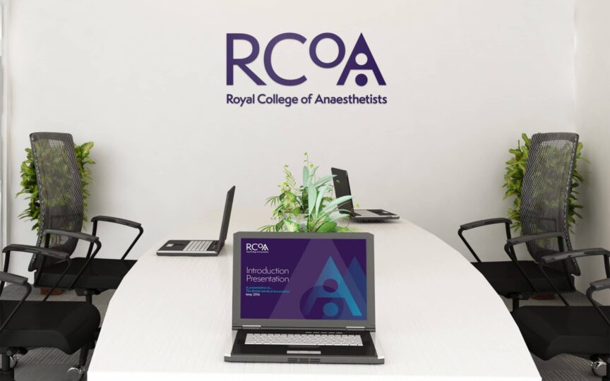
This approach demonstrates how heritage brand design can modernise tradition without losing credibility. The updated identity performs consistently whether it’s on a conference app, academic paper, or social media post, proving that evolution and heritage can coexist beautifully.
Higher education visual identity projects like this show how professional institutions can embrace change while preserving what makes them distinctive. The key lies in understanding which elements are non-negotiable and which can adapt to serve contemporary needs.

Think systems, not just symbols
It’s not just what your logo looks like—it’s how your entire visual identity performs across every interaction.
Higher education visual identity extends far beyond logo design. Your brand encompasses colour, imagery, layout, typography, and tone working together as a cohesive system.
Successful visual identity for Royal Colleges develops supporting elements like icon families, illustration styles, and photography guidelines that reinforce your institutional character.
Plan for sub-brands, special events, and campaign requirements from the outset. Your annual conference needs visual coherence with your quarterly journal. Your member communications should feel connected to your professional development programmes.
A flexible brand system accommodates these varied needs without fragmenting your overall identity.
Visual consistency across touchpoints builds recognition and trust. When your email signatures, presentation templates, and social media posts all feel unmistakably connected, you create a sense of institutional reliability that resonates with professional audiences.
Build a flexible system
Brand identity equals logo plus colour plus imagery plus layout plus tone—all working in harmony. Develop supporting visual elements that complement your primary mark whilst extending your brand’s reach and recognition.
This might include custom iconography for different departments, illustration styles for publications, or photography approaches that reflect your institutional values.
Digital-ready identity systems account for various platforms and use cases. Your evolving visual identity should work equally well on Instagram stories, PDF reports, and email signatures.
Consider how your brand elements scale, combine, and adapt while maintaining consistent recognition and professional standards.
Brand architecture becomes crucial when managing multiple programmes, events, and sub-brands under your main institutional umbrella.
Clear hierarchies and relationship guidelines ensure everything feels connected whilst allowing appropriate flexibility for different contexts.
Create usable guidelines
Practical, platform-specific examples make your brand guidelines genuinely useful for internal teams and external partners. Show exactly how your visual identity works on Instagram posts, brand communications, email signatures, and presentation slides.
Abstract design principles become actionable when accompanied by real-world applications.
Empower your communications team with modular templates that ensure consistency whilst enabling speed and creativity. Well-designed brand systems make it easier to maintain professional standards, not harder.
The goal is enabling better work, not constraining it.
Template systems should address common scenarios: conference presentations, research publications, recruitment materials, and member communications.
When teams have clear, attractive options readily available, maintaining brand consistency becomes natural rather than burdensome.

Getting started with your visual identity evolution
Beginning your evolving visual identity journey requires careful planning and stakeholder alignment.
Start by auditing your current visual assets and identifying pain points.
Where does your existing identity struggle? Which applications feel outdated or perform poorly?
Understanding these challenges helps prioritise improvements and build internal support for change.
Engage key stakeholders early in the process.
Council members, department heads, and communications teams all have valuable perspectives on how your visual identity serves—or fails to serve—their needs.
Their input ensures any updates address real problems rather than perceived ones.
Consider phased implementation that allows gradual transition rather than sudden change. This approach helps your community adjust whilst providing opportunities to refine elements based on real-world feedback.
It also manages costs more effectively, spreading investment across budget cycles.

Measuring success in visual identity projects
Successful visual identity for Royal Colleges can be measured through both quantitative and qualitative metrics.
Digital performance indicators include website engagement rates, social media reach, and email open rates. Improved visual identity often correlates with better user engagement across platforms.
Track these metrics before and after implementation to demonstrate tangible impact.
Qualitative feedback from members, staff, and external partners provides crucial insights into how your updated identity is received. Surveys, focus groups, and informal feedback help gauge whether your evolving visual identity successfully balances tradition with contemporary appeal.
Brand recognition studies can measure whether your updated identity maintains or improves recall and association with your institution’s values and expertise. This data helps justify investment and guide future refinements.

It’s not just a crest
Heritage doesn’t have to hold you back. When handled strategically, your institutional history can power your brand forward—connecting past achievements with future ambitions.
Professional institution branding requires balancing respect for tradition with recognition of contemporary needs. The most successful visual identity projects for Royal Colleges enhance what works whilst addressing what doesn’t.
Your crest might stay largely unchanged, but how it works within your broader communications ecosystem can transform entirely.
Evolving visual identity isn’t about chasing design trends or abandoning heritage—it’s about ensuring your expertise and authority translate effectively in today’s digital-first world.
The institutions that thrive are those that embrace thoughtful evolution whilst maintaining their distinctive character and professional credibility.
At Fabrik, we help Royal Colleges refresh their brands in ways that respect tradition while amplifying impact. We understand that visual identity for Royal Colleges isn’t just about aesthetics—it’s about ensuring your institutional authority and expertise connect effectively with contemporary audiences.
If evolving your visual identity sounds like a journey you’re ready to begin, we’d love to help guide the way.

Clarity starts with a conversation.
Thanks—we’ll get back to you shortly.
Whether you're navigating a rebrand, merger, or simply need a clearer identity—we’re here to help. No hard sell, just honest advice from people who know the sector.
Let’s start with a simple question…
Prefer to email? Drop us a line.
Fabrik’s been helping organisations rethink and reshape their brands for over 25 years. We’ve guided companies through mergers, rebrands and new launches. Whatever stage you’re at, we’ll meet you there.