The 9 best microsite design examples we’ve seen so far

Sometimes, the best things really do come in small packages.
The keys to your new home, an engagement ring for your soon-to-be-bride, and perhaps even a miniature website for your new marketing campaign too…
Now that today’s consumers have attention spans smaller than that of the average goldfish, it makes sense to cut the information you share online down into more digestible chunks. While microsite ideas might not appeal to everyone, a smaller website can play an important part in your overall branding strategy.
Unlike regular websites, microsite templates are often basic, easy to navigate, and concentrated on a specific goal. That’s not to say that microsites aren’t engaging though. Used correctly, your miniature website could make a huge difference to your brand, boosting your chances of connecting with your audience, and strengthening your impact in the industry.
To help you decide if a microsite might be just the thing for your next campaign, here are some of the best microsite examples that we’ve seen so far.
1. Puppyhood
A website all about puppies? What’s not to love?
Designed by Purina to support their new puppy food range, Puppyhood made such an impact on customers that it became an essential component of the Purina brand.
Though it started life as a simple website featuring a bunch of videos about a guy and his new puppy, the microsite design quickly exploded into a much bigger forum for everything you need to know about selecting and adopting your new pup.
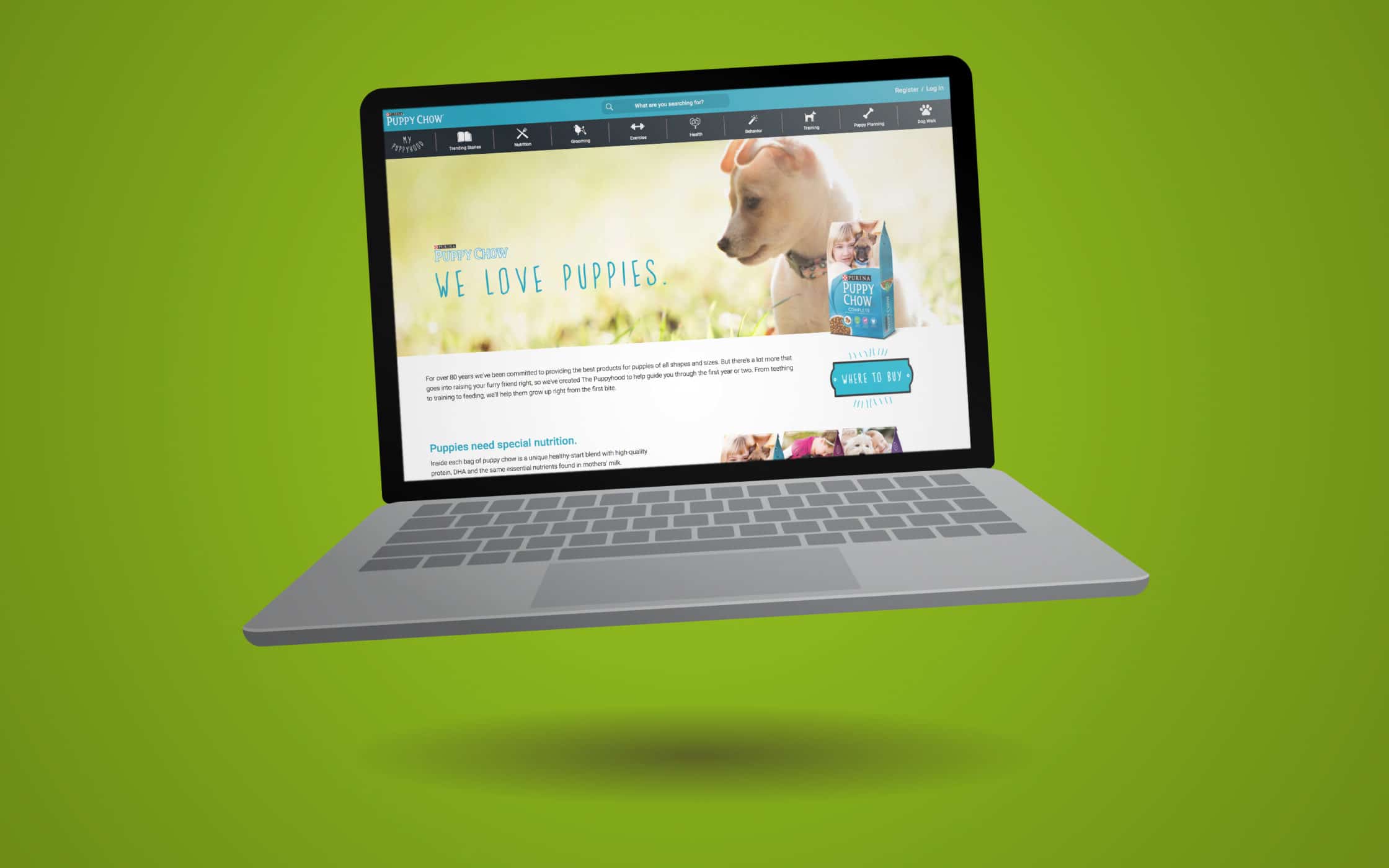
The puppyhood site’s video content is still available on YouTube, but the puppyhood site itself is no longer around. Still, if you’re looking for microsite design examples that prove the benefits of creating a smaller website for your company, then Puppyhood could be just the thing you’re searching for.
While it was active, Puppyhood sent thousands of new visitors to the Purina website. Today, the Puppyhood videos still pull in traffic to the main website from YouTube too.
2. ElfYourself.com
It’s hard to write an article about Microsite designs without paying some homage to perhaps the best-known microsite in existence – ElfYourself.com. Created by the Office Max team as a bit of seasonal fun, ElfYourself is a microsite that went viral thanks to it’s fantastic shareability.
As part of a Christmas Office Depot promotion, ElfYourself gave customers the option to transform themselves and their loved ones into dancing elves – just in time for the holidays.
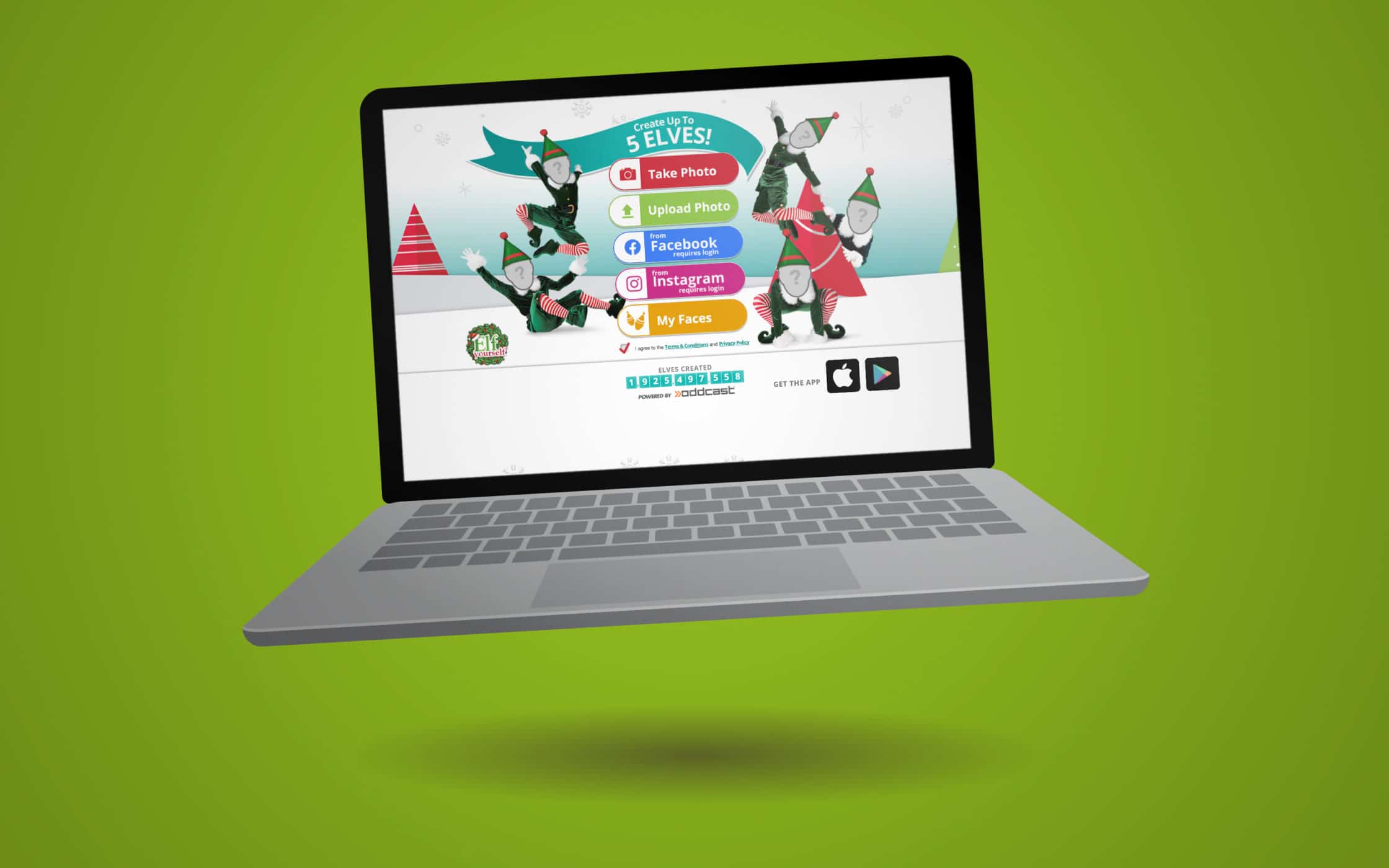
Unlike some of the other microsite inspiration that we’ll cover in this article, ElfYourself didn’t disappear after a month never to return again. Every year, you now have the option to count down the days until the site becomes live again.
ElfYourself.com is an excellent example of how brands can use their microsite creations to really get creative and showcase their unique personalities. If you’re looking for a way to deepen your relationship with your audience through some playful content, a microsite might be just the thing.
3. WhatTheF***ShouldIMakeForDinner.com
When it comes to following microsite design best practices, an expert will always tell you that it’s important to target a very specific audience. Microsites are all about reaching out to particular people with a unique campaign. While your mini-site might not appeal to everyone, it will help you to capture the attention of a select group.
This microsite example from Zach Golden is an excellent insight into how you can speak your audience’s language – even if that language is a little aggressive.

When you type the name of the website into your search bar, you’re presented a rotating landing page that gives you a potential meal you might want to cook. Handy right? This is actually one of the best microsite homepage examples we’ve seen, because it means that you get a different experience every time that you log on.
The Microsite was originally intended to attract customers to Zach’s new book, and there’s a link to that title in the corner of the screen too. However, the site has stuck around for a while now – perhaps because people love using it as inspiration for their meals.
4. Blueheart (Patagonia)
Microsite designs don’t have to be all fun and games.
If you’ve got an important message to get across, then your miniature website could help you to do that too. For instance, Patagonia needs to focus on keeping its business running on its main website, by selling products and clothing. However, that doesn’t mean that the brand doesn’t want to invest in making the world a better place too.
Blueheart by Patagonia is a great source of microsite inspiration for those who want to branch out from their existing online presence. The website maintains the same logo and a few of the branding techniques that you’d see on the main Patagonia site. However, there’s also a unique appearance and navigation strategy throughout the microsite too, so you know you’re in a unique environment.
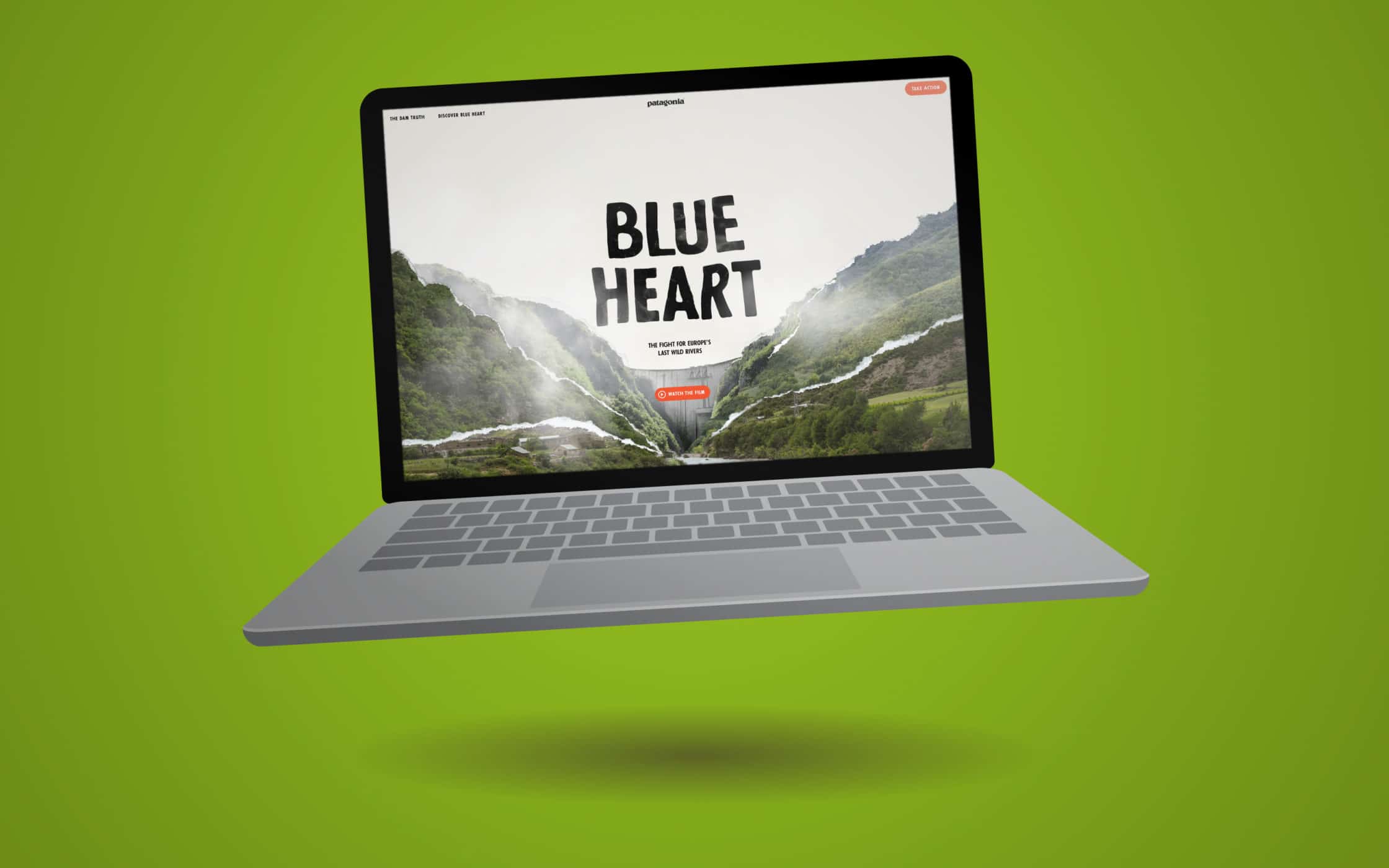
Patagonia has been able to create something unique and compelling for their audience, while still making it easy to trace the source of the campaign back to its original brand.
This microsite design is Patagonia’s opportunity to give customers more information about who they are and what they do, without overwhelming the selling purpose of its primary website.
5. The Data That Lies Beneath
Speaking of microsite examples that send an important message, Lucidwork’s microsite, “The Data that Lies Beneath” introduces people to the concept of dark data, and what you can do to protect yourself in an age where privacy is becoming harder to protect online.
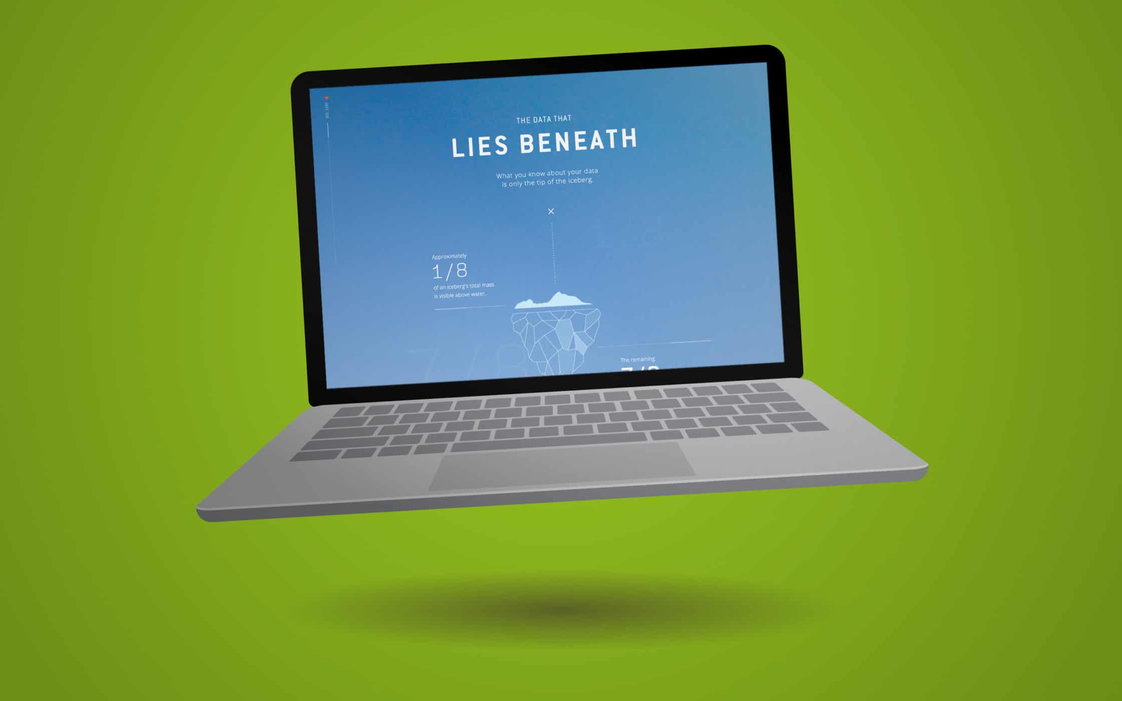
When it comes to Microsite ideas, Lucidwork’s vision is a lot simpler than some of the other microsites that we’ve covered on this list. There aren’t multiple pages to browse through, just a single interactive page that provides some useful insights into the world of data.
Though this site is very small in size, it’s enough to make a significant impact. Lucidworks does a great job of explaining how data goes dark and gives you a few quick tips on how to protect yourself against the dangers that dark data can pose to any family. At the same time, like most of the best microsites that we’ll mention today, this digital asset also helps to drive attention back to the parent brand. At the end of the scrolling page, you’ll find information about what Lucidworks is doing to tackle dark data, and where you can find out more.
6. EveryLastDrop.co.uk
Microsites are often very common among charity sites that might not be able to afford a bigger website or a larger campaign to attract new donors. Because of this, many of the best microsite design examples that you’ll see online will come from non-profits trying to improve the world. For instance, Waterwise created a colourful and clever Microsite called “Everylastdrop.co.uk”.
The Microsite design is more of an interactive experience than anything else, giving today’s consumers the chance to see for themselves how water is so commonly wasted throughout the UK. As you scroll through the microsite homepage, you’ll see an animated character waking up and going through the steps it takes to get ready for work.

The more you scroll, the more you’ll see the water use adding up. Waterwise even draws attention to the things that use water that you might not be aware of, such as your clothing manufacturing process. It’s a clever way for the company to draw attention to an important issue, without cluttering their main website with too much information that might distract donors.
7. SoundsLikeYou (Pandora)
Unfortunately, this is another option on our list of the best microsite examples that aren’t available to visit on your own anymore. If you want to see the Sounds Like You microsite design for yourself, then you’ll need to check it out here. Like many microsite ideas, Sounds Like You was a temporary website created for the SXSW event in 2018.
The microsite was perfect for highlighting music company Pandora’s unique approach to helping customers customise their listening experience. It worked by allowing people to compose a unique song based on their musical taste and connect it to a picture of themselves. It was a really interesting prospect and a fantastic insight into Pandora’s commitment to its customers.

While the microsite design here was pretty simple, it achieved its goal perfectly. When visiting the website, users were asked to give their email address and name before they could begin composing a new track. Since everyone wanted a chance to create music that was unique to them, Pandora was able to collect thousands of emails for their list, almost immediately.
The Sounds Like You website even used personality traits to improve the quality of the music that they could produce. Using 3 character traits, Pandora suggested the kind of songs and sounds that might suit their customers best.
8. Do You Want to Build a Snowman?
This website has very little to do with the movie “Frozen” and more to do with helping children explore the wonders of the digital age. Created by DBS Interactive – an American marketing agency, Do You Want to Build a Snowman is a microsite that allows people to build their own snowman using a few basic graphics. Similar to the ElfYourself.com microsite design, this website is highly seasonal – but it stays online all year around.
Like “ElfYourself”, the DBS Interactive microsite example shows how highly shareable experiences can capture the attention and love of your audience. There are plenty of ways to share the snowman that you create on social media too, which means that DBS Interactive had endless opportunities to expand brand reach.

The thing that makes this particular piece of microsite inspiration so appealing is that it wasn’t created just for social sharing purposes. The platform was intended to introduce underprivileged children around the world to the magic of the internet. The app was part of a wider strategy to teach youngsters more about building things online.
Within the application, children can learn how to use a mouse to click and select objects, scroll through web pages, and manipulate images. While those things might not seem very complicated to us, they’re basic elements that children need to learn when they’re just getting started in the digital world.
9. Willitblend.com
Finally, let’s go back to a slightly stranger microsite example for our final choice. Willitblend.com is a playful microsite designed by the Blendtec company to help promote its vast range of blenders. Basically, the site builds on the average person’s urge to know once and for all whether everyday objects like remote controllers and footballs will blend or not.
A website packed full of videos of a man in a lab coat trying to blend household items might seem a little strange at first, but it quickly became a cultural phenomenon. It’s similar to all of those videos you now see on YouTube and Facebook of people crushing things under a hydraulic press.

Willitblend.com is more than just a way for the folks over at Blendtec to have some fun with the spare technology they have sitting in their warehouses. The site is also a fantastic insight into how strong and durable the Blendtec blenders actually are.
The videos, presented by Tom Dickinson, always feature a Blendtec blender, helping customers to see first-hand what these tools are actually capable of. This Microsite allows Blendtec to promote their products without being overly “salesly.” It’s pure genius – with a little “mad scientist” thrown in.
Do you need a microsite?
If our selection of microsite examples have left you aching to put your own creativity to the test, then you could always try creating your own microsite as a supplement to your main website. Here at Fabrik brands, we can help you to create everything from fully-fledged websites, to simple interactive pages. Contact us today to learn more about designing a microsite.
On the other hand, if you want to learn more about building the perfect marketing and branding tools, you can always check out our amazing range of articles on the Fabrik blog!
If you enjoyed this article, you might enjoy these too:
— Making your mark: How to find a profitable niche
— Boost your SEO: Avoiding keyword cannibalisation


