


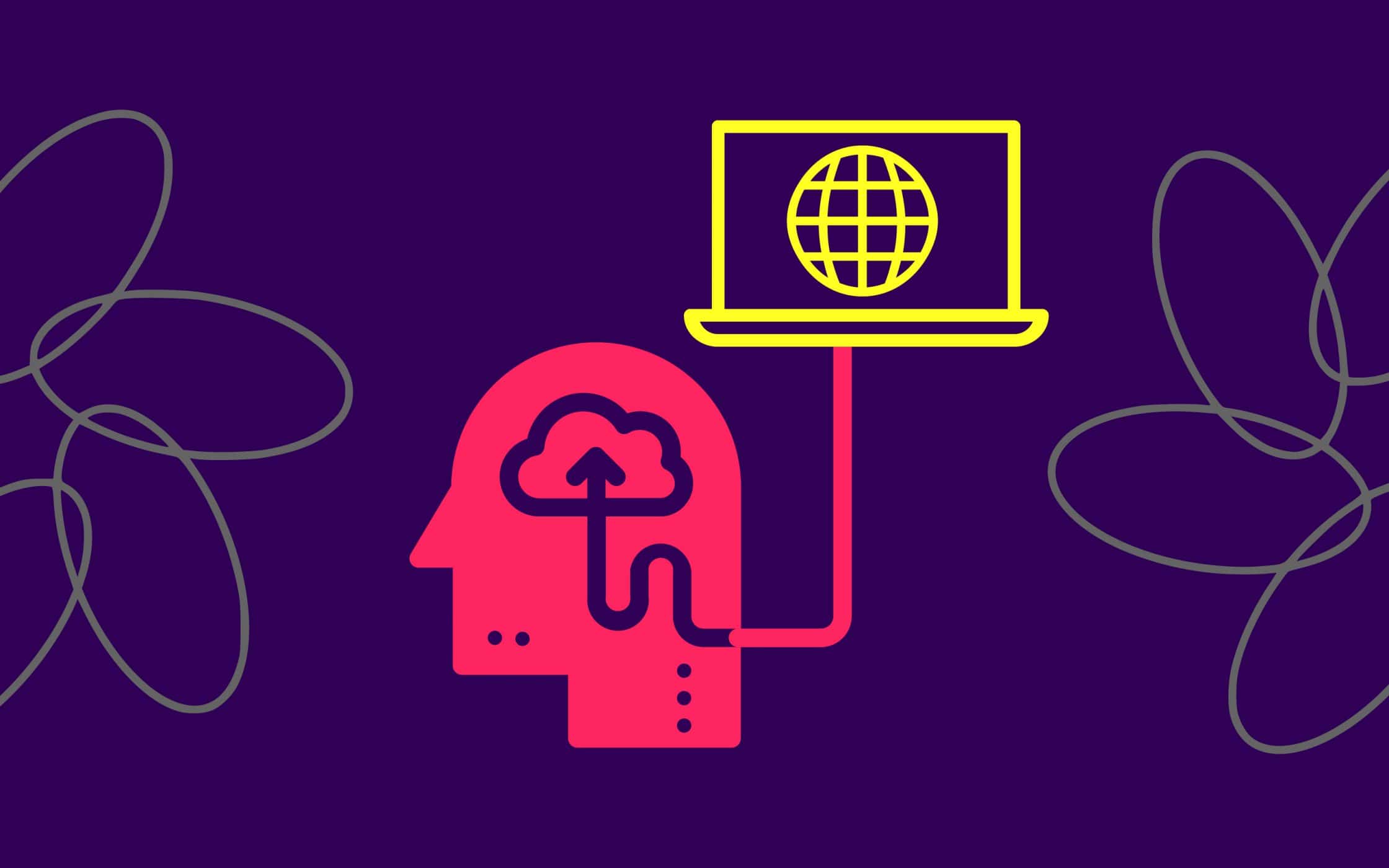
Web psychology: Hacking customer experience with art and science
When you go shopping, either online or in person, what factors make you choose one brand over another? Is there something about the packaging or the web page that you appreciate? Does the tagline put your mind at ease, do you simply feel loyal to the brand, or is it something else entirely?
Customer purchasing decisions are personal and complicated, but that doesn’t mean that businesses can’t do anything to influence their audience. In fact, there are many ways a company can align their use of design and marketing plans with elements designed to impact customer behaviour – particularly when they’re using the basics of web psychology.
The objective in designing a website is to appeal to customers using colours, fonts, images, and content. While all companies need a functional website that loads quickly and feels easy to use, learning a few principles around the psychology of web design could help you to increase the user engagement you receive.
While most experts and online enthusiasts are familiar with the psychology of colour in web design, the truth is that your ability to persuade and manipulate your customers can go beyond the different shades you use.
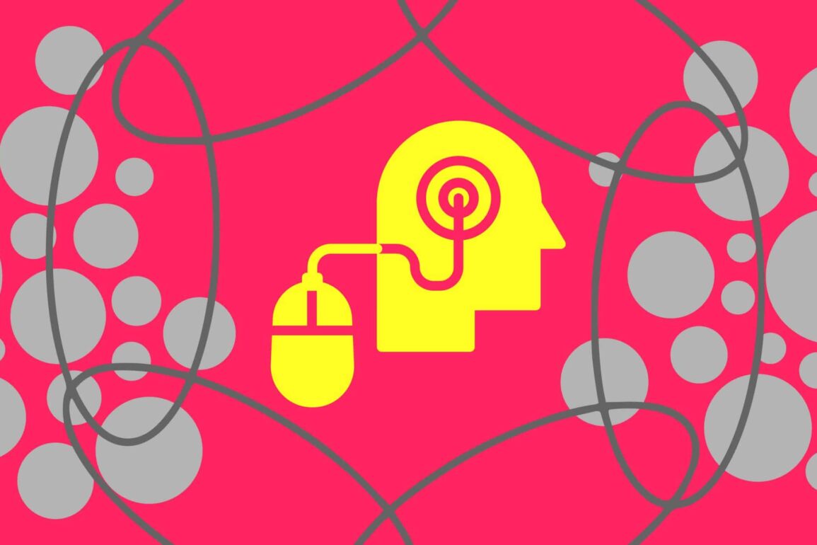
The human brain is incredibly complex, but with a little practice, we can use what we know about the brain in the process of web design and prevent a new site from becoming yet another lost domain in a galaxy of competing websites.
So, what is web psychology, and what can it do for you?
Marketing with meaning: The psychology of web design
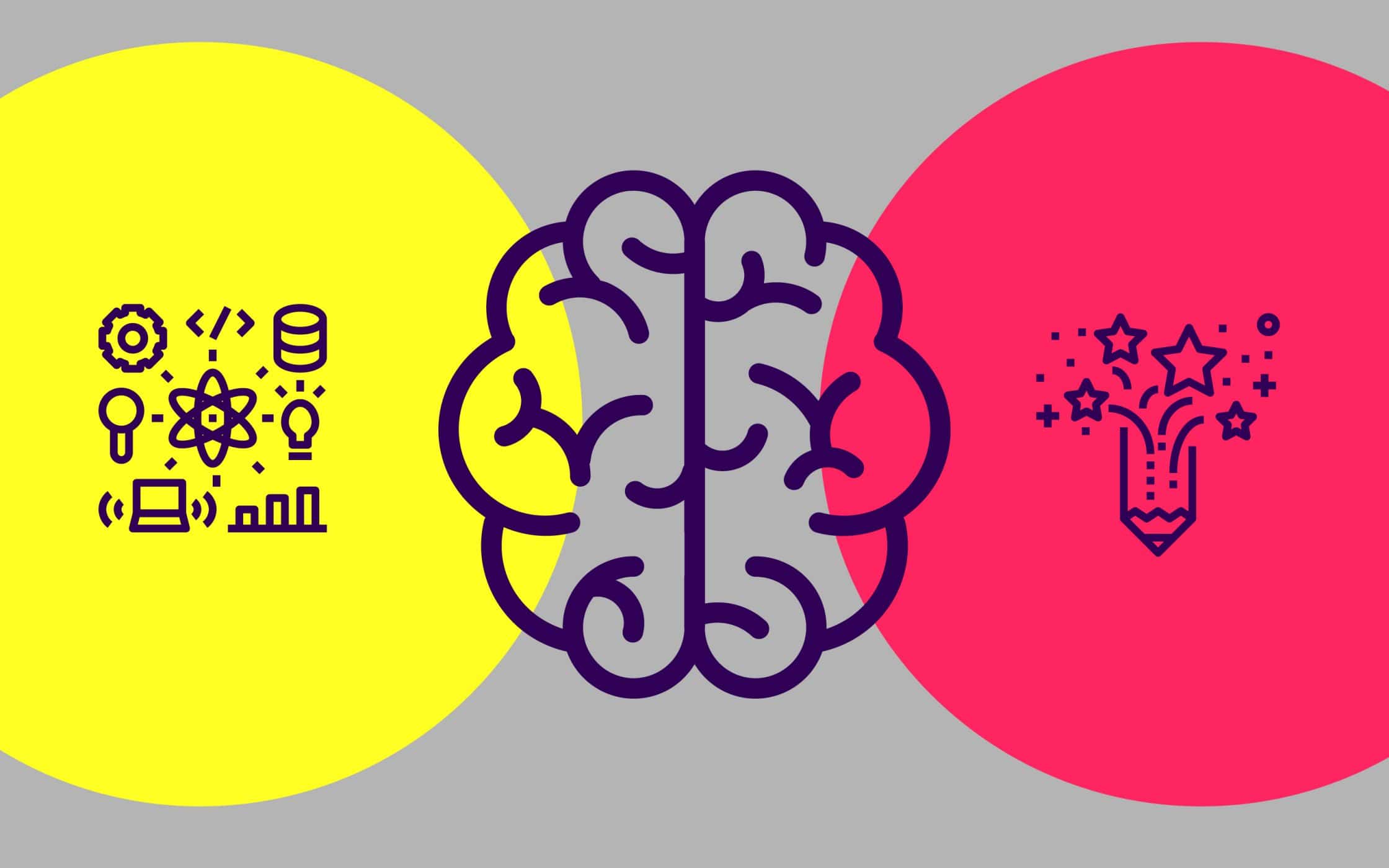
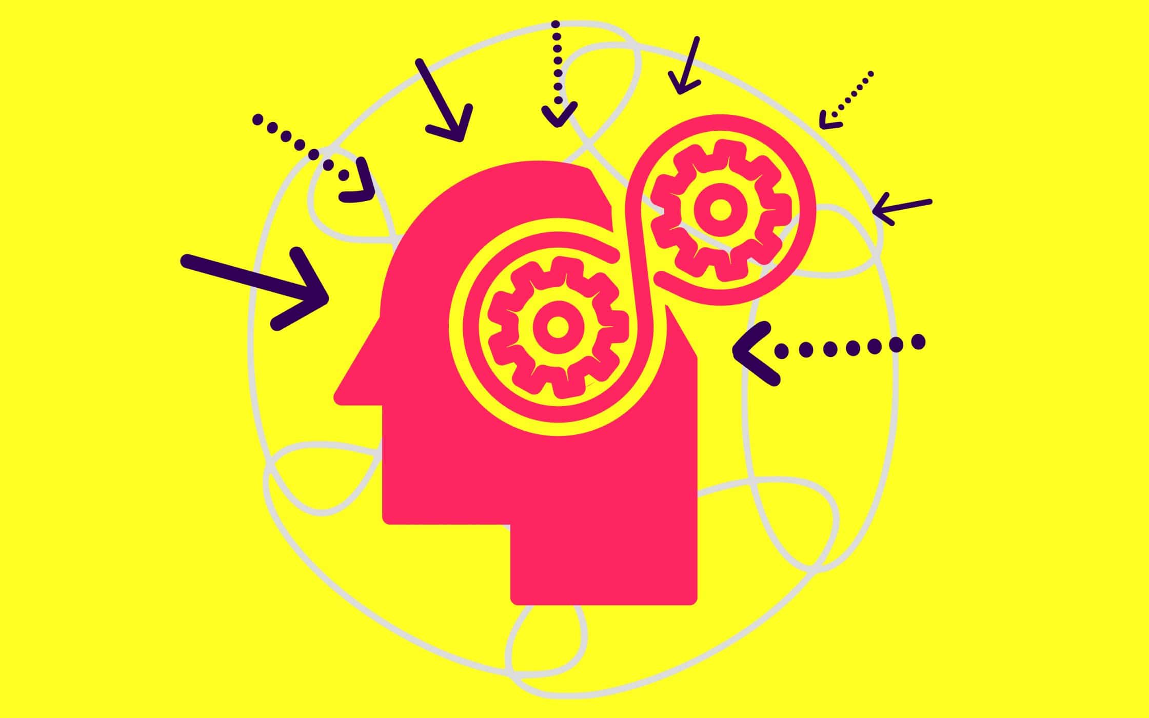
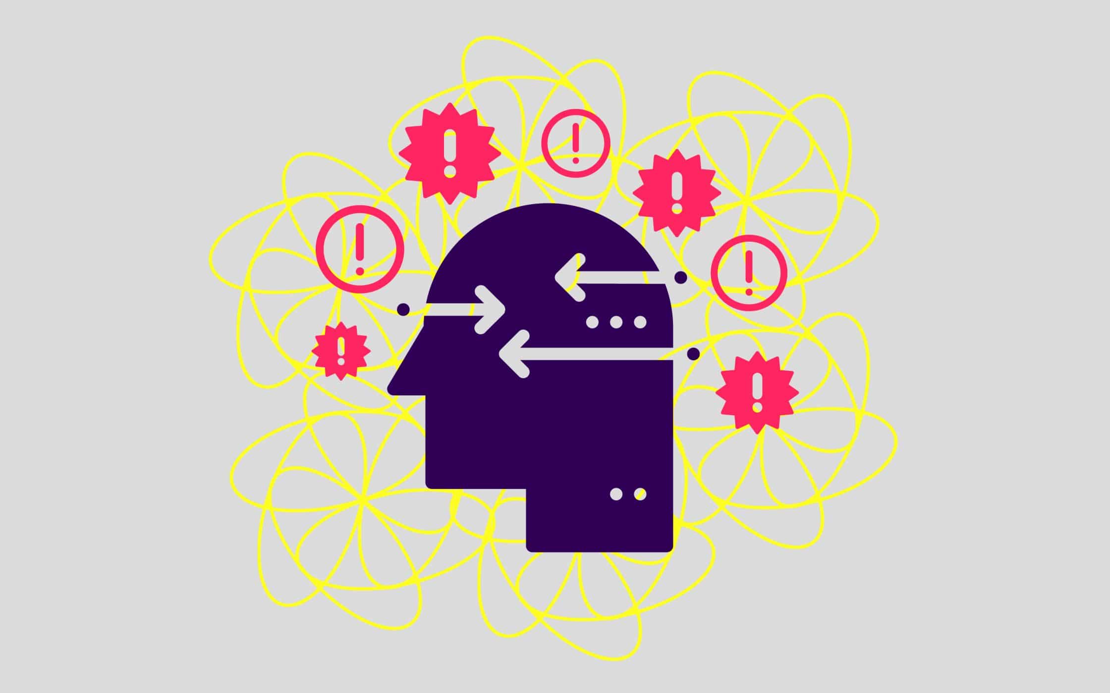
Psychology is the study of the human mind, and how it works. Since our brains influence everything we do, it makes sense that understanding psychology would be an effective way for branding experts and companies alike to improve their interactions with customers.
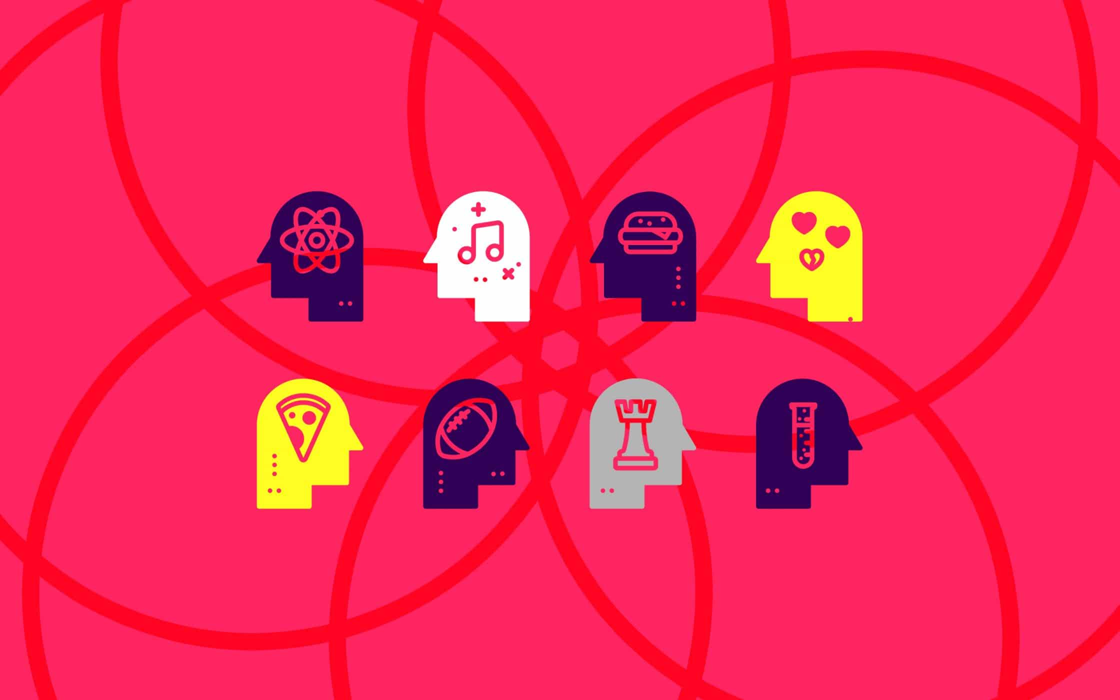
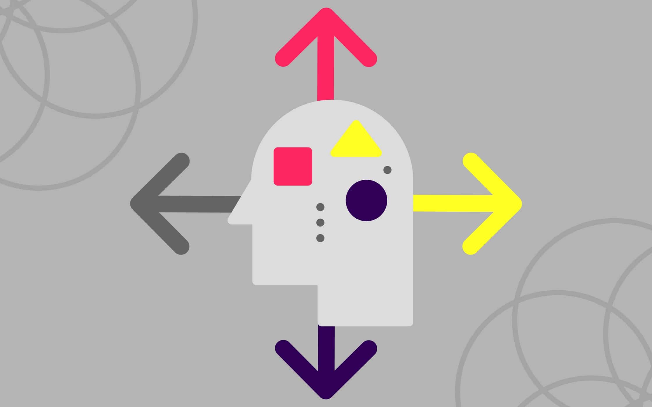
For a brief example of just how important the brain is to customer buying decisions, let’s consider how different parts of the brain compel different actions. For instance:
- The limbic system is the emotional part of the brain that helps us to associate memories and behaviours with positive experiences. If you can make it so that customers associate your website with a positive experience, then they’ll be more likely to visit again, and recommend you to their friends too!
- The neocortex is the “thinking brain”. This is the element of the brain that many designers feel most comfortable with because it works logically. The neocortex wants plenty of information, so placing in-depth content on your site is a great way to appeal to this part of the mind.
- Cognition is the process of thinking – the thing that makes humans different to other animals. However, cognition is costly. It takes a lot of energy to think, and customers want the simplest experience possible from their favourite brands. Making your websites easy to understand and use could help to increase sales.
The more you can learn about the factors that drive your visitors, and the strategies you can implement to affect their decisions, the more likely you are to create a site that taps into the psychology drive of your target audience.
On top of that, considering psychology can be a good way to build a brand that ends up with happier visitors, more likely to feel an affinity with your company, and perform the actions that create bigger profits. After all, if you understand the way your customer’s mind works, you can easily make them feel happier, more satisfied, and more committed to your company.
So how do you build your website around the principles of web psychology?
The basics of web psychology: Starting with trust
The psychology of web design, just like any practice that revolves around insights into the human brain, has numerous facets to think about. One of the first areas that most designers focus on, is the concept of “trust”. This simply means ensuring that your customers believe in your personality, your values, and the other elements that make your brand special.
If you want customers to do something on the behalf of your brand, then you need them to trust you. Unfortunately, trust doesn’t come easily in a world brimming with two-faced companies and scam artists.
The good news is that the more you know about your demographic, the more you can add an element of trust between yourself and your user, simply by making careful changes in your design. Think about the colours on your web page, do they resonate with your brand personality? Does your brand feel consistent on your site, and social pages?
Here are a few elements to remember when building trust with web design.
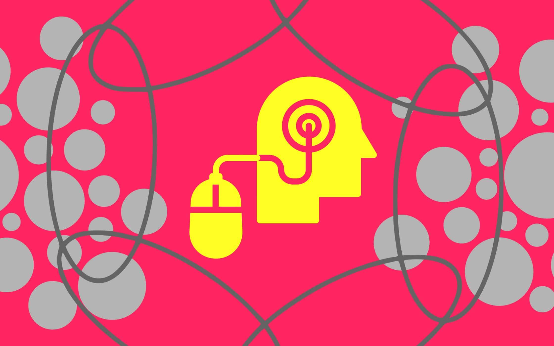
1. Social proof influences customer action
Humans are hard-wired to feel certain ways about certain things. This is something known as a cognitive bias, and we’re susceptible to many kinds of bias in web design. Understanding how these biases impact the behaviour of your website visitors is crucial when convincing people to buy from you.
One of the most important biases used in marketing is “social proof”. Also known as social influence, this is when people assume that the actions of others can outline the right path to take. To show social proof on your website, all you need to do is use testimonials, reviews, and even display how many people follow your brand on social media.
The more you demonstrate your social impact, the more customers will believe in your brand.
2. Personal and familiar experiences are key
Want to make your website feel less like a brand-new or confusing experience to your customers? If your visitors can easily imagine themselves interacting with your company or product, they’ll feel more committed to your brand. All you need to do is think about how you can create a comfortable experience for your audience.
For instance, studies constantly show that people naturally react more positively to images featuring a human face. This is because people simply relate better to human faces. Unfortunately, the caveat to this rule is that standard stock images aren’t relatable. People can’t connect to “fake” families and happy customers.
Using an image that evokes real, authentic people is a great way to create a more personal atmosphere on your site. However, keep in mind that your personality and brand tone of voice needs to carry on that personal, and “human” attitude too.
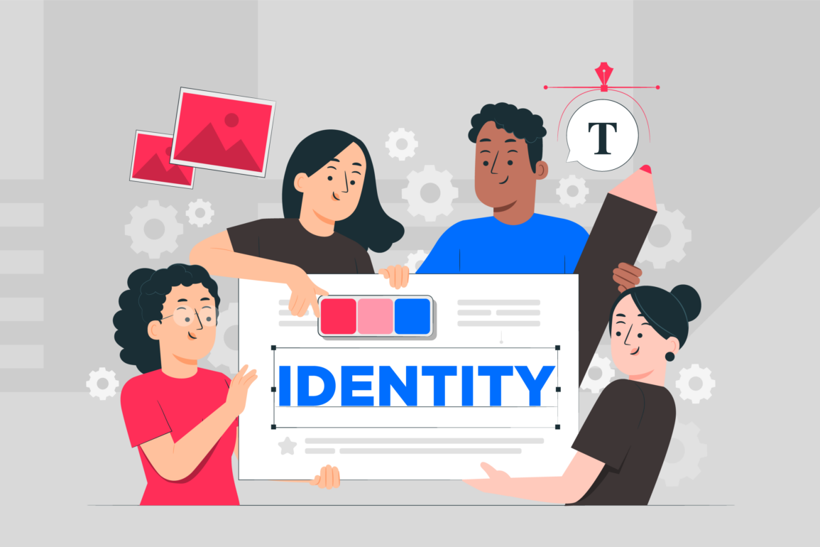
3. Remember the importance of brand consistency
Besides the general elements that people expect to see when they appear on a website, like a page for contact information and a paragraph or two “about” your company, there are many things that visitors might associate with your company identity in particular. While this might not be as much of an issue for new businesses, it’s crucial for making sure that you deliver a good experience as a brand overall.
Think about the colours, images, and tone that you use in your offline promotional materials, and even your social media accounts. The way you portray yourself in one form of media should resonate consistently throughout everything else you do, both online and offline.
For example, if you use a certain style of imagery in your marketing materials offline, then the same look and feel needs to apply to your website too. This might only be a basic concern, but it may surprise you to learn how many businesses overlook the importance of ensuring consistency between offline and online marketing efforts. The more you repeat the same experience for your customers, the more familiar it becomes. Since it’s easier to trust someone or something that feels familiar, that consistency is key to earning your long-term audience.
Visual impact: Colour psychology in web design
For better or worse, visual impact is one of the first things that most companies consider when it comes to web design. However, web psychology requires designers and businesses alike to consider the visual side of their online presence from a new angle. Psychology in web design suggests that there’s more to a great website than adapting to the latest designs on the market.
While it’s true that your website should look good if you want to convey an air of professionalism and sophistication to your customers, the elements that you use to build the aesthetic appeal of your site have more of a psychological influence than you might realise. In fact, the way designers access and use different design elements like colour, content, and images can have a huge effect on the mood, attitude, and experience of your user when they browse your website.
So, how exactly can you use visual elements to your advantage in web psychology?
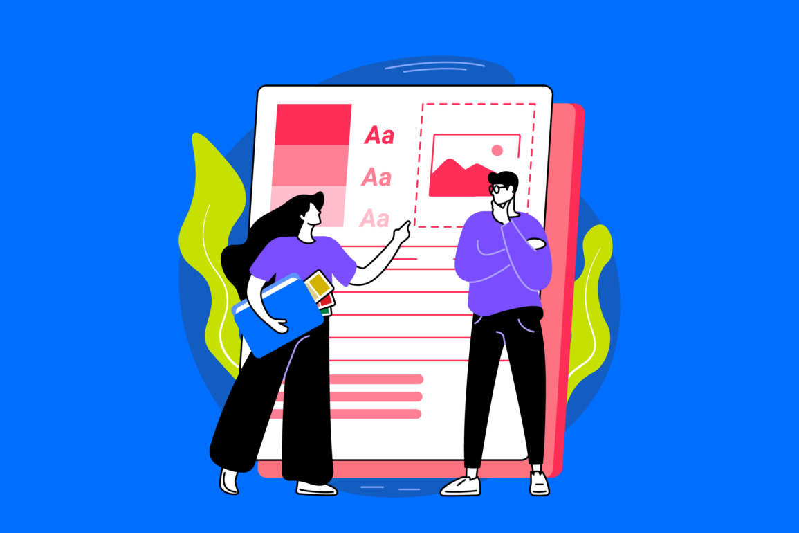
1. Colour psychology in web design
We’ve addressed the concept of colour psychology before here at Fabrik. After all, according to studies, people form opinions about websites within 90 seconds, and colour can influence up to 90% of that opinion. In other words, the colour you use for your online pages alone can be enough to decide whether your business is a failure or a success.
When used correctly, colour can increase brand recognition by up to 80%, making your brand mark and materials instantly more recognisable. However, colour isn’t just important in your marketing materials, but in the platforms, you use to represent your business online.
Cooler colours like greens and blues on your website can provide a professional, inviting, and relaxed atmosphere for your customers. Yet, in the wrong circumstances, the same shades can deliver a cold and unfriendly feeling too. On the other hand, warmer colours like red, yellow, and orange can indicate warmth and creativity, while also giving off feelings of stress and anger.
How you convey feelings through colour on your site will depend on the balance of shades you use, and how much of each hue you choose to place on your web design. It’s the complexity of using colour to inspire certain feelings that makes the web design process so complex.
2. Using well-placed, concise content
While colour plays a huge role in evoking emotion in your customers, it’s not the only aesthetic element to consider in the psychology of web design. Other design choices, like the way you choose to create and place your content, can have a huge impact too.
For instance, imagine the images you use on your site. Most research into web psychology suggests that pictures of people can be an important way of building trust and familiarity with your audience. But the way that person is placed on your site can change the perception of your customer drastically. For example, a picture of a person facing the viewer is welcoming and inviting. On the other hand, if the person’s eyes are pointing in a certain direction, that can push the user towards viewing other areas on the page.
When it comes to structuring written content, remember that relevant information should generally stay towards the top of the page, to appeal to the simplicity that customers want from their online experiences. No-one wants to scroll down a page just to find out what a website, company or product is about.
3. Typography and the appeal of font psychology
Finally, just as colour psychology in web design is an important emotional concern for companies to consider, typography can also convey a ton of feelings for visitors to your website. There are thousands of different typefaces to choose from, and everything from the style and shape, to the colour and size of your chosen font, can impact the way your customer feels about you.
While it’s up to you to choose typography that demonstrates the personality and tone of your brand, it’s worth noting that different fonts are often intended for specific uses and situations. For example, serif fonts, (like Times New Roman), are best associated with seriousness and professionalism. On the other hand, sans-serif fonts are a bit more modern, informal, and clean feeling.
Creating a comfortable experience with format and design
Now that you know the basics about aesthetics in web psychology and the rules of creating trust in your target customer, you’ll be able to start putting things together into a pattern that appeals to your user.
Remember, the human brain is particularly good at recognising patterns – sometimes even when those patterns don’t actually exist. The key to making the most out of psychology in web design is to create a consistent pattern across your website, using the same styles, fonts, colours, and layouts that your readers expect, while implementing your own personal touches too.
So, what are some of the simplest web psychology strategies you can use to create a comfortable experience through format and design?
1. Consider visual hierarchy
We mentioned above that when customers come to your website, they expect to see certain things, such as your contact information, and your unique sense of style. However, they also expect to see those things formatted in a certain way. For instance, visitors typically jump among prominent features when browsing a site.
The average customer won’t read every word written on a page but scan across the page in a “Z” pattern. That means that you need to guide your customers towards the information you most want to see using visual hierarchy.
Remember, keep culture in mind here. In English-speaking countries, people read from top to bottom and left to right. However, those in the middle east and Asia view content differently. You can implement hierarchy by using splashes of colour, bold fonts, new typography, and even images.
2. Give every page a focus
When it comes to using psychology in web design, it’s easy to forget that your customers crave simplicity. The human brain is complex, but that doesn’t mean your website should be. Instead, make sure that every page on your site has its own distinct focus.
By dedicating each page to a specific focus, you make it easier to improve awareness by pulling attention to the unique elements of each page. For instance, your headlines, your images, and your content should all tell the same consistent story.
3. Provide plenty of breathing room
Speaking of making websites too complicated, if a visitor arrives on your website and finds that it’s cluttered with every piece of content possible, then they’re going to feel overwhelmed and even a little claustrophobic. If your customer doesn’t know where to start when navigating your page, they’re more likely to skip over your website entirely and move to a location that gives them more breathing room.
Rather than getting carried away with web psychology by trying to place as many elements on each page as possible, ensure that your content is clear and concise. Allow the negative or blank space on your site to direct your visitors towards the most important areas you want them to focus on. This will help to compel a desired action.
How to incorporate web psychology into your website
Now that you know the basics of web psychology, and what it means to influence the behaviour of your online visitors, you might be wondering what exactly you can do to improve your chances of success with your own psychological design process.
Just like with any aspect of building an online presence, it’s worth remembering that there isn’t exactly a one-size-fits-all guide to success. Instead, companies need to discover exactly who they’re talking to, and what elements their audience respond best to before implementing their own design choices.
With that in mind, here are a few tips for getting started:
Step 1: Figure out who your customers are
Understanding and recognising your visitors will always be a crucial first step in designing a website that’s going to appeal to a specific collection of people. For example, if your visitors are internet veterans who love all-things-tech, then they’re more likely to have a set of priorities that differ to someone who only goes online to look at pictures of their grandkids on Facebook.
Creating a user persona will help you to figure out who you’re talking to while giving you the insights you need to determine which emotional triggers will work best for your followers.
Step 2: Make your audience feel at home
Once you know who your customers are, your aim should be to make them feel as though they’re in the right place when they visit your website. If you’re producing a website for bankers, then you should have plenty of content and pictures that feature numbers, money, figures, and businessmen.
On the other hand, if you’re appealing to mothers, then you might use soft colours, pictures of families, and fewer (if any) statistics. The more you know about your audience and what makes them tick, the more you can adapt your web psychology design to suit the needs of the person you’re appealing to.
Step 3: Keep it simple
As we mentioned before in this article, people from every niche are often looking for websites that give them the simplest experiences. A lot of website pages are frequently too cluttered and overwhelming, which leaves customers searching for simpler results.
However, if you can make your website as clear and concise as possible, then your customers will have less trouble navigating the pages available, and finding the information they want. Remember, use images, subheadings, and formatting to direct your customers around each page.
Step 4: Make the most of repetition
While a good website doesn’t simply repeat the same information time and time again, repeating elements can help to create predictability and familiarity among your audience. For instance, headings and images are often stylised in the same way between pages so that there’s a natural hierarchy on your website.
Using the same elements throughout your web design can help prime your visitors to expect the same consistent experience throughout your website. This process also makes you look more professional, which supports your marketing mix and makes it easier to buy from you.
Web psychology: Learning the “why” of the world wide web
To some extent, using psychology in web design is a natural next step from learning how to influence customer behaviour in every brand interaction. In stores, companies use colour psychology to make certain packages appeal to the right customers at the right times. You might have noticed that a lot of baby products avoid harsh colours like red, and orange.
In the retail buyer funnel, psychology can also be used to influence purchasing decisions as a person moves throughout a store. By way of an example, “impulse” products are generally placed at the front tills, where people are more likely to grab something they don’t need “last minute”, simply because it’s there.
Online, we can’t physically place products and people in front of our customers to help influence their decisions. Instead, we can only use the basic principles of web psychology to change how our customers think and feel about a brand.
The good news is that even something as simple as changing the font on your landing page, or the way you arrange content on your website, can be enough to enhance sales, improve ROI, and boost your profits in an instant. All you need to do to get started is figure out how your customers respond to different kinds of stimuli.
The more you can learn about how to build trust with your target customers, which colours and fonts appeal most to them, and how you can use website structure to influence buyer behaviour, the more you can manipulate certain results from your website, and use it your advantage.
A website will always be one of the most important online resources a company can have. With web psychology, you can make sure that your site is delivering the experiences that your customers are searching for, alongside the profits and results that you crave.
If you enjoyed this article, you might enjoy these too:
— Font psychology and typography in logo design
— Is your brand photography worth a thousand words?

As Fabrik’s creative director, Stephen oversees complex branding programmes. He advises our clients on their tone of voice, creates logos and visual identities and crafts names for companies, products and services. Writing for Brand Fabrik Stephen reflects his love for logo design and visual identity.