

Prismo
Repositioning
restores trust for
an industry pioneer.


approach
Find the insight that unites product
and promise.
Through workshops with the new ownership team, we discovered genuine affection for Prismo still existed throughout the industry.
We landed on a powerful dual meaning. Every physical mark must endure, and so must the Prismo brand.
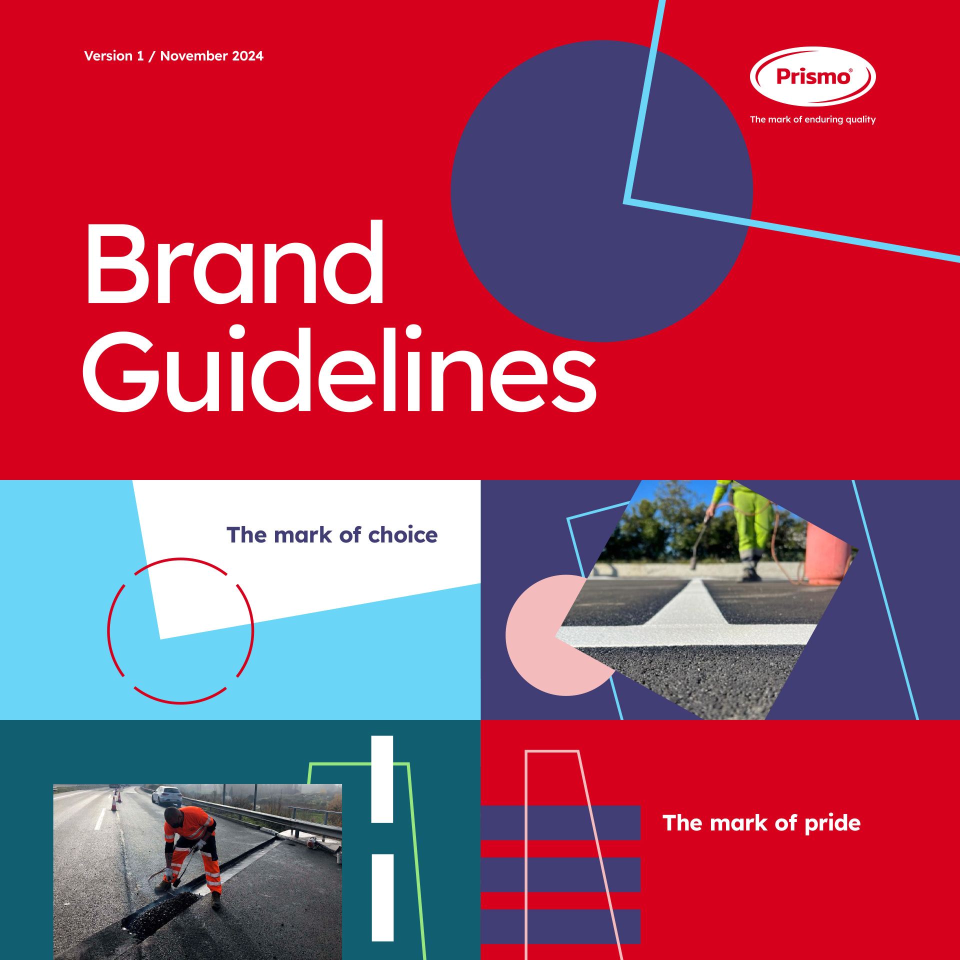
“The mark of enduring quality” became our strategic foundation, uniting product truth with brand promise.
IMPACT
INDEPENCE RECLAIMED.
IDENTITY RESTORED.
A repositioned brand supporting Prismo’s return to independent ownership and renewed customer relationships across 70+ countries.
Independence
Ownership reflected
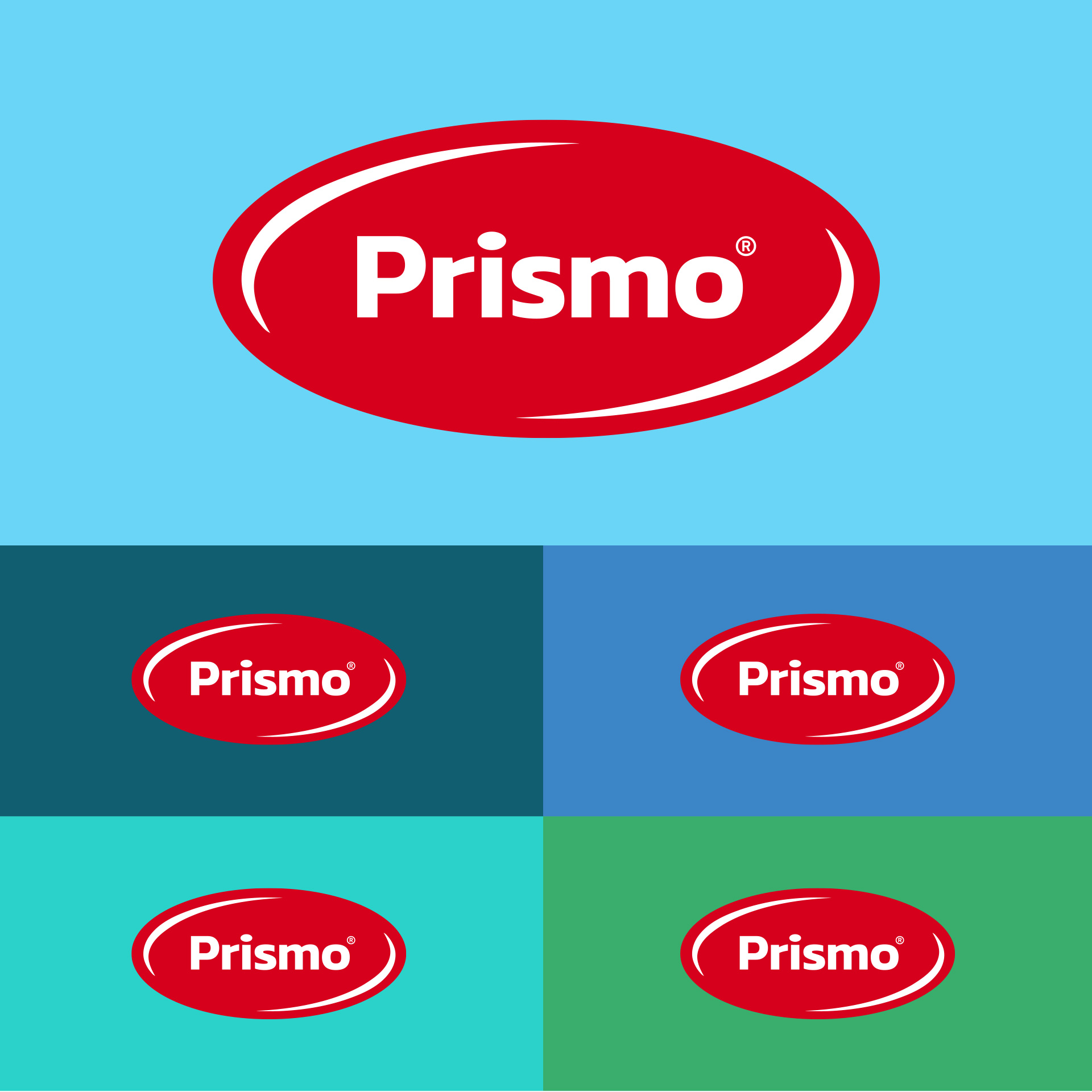
A brand identity that signals the management buyout and Prismo's return to the personal, dependable partner the industry remembered.
Global
Consistent presence
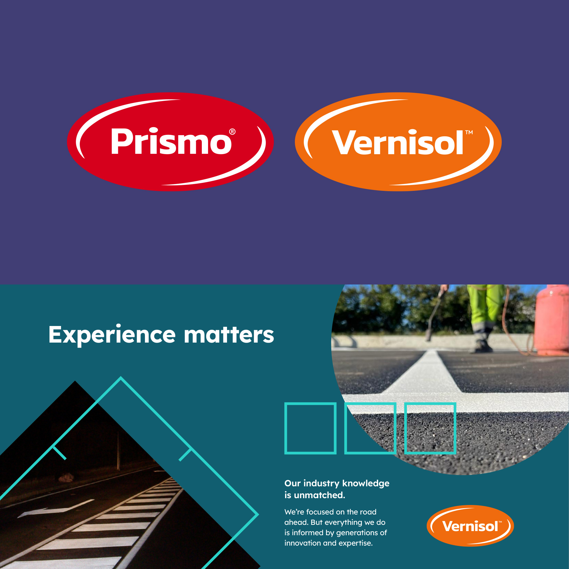
One unified identity across manufacturing in Britain, Italy, and South Africa – with sub-brand integration for Vernisol maintaining local equity.
Clarity
Story simplified
"The mark of enduring quality" – a positioning that unites product truth with brand promise across every touchpoint.
What we did
Strategy & positioning
- Market research
- Discovery workshops
- Brand positioning
- Strategic framework
- Value proposition
- Brand personality
Visual identity & assets
- Logo refinement
- Visual identity system
- Identity guidelines
- Brand assets
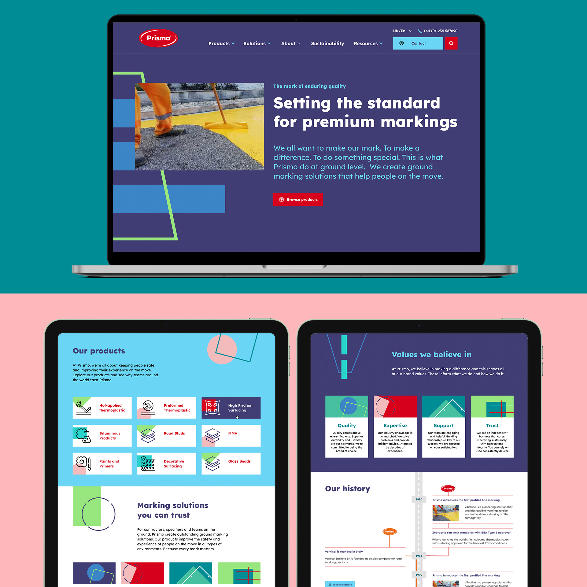
- Bespoke website
- Sub-brand integration
Following our management buyout, we needed a partner who could help us reconnect with the industry and rebuild relationships that had suffered under corporate ownership. Fabrik helped us rediscover what made Prismo special in the first place – the heritage, the quality, the personal service our customers valued. Through workshops with our leadership team, they landed on 'the mark of enduring quality', a positioning that captures both what our products do and what we stand for as a company. The new identity feels like us again – only sharper, clearer, and ready for what's next.
Sharon Hendry, Marketing Director, Prismo Global
Our Work