Hero Image Block
Hero Image Block
Hero Image Block
Hero Image Block
VISUAL IDENTITY

ADD TO BE SEEN.
SUBTRACT TO BE
REMEMBERED.
Designing by
undesigning.
Then design.

Most visual identity specialists begin by asking what your brand should look like. We begin with what it shouldn’t. The logos it shouldn’t resemble. The colour palettes it shouldn’t borrow. The typography your category has already worn through. At Fabrik, our visual identity services are subtractive first. Additive second.

Every brand you recognise at a glance became recognisable by removing what made it look like everyone else. That’s the part most agencies skip. So our visual identity services don’t start with a mood board. They start with a question. What does your brand need to stop looking like? Subtraction is not the absence of design. It’s the hardest part of it. Strip away the borrowed and the expected, and what remains is yours alone. Designing by undesigning. Then design.

Identity by
questioning
what isn’t.

Most visual identity development begins with execution. We begin with interrogation. What does your category already do visually? Which colours, forms and conventions have become invisible through repetition? Where is your current brand visual identity borrowing equity from competitors without meaning to?

Before we put anything on a page, we map where your brand identity design has to show up, and what each environment demands. Screen. Print. Environment. Each has different physics. Each punishes different mistakes. This is what visual identity consultancy should be. Not decoration. Investigation. Our visual identity consultants arrive with the questions your internal team has no time to ask. About hierarchy, legibility and flexibility. Professional visual identity services that interrogate before they illustrate. Identity, defined by what it refuses to be.

Three stages, one identity.

We develop your visual identity through three deliberate stages. Each one removes more than it adds.
Category and competitor audit

We deconstruct your visual landscape before we design inside it. Logos, colour palettes, typography, image style, iconography. The visual conventions everyone in your category has settled on without realising. This tells us what your brand identity design has to move away from, and what space is genuinely available. Most identity projects fail here, before they’ve started, because the agency never bothered to ask the question.

Identity strategy and design principles

This is where we define the logic beneath the look. Design principles, graphic language, and the rules that govern how every element of your visual identity system behaves. Not rules as restrictions. Rules as decisions made in advance. A visual design system is only as strong as the strategy it’s built on. We make that strategy explicit before we make anything visible.

Visual identity design and system build

Now we design. Logo and visual identity core, typography, colour, iconography, illustration style, motion principles, layout principles. Built as a scalable identity system that flexes across touchpoints without fragmenting. Because a cohesive brand identity isn’t a set of matching assets. It’s a set of decisions that produce consistency automatically.

MINERVAX
Visual identity brings clarity
to a biotech breakthrough.

Built to hold. Not to match.

Everything we deliver is built to travel. Visual identity design services should produce systems that work in your team's hands, your external partners' hands, and in the hands of people you haven't hired yet.
Logo and core identity system

Logo design is where most identity projects begin. For us, it’s one component of a larger system. We create primary and secondary logo marks, responsive lockups, and the application rules that govern every context. The logo isn’t the identity. It’s one distinctive brand asset among many, engineered to work alongside typography, colour, and everything else your brand needs to communicate.

Typography, colour and graphic language

The type system does more heavy lifting for your brand visual identity than the logo ever will. We define typeface pairings, weight hierarchies, and the rules that keep communication legible at any scale. Colour palettes built for digital, print and environmental use, with accessibility as a starting condition, not an afterthought. A graphic language that gives your brand a recognisable signature beyond the mark itself.

Image style, illustration and iconography

Most brands look the same because they source imagery from the same stock libraries. We define an image style, illustration style and iconography your brand can own. A distinctive visual language that makes your content recognisable before anyone reads the headline. This is where brand recognition is built or lost, in the space between the logo and the words.

Motion, layout and digital systems

Identity systems that only work in print are halfway identities. We define motion principles and layout principles that govern your brand across digital touchpoints, print touchpoints, and environmental applications. How things move. How things sit on a page. How the system behaves when someone scrolls, taps, or scans. Corporate visual identity built for how brands live today.

Brand guidelines and implementation toolkit

Every visual identity system we deliver comes with the brand guidelines required to keep it consistent. Visual brand guidelines covering logo usage, typography, colour, image style, iconography and motion. Identity guidelines written as tools, not reference books. A brand toolkit covering marketing collateral, campaign assets, presentation templates, social media templates, and signage and environments ready to roll out. Built for use, not archiving.

More restraint.
Less volume. More recall.

After nearly three decades as visual identity consultants, we’ve learned that the most recognisable brands aren’t the most decorated. They’re the most disciplined. Visual consistency isn’t produced by more design. It’s produced by better decisions, repeatedly.

Our visual identity experts start every project with the same assumption. Your brand already looks like something. The question is whether it looks like you, or like your category. That’s the work. The right visual identity partner knows the difference between new and inevitable. A visual identity refresh isn’t about making things look new. A brand identity refresh makes the system look inevitable, as though it could never have been otherwise. That only happens when the identity is built on logic, not taste.

The Fabrik team worked closely with me to redesign my company brand, and I couldn't have asked for a better outcome. Their creative energy, thoughtful approach, and quick turnaround meant we could build something that truly captures the soul of my business. They brought my ideas to life with care and clarity.
Linda Steinbock, Founder & Coach, Touching Distance
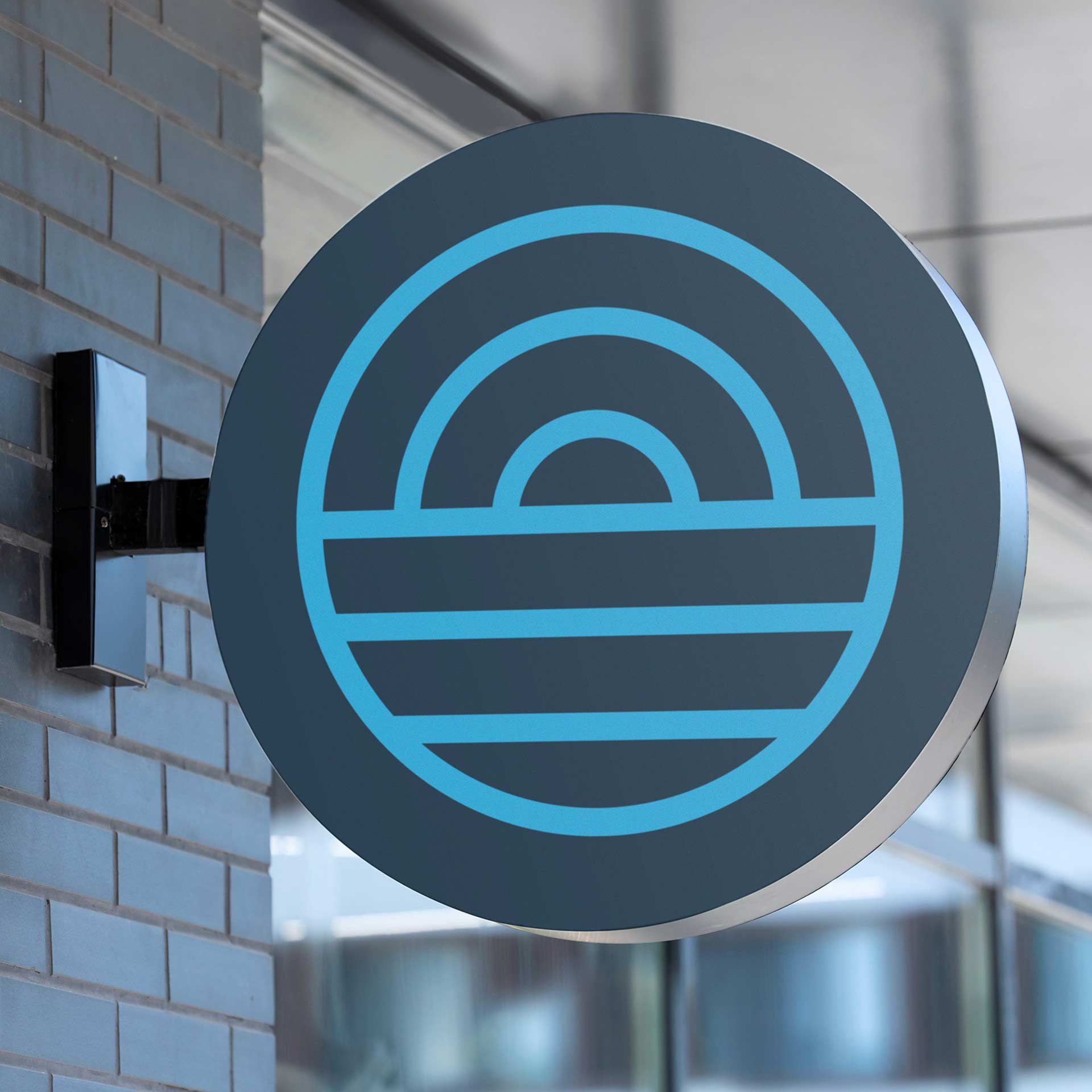
TOUCHING DISTANCE
Positioning and identity define
a leadership coaching brand.
View