


MinervaX
THE SCIENCE WAS
READY. THE BRAND
WASN'T THERE YET.



APPROACH
Building on what was already there.
Not starting over.
We worked closely with the senior team through workshops and consultations, understanding what had earned MinervaX its reputation in the first place.
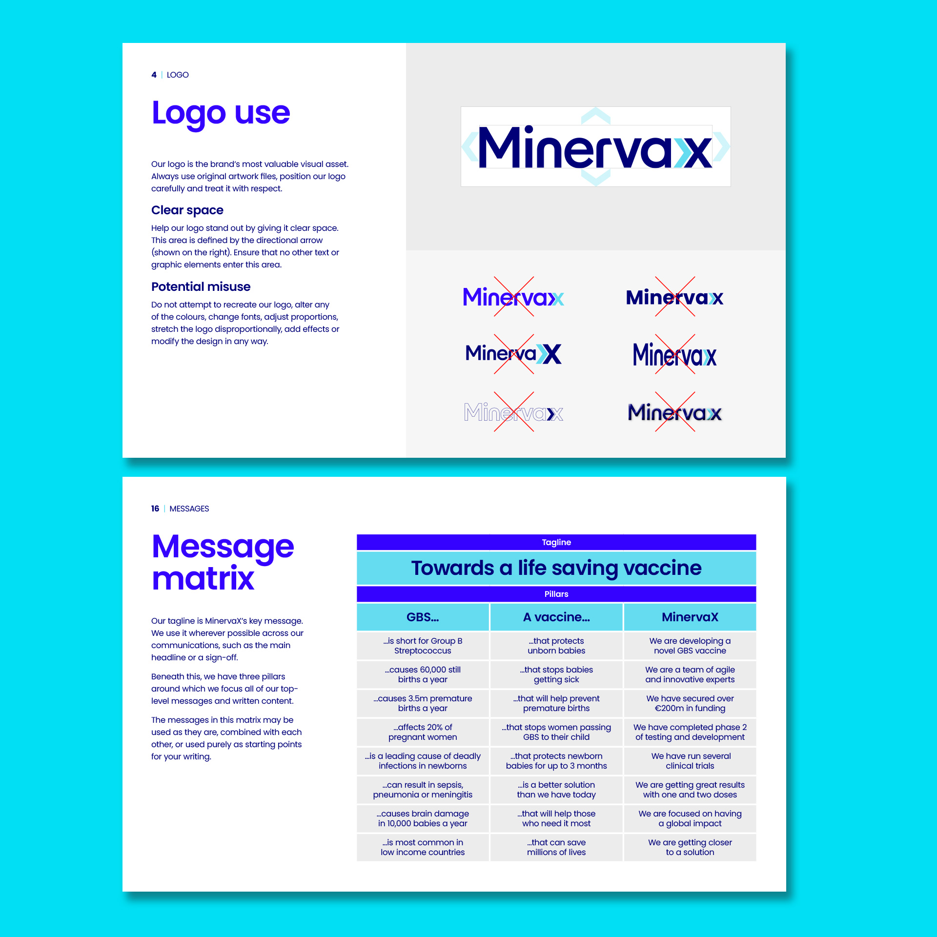
The new logo – a typemark with an arrow pointing towards the ‘X’ – captures the company’s relentless progress towards its life-saving goals.
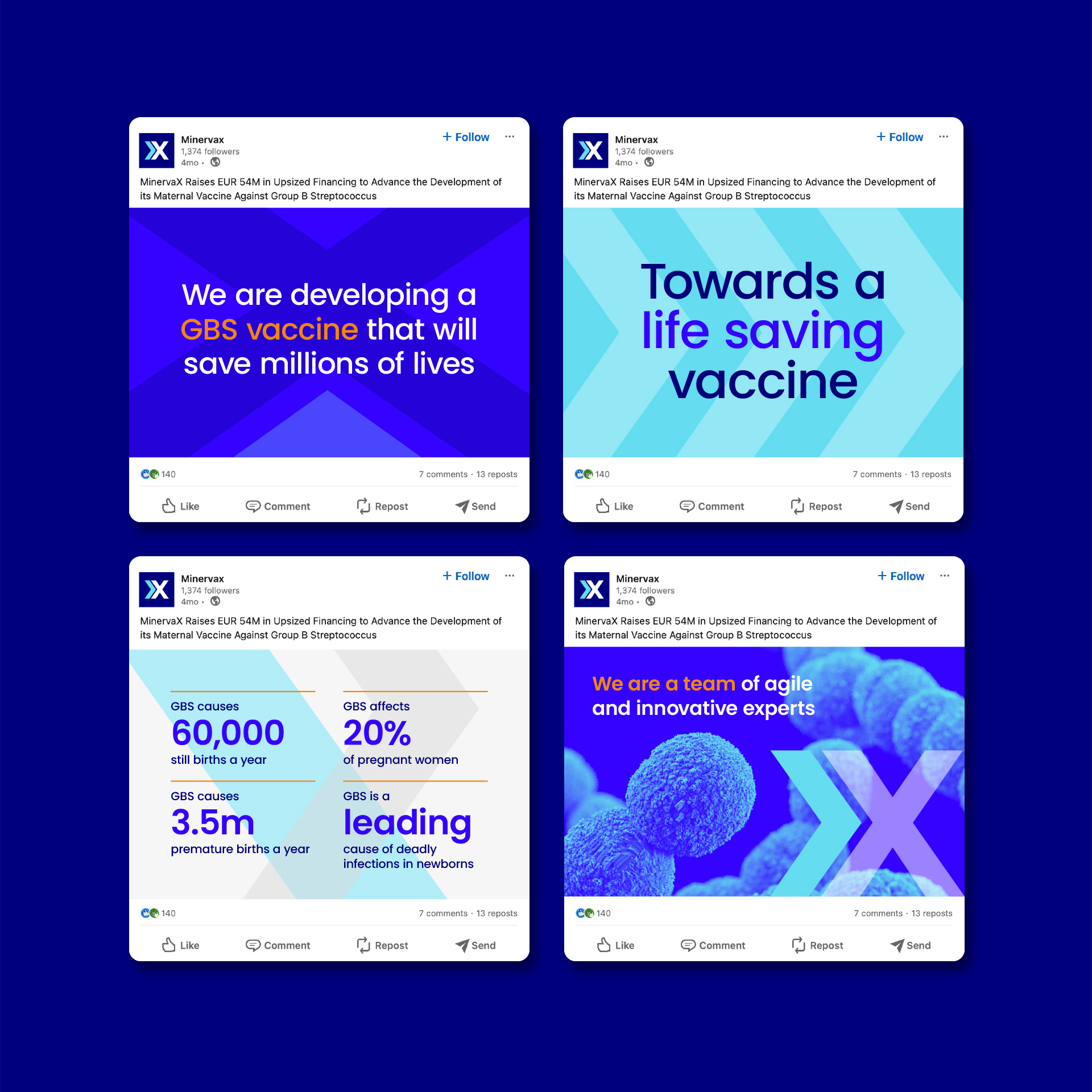
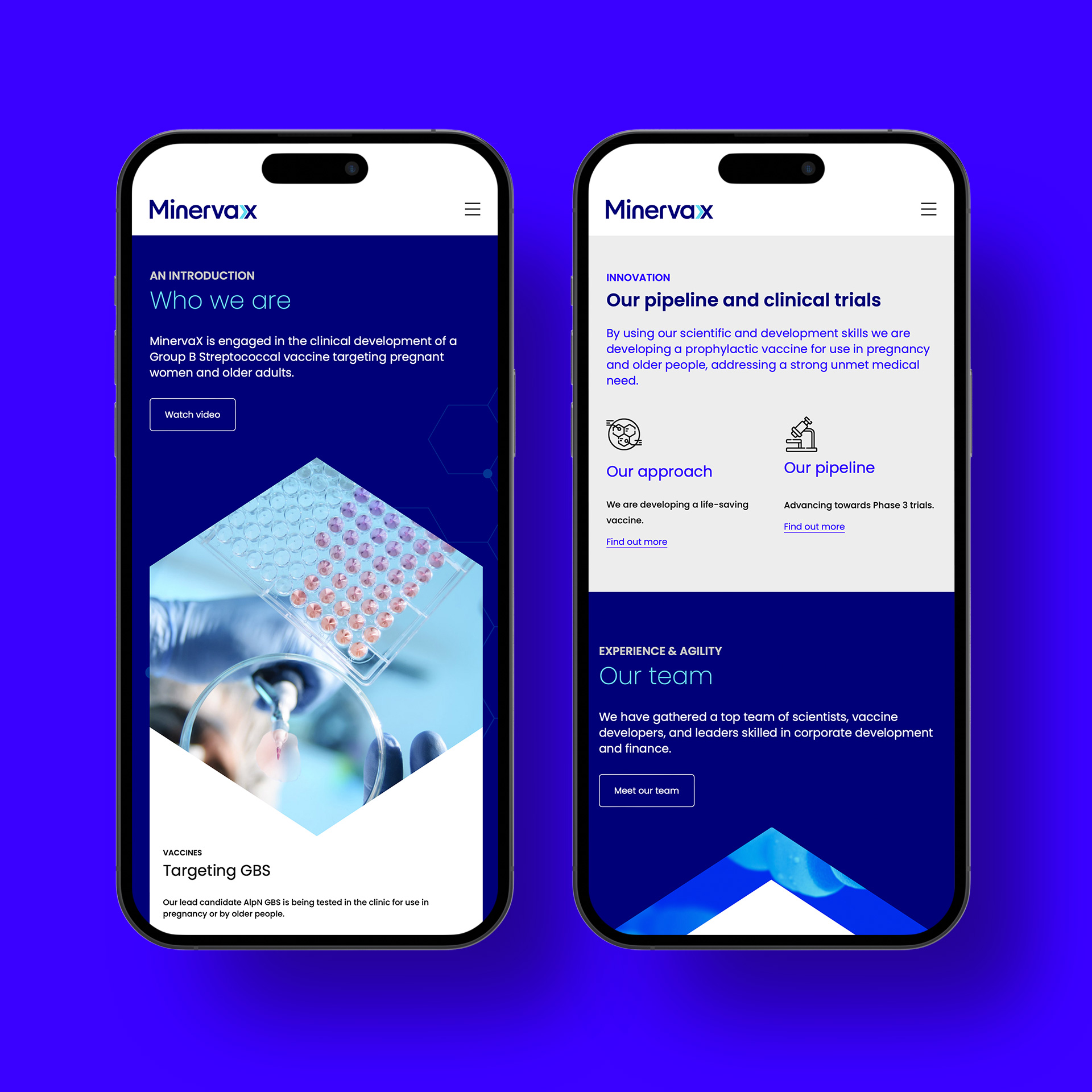
A refined blue palette and modern typography completed the system, projecting reliability and contemporary confidence across every touchpoint.

impact
A brand that earns trust at every table.
A visual identity that gives MinervaX the credibility to stand alongside global biotech leaders. In boardrooms, at conferences, and with regulators.
Investors
Continued backing
Blue-chip healthcare funds including EQT, OrbiMed, Novo Holdings, and Sanofi Ventures.
Regulators
Doors opened
Brand credibility behind successful FDA Fast Track and EMA PRIME designations.
Partners
Commercial traction
Manufacturing collaboration secured as MinervaX scales toward Phase 3 trials.
What we did
Strategy & positioning
- Sector research
- Brand positioning
- Brand strategy
- Logo development
- Sub-branding
Visual & verbal identity
- Tone of voice
- Top-level messaging
- Brand user guidelines
- Digital design templates
- Website development
We enjoyed working with Fabrik. No marketing jargon – just insightful strategy, fresh creative thinking, and a collaborative approach.
Fabrik crafted a distinctive new visual and verbal identity, including a logo design, tone of voice, and brand guidelines, all designed to strengthen our market presence. By drawing from our past to maintain continuity with the old MinervaX identity, they struck the perfect balance between familiarity and innovation.
Their guidance and reassurance to our senior team made the process seamless and impactful.
Fabrik crafted a distinctive new visual and verbal identity, including a logo design, tone of voice, and brand guidelines, all designed to strengthen our market presence. By drawing from our past to maintain continuity with the old MinervaX identity, they struck the perfect balance between familiarity and innovation.
Their guidance and reassurance to our senior team made the process seamless and impactful.
Per Fischer, M.Sc. D.Phil
Our Work