

Amplius
Merger naming and branding defines a new era in housing.



APPROACH
Deep research, bold creativity We started with deep research – interviews, focus groups, surveys, and competitive analysis – uncovering the shared values that would unite both organisations.
The name Amplius emerged from exploring concepts of community and belonging – Latin for “further,” it captures the merged organisation’s drive to help more people, go further, achieve more.
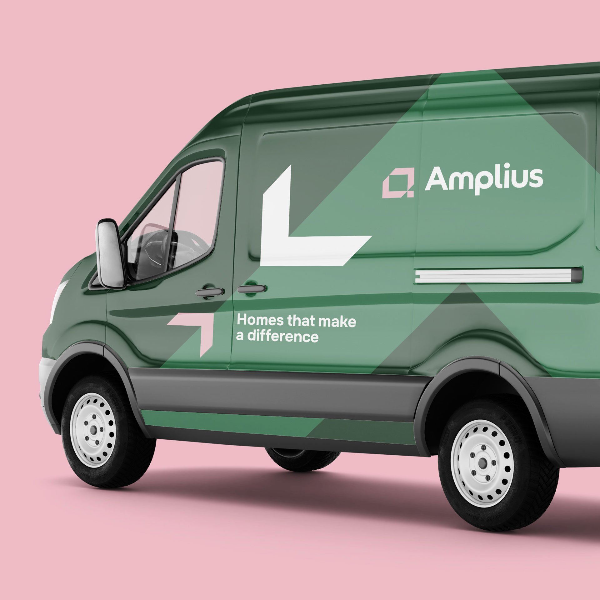
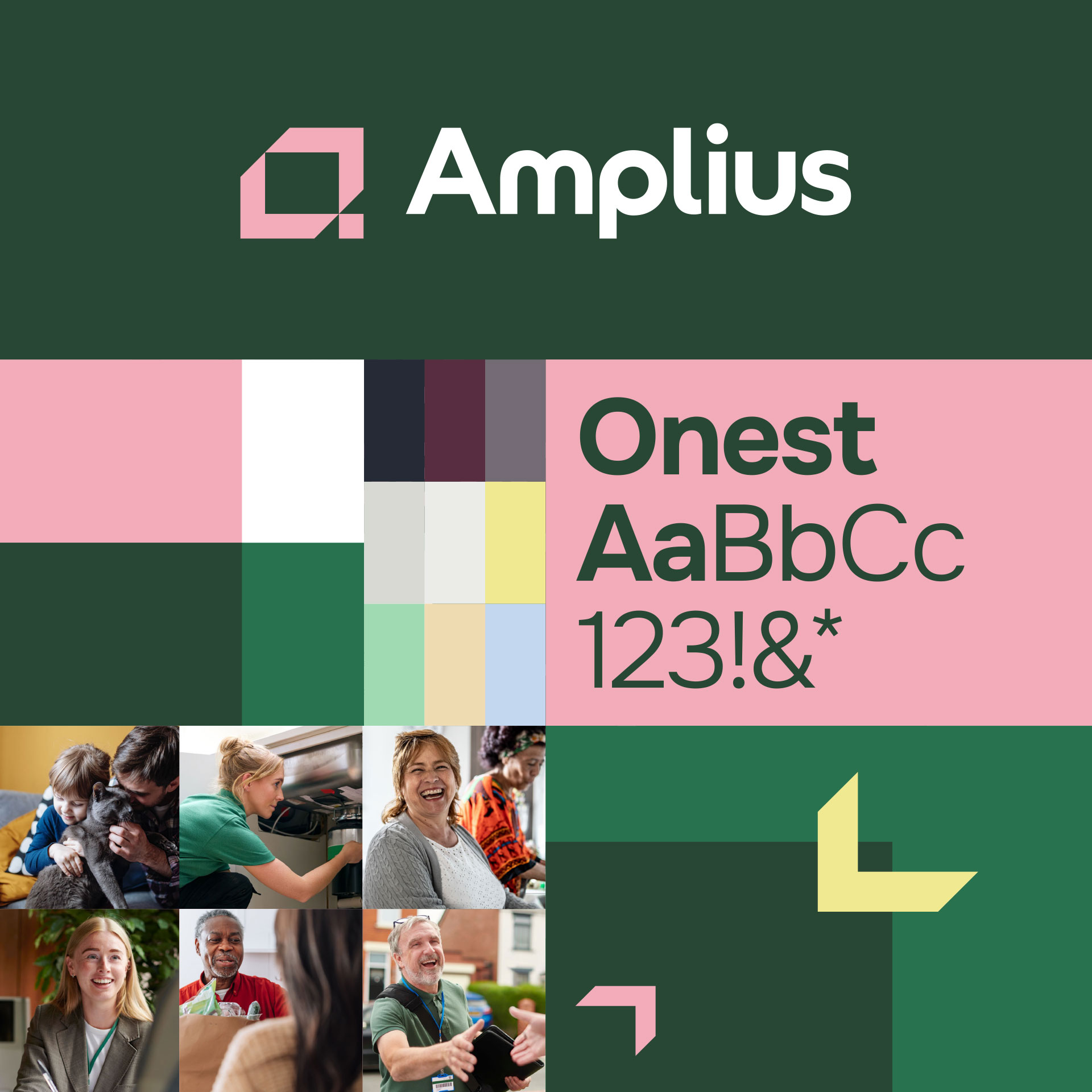
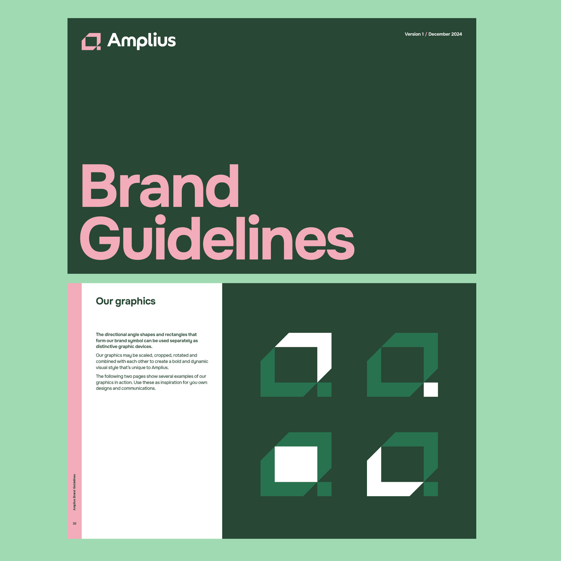
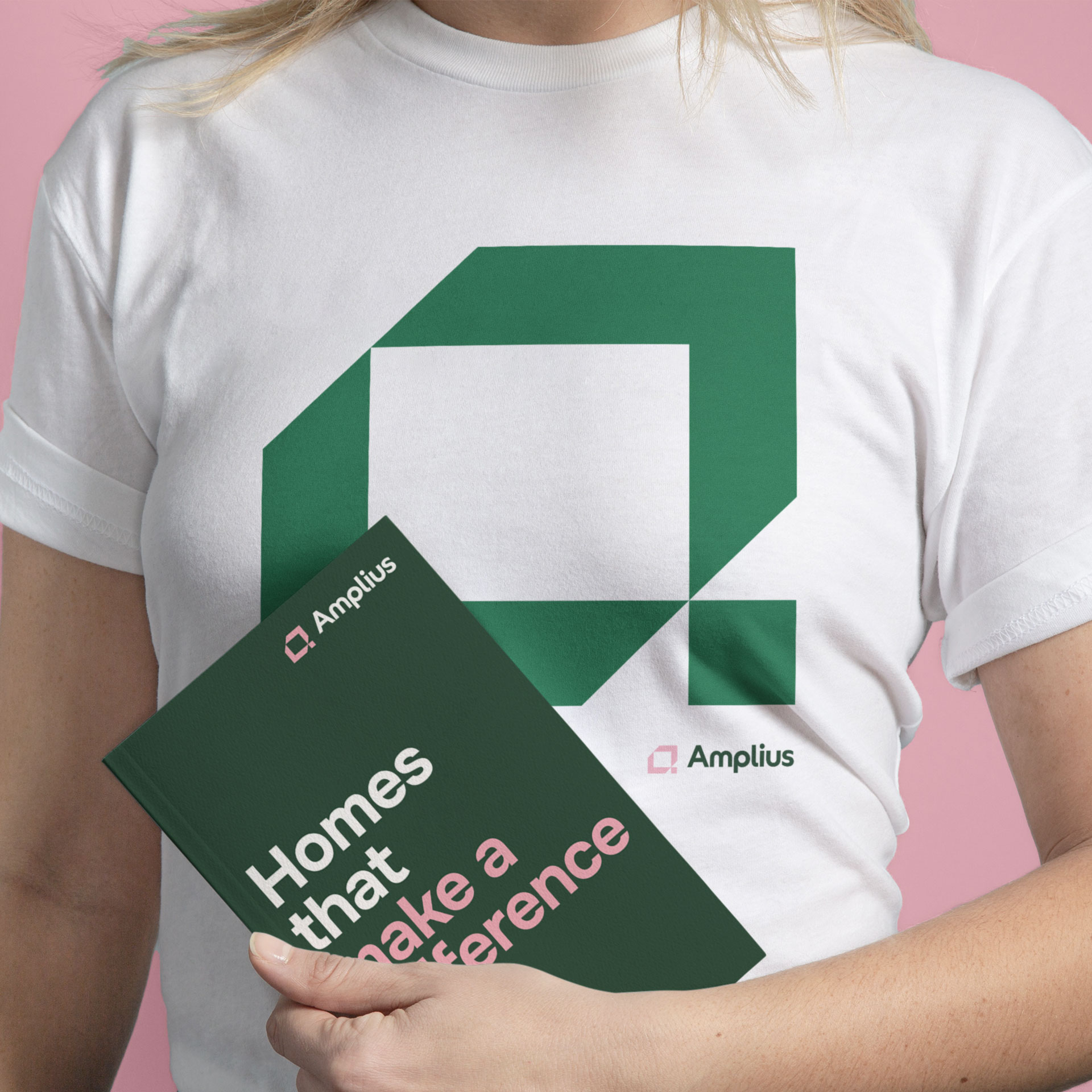
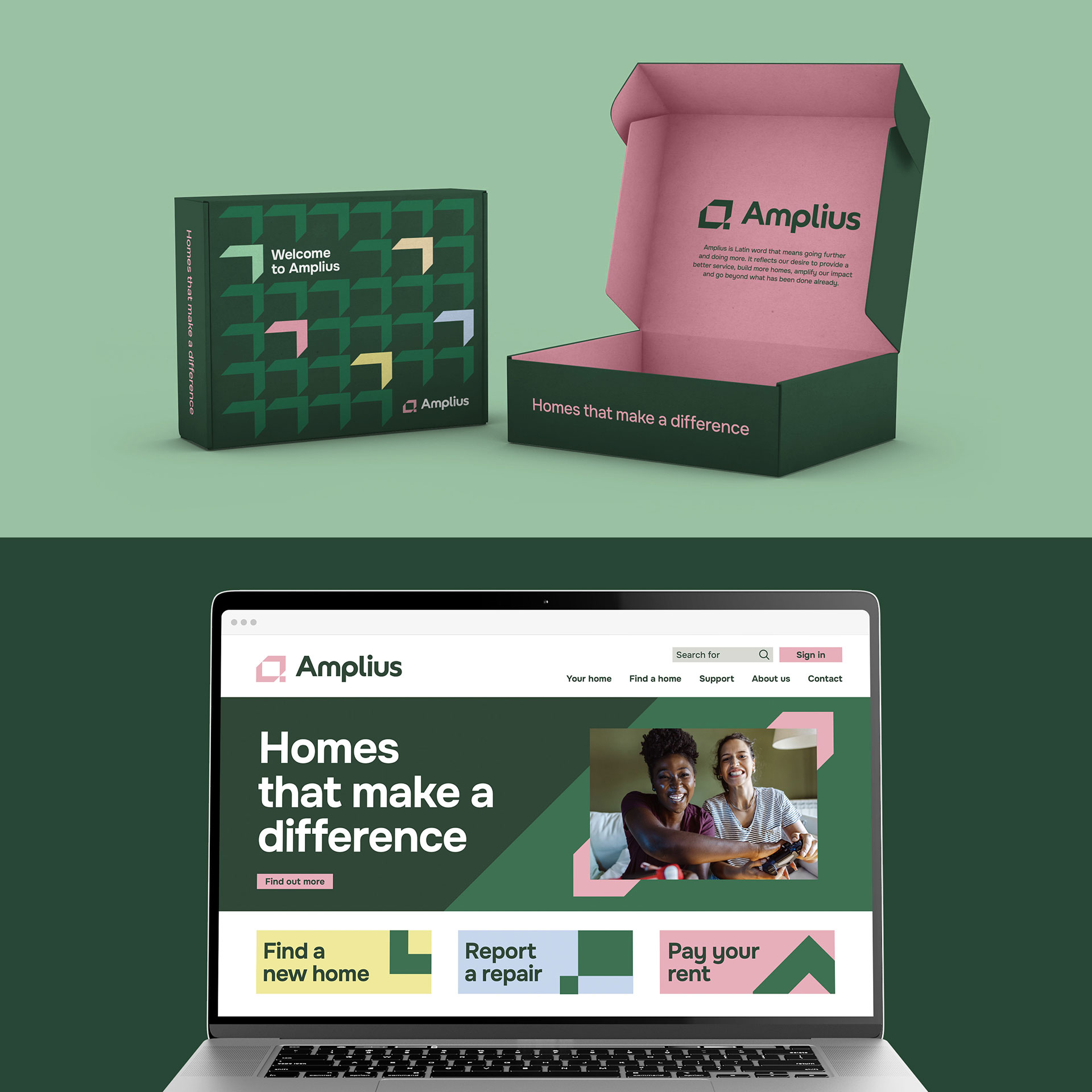
We built a bold visual identity around this ambition: confident colours, modern typography, and authentic imagery that speaks to diverse communities.
impact
A stronger business.
Realised and measured.
One operating model aligning services, systems and teams. One unified brand supporting local authorities, developers, suppliers and funders.
£26m
Net surplus
Strong first-year performance in H1 to September 2025, up from £24m prior year.
31%
Operating margin
Profitability strengthened across the business, rising to 33% on social housing lettings.
£256m
Liquidity
Financial resilience secured, providing headroom for future development activity.
What we did
Strategy & naming
- Stakeholder interviews
- Focus groups & surveys
- Brand positioning
- Strategic framework
- Name development
- Trademark searches
- Registration support
Visual identity
- Logo design
- Colour palette
- Typography system
- Photography guidelines
- Brand guidelines
- Brand assets & templates
- Launch materials
Fabrik guided us through a complex merger branding process with strategic expertise and creativity. They took the time to listen, consulting with stakeholders and engaging our team throughout, ensuring every detail reflected our shared vision. From crafting the new name, Amplius, to delivering a cohesive visual and verbal identity, Fabrik provided the tools we need to strengthen our position in the housing sector.
Julie Doyle, Chief Executive, Amplius
Our Work