
Hero Image Block
Hero Image Block
Hero Image Block
Hero Image Block

LIFE SCIENCES BRANDING SERVICES

THE SCIENCE IS
SETTLED. THE
STORY ISN’T.

Clear in the lab.
Unreadable in
the market.

The research holds up. The data is sound. The science, by any measure that counts inside the building, works. Then it meets an investor, a partner, a regulator, a patient, and something is lost. The organisations that struggle rarely have a weak science problem. They have a translation one.

Our life sciences branding services start in that gap. Not with a logo, and not with more explanation. With the harder question of what the science means to the people who decide its future. What does this organisation stand for once you strip away the mechanism of action? Which audience needs to understand what, and in what order? Where is the brand doing the work of translation, and where is it just adding another layer of jargon on top of the last one?

Clarity isn’t
adding. It’s
taking away.

Add another paragraph of evidence. Commission a denser website. Lengthen the deck. Walk them through the pathway one more time. The instinct in science-led organisations is that comprehension is a volume problem. If they do not understand, they have not been told enough. So you tell them more.

It rarely works, because clarity is not more information. It is the discipline of leaving things out. Work with enough research-led companies and the pattern repeats. The audience was never confused by too little detail. They were lost in too much of it. The brands that land make a decision the science alone will not make for you. What matters most, said first, in language the room already speaks. That decision is uncomfortable. It is also the entire job.

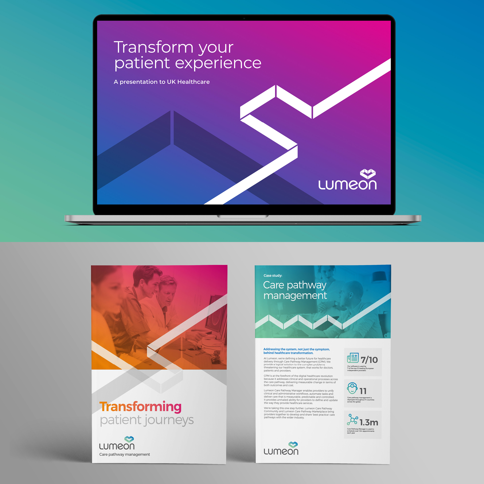
Lumeon
A new name and visual identity
illuminate patient care.

Life sciences branding services. Seven disciplines. One system.

Seven disciplines, delivered as one integrated system. Applied to research-led, science-led and innovation-led organisations, where technical complexity, demanding audiences and high stakes all pull against clarity.
Life sciences brand strategy

The strategy is everything the science can’t say for itself.

Research-led organisations tend to treat the science as the strategy. It is not. Strategy is the decision about what the work means, to whom, and why it should matter now. We build life sciences brand strategy that starts from what the organisation is for, not only what it does at the bench.

Brand positioning for life sciences

First in the science. Invisible in the market.

Technical superiority is not a position. Being ahead in the lab means little if a non-specialist cannot hold what you do in one sentence. We develop positioning for life sciences companies that a partner, an investor or a board member can repeat accurately, without the deck in front of them.

Life sciences brand architecture

The parts make sense. The whole does not.

The science, the products, the corporate parent, the ventures grown alongside them. Each was named and framed in isolation, and the relationships are legible only to the people who built them. We build brand architecture for science-led organisations that makes the connections obvious to everyone else, so the whole reads as one enterprise, not a collection of programmes.

Naming for life sciences

A name only a specialist can love is a name that limits you.

Compound codes. Internal shorthand. Names that signal precision to a scientist and nothing to anyone else. As an organisation moves from research towards a market, its names have to carry further. We create names and naming systems for life sciences organisations that hold their meaning outside the lab, without losing credibility inside it.

Visual identity for life sciences

Looking scientific is not the same as being understood.

The blue palette. The helix. The abstract molecule. The visual shorthand of the sector signals the category and distinguishes no one inside it. We design life sciences brand identity that carries credibility across every context, from a data-heavy investor deck to a regulatory submission to a patient-facing site, without dissolving into the same sea of blue as everyone else.

Verbal identity for life sciences

Precision for the specialist. Clarity for everyone else. One voice.

The scientist needs rigour. The investor needs the thesis. The regulator needs compliance. The patient needs plain language. One organisation has to reach all of them, without four disconnected voices or one flattened to the lowest common denominator. We build verbal identity systems for life sciences organisations that flex across audiences without fracturing.

Brand guidelines for life sciences

Built to be used. Not admired and ignored.

The guidelines exist. They are thorough. They are also unread, because the people who make the work, agencies, regional teams, the scientist assembling a conference poster at short notice, need an answer faster than a 200-page PDF allows. We build guidelines for life sciences organisations designed for adoption, structured for the people implementing the brand, not the people who designed it.

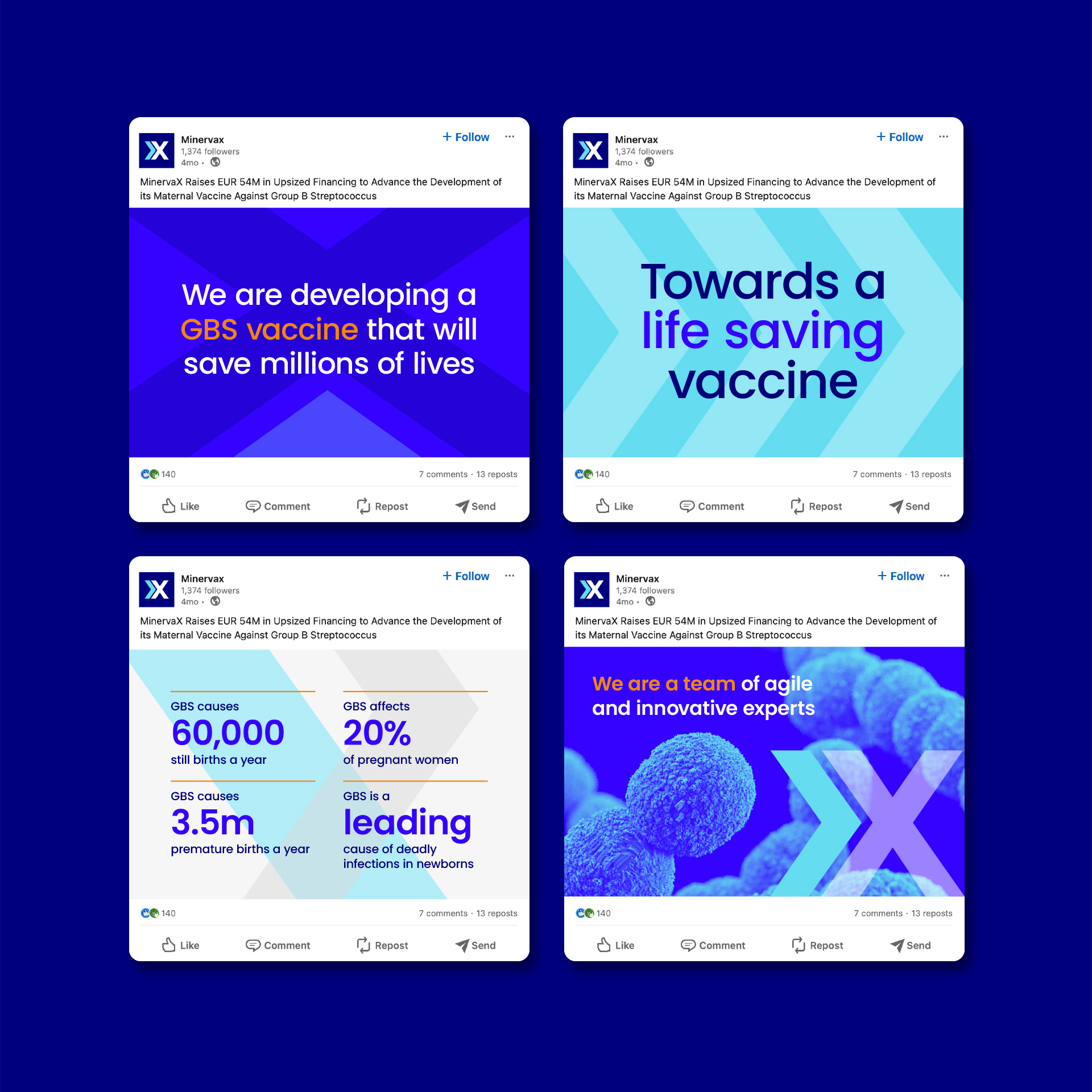
minervax
Visual identity brings clarity
to a biotech breakthrough.

The science is
real. That is
not enough.

A therapy that works, described in a way no investor quite grasps, so the round takes twice as long. A capability ahead of its field that partners misread and undervalue. A discovery that genuinely matters, competing for attention against rivals who are simply easier to understand.

None of this is a science problem. It is the cost of leaving translation to chance. The market does not reward the best research. It rewards the research it can understand, trust and act on, which is not always the same thing. Great science that cannot be read gets funded later, partnered on worse terms, and remembered less. The work of a brand here is not decoration. It is making sure the value that is already there is the value people see.

Life sciences
branding experts.
Still asking why.

Fabrik is a London-based branding consultancy (/branding-agency-london/) that delivers strategy, positioning, architecture, naming, visual identity, verbal identity and guidelines as one system, not a menu. Decades around science-led organisations. Biotech, pharmaceutical companies, diagnostics and medical technology. Long enough to know the science is rarely the hard part.

The brief usually arrives as a design problem. A tired website. A logo that no longer fits. A deck that needs polish. It almost never is. Underneath, it is usually a translation problem. Strong science the market cannot read. Three decades has not made us quicker to agree with the brief. It has made us slower to take it at face value. The obvious fix is often the one that failed last time.

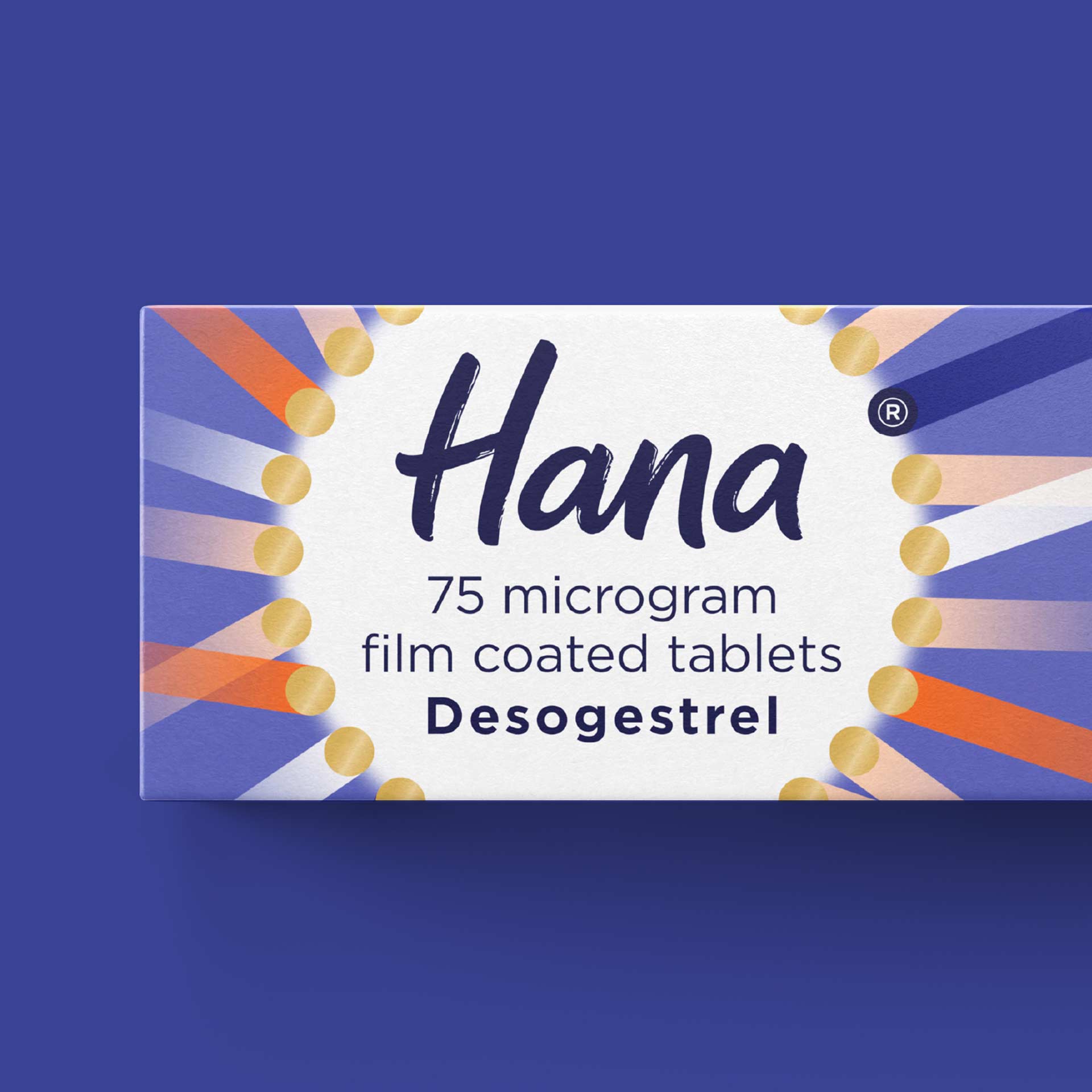
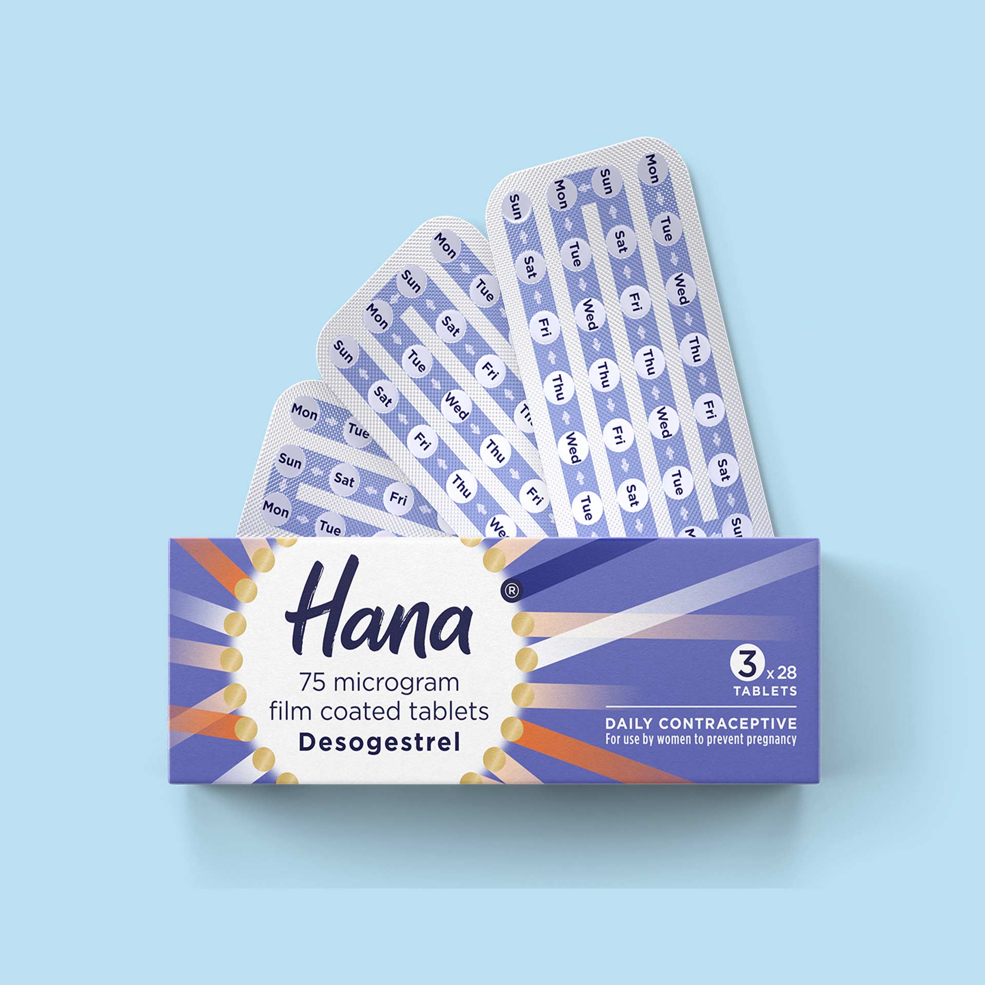
Hana
Product naming for a global
self-care healthcare leader.
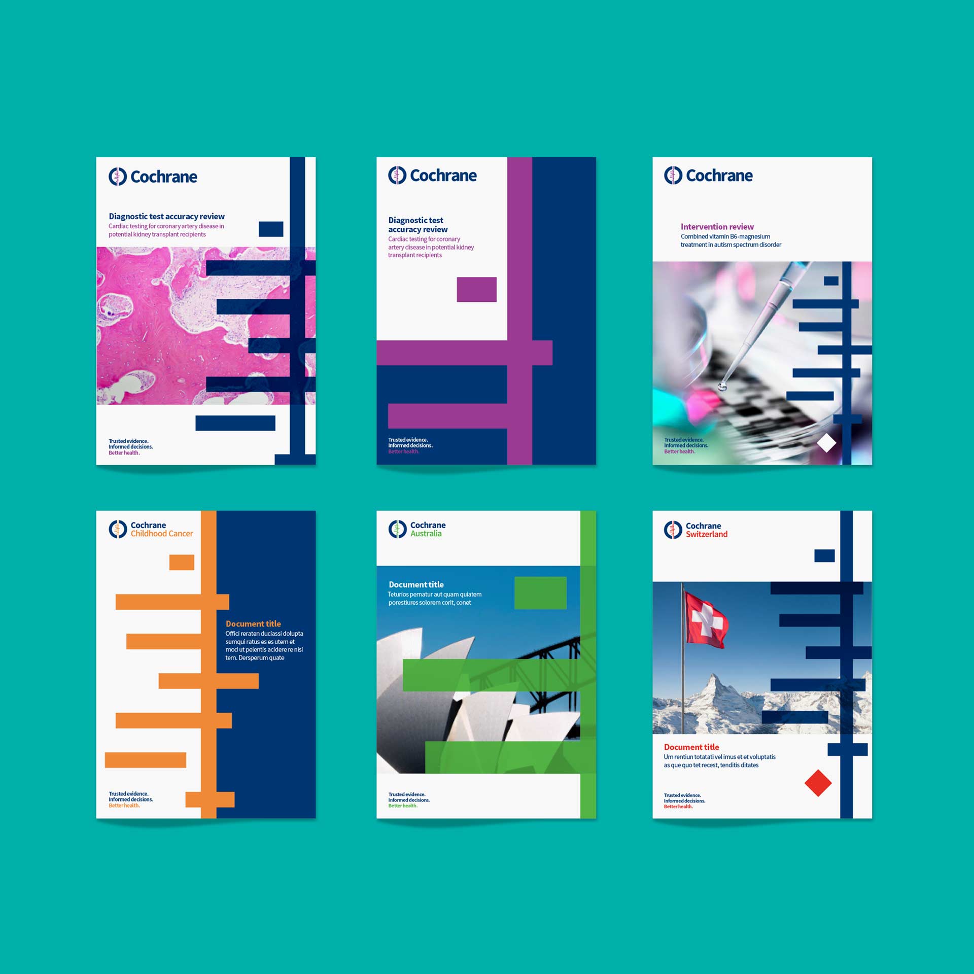
We worked intensively with Fabrik for the best part of a year on our global rebrand. We loved the clear strategic thinking, the passion for design, and the professionalism that fed into our new visual identity.
Jo Anthony, Senior Media and Communications Officer, Cochrane
View