
Lumeon
A HEALTHCARE TECH PIONEER GETS THE BRAND TO MATCH ITS AMBITION.

APPROACH
STRATEGY, NAMING, AND IDENTITY BUILT FROM A SINGLE IDEA. We started by understanding what made Lumeon different. Technology that illuminates the entire patient pathway.
The name Lumeon emerged from this – evoking illumination, discovery, and clarity in complex healthcare systems.
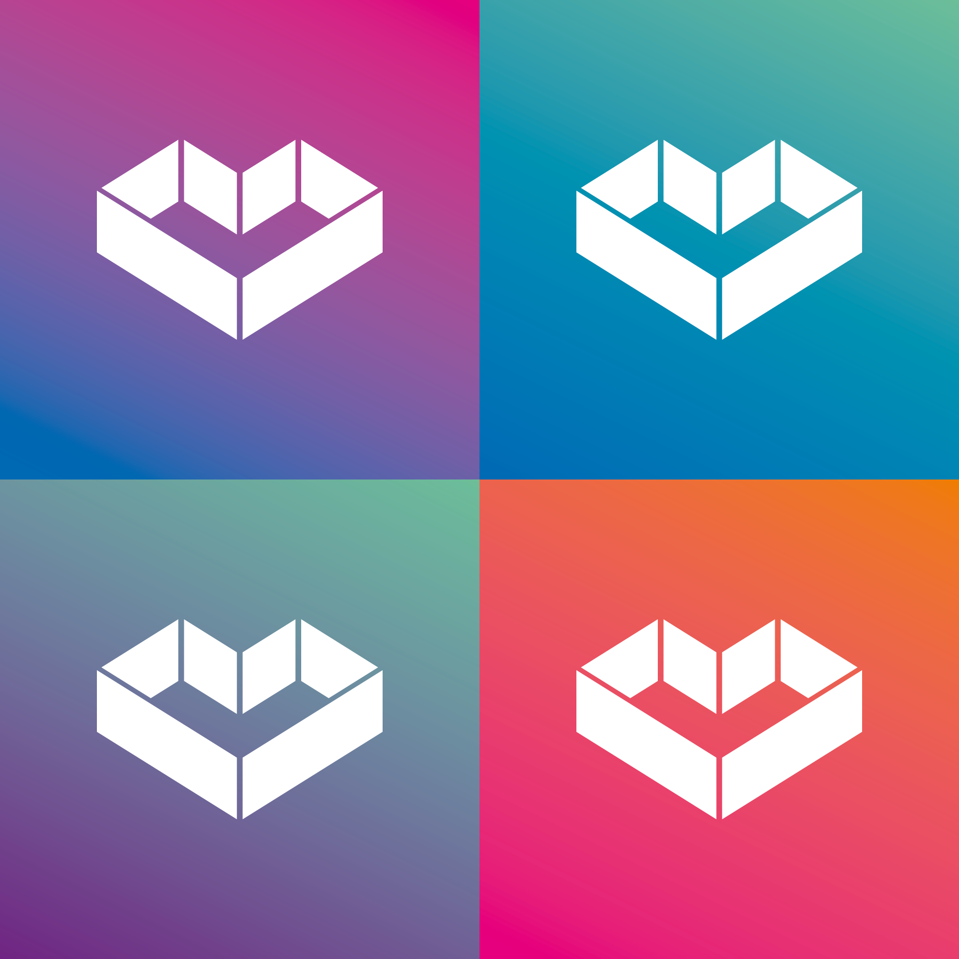
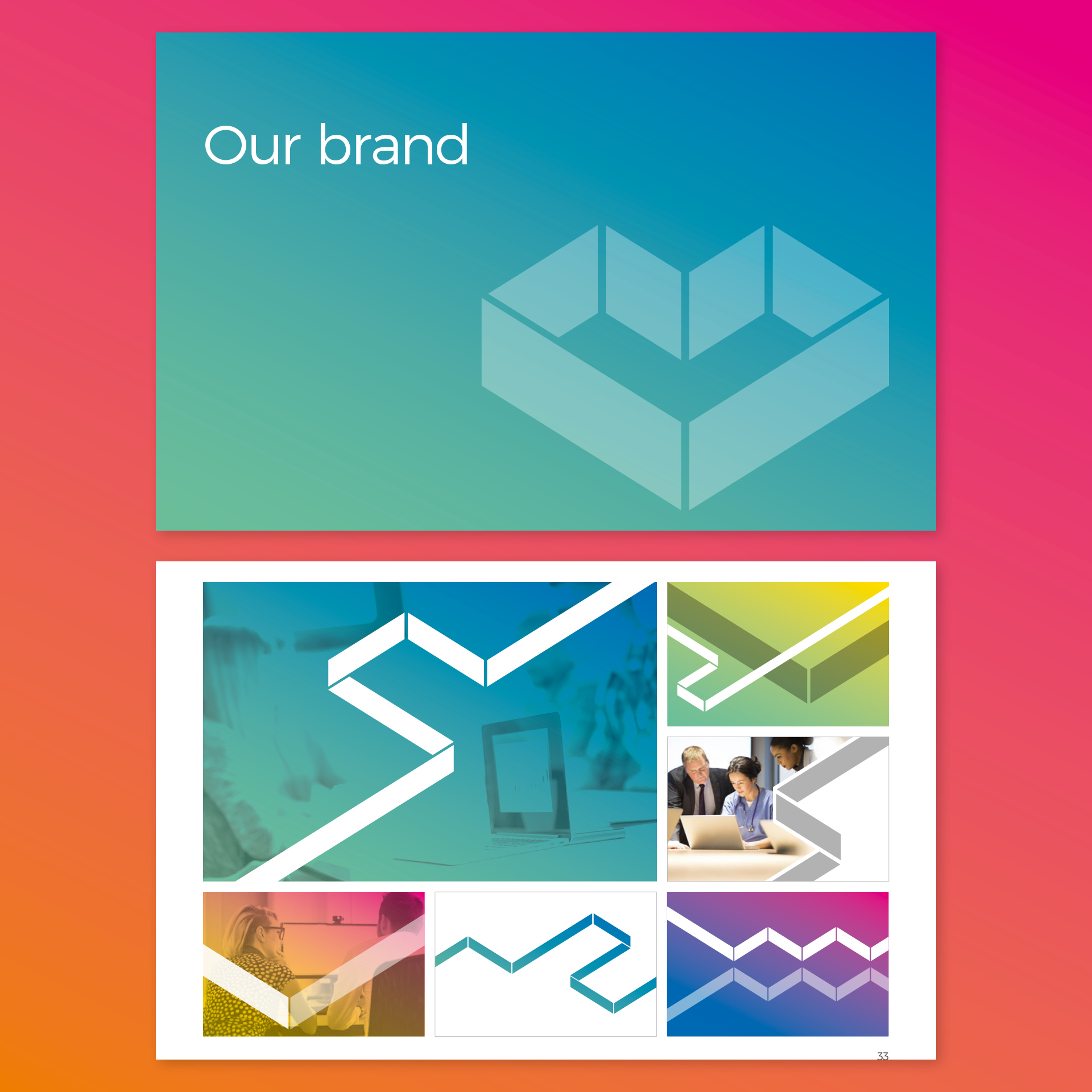
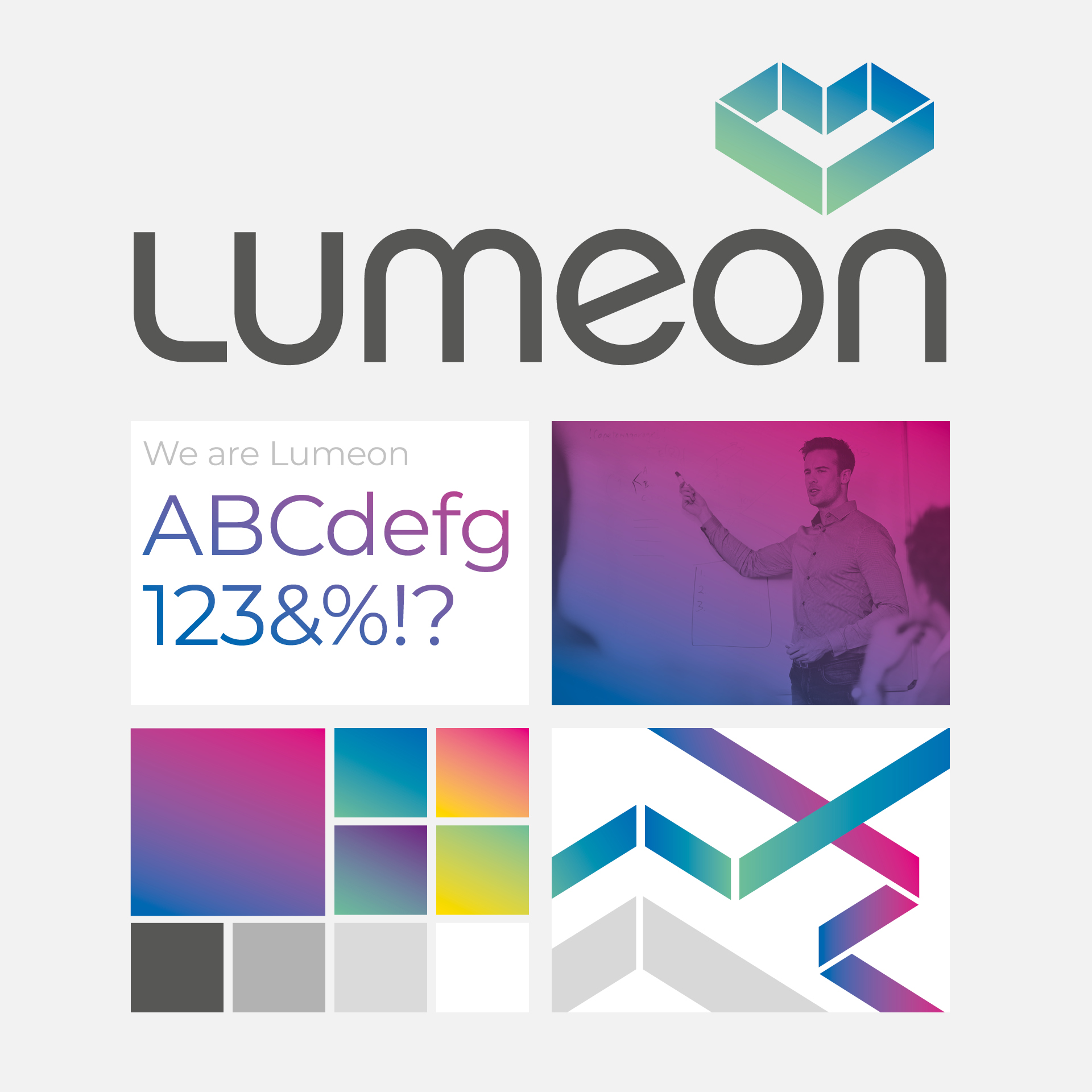
For the visual identity, we created a symbol from rotated ‘L’ characters forming a heart, pairing it with a gradient palette that bridges human compassion and technological precision.

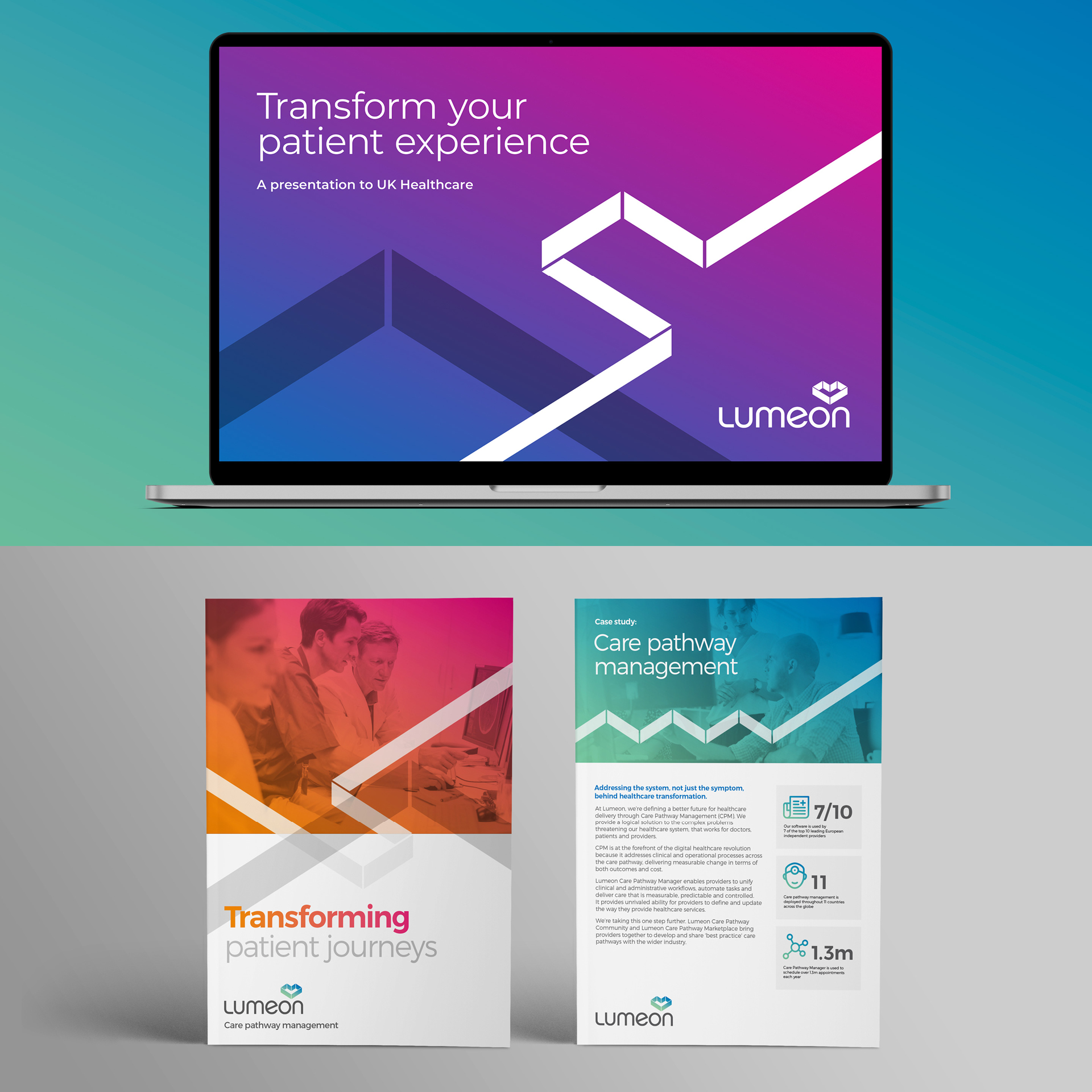
impact
FROM REBRAND TO ACQUISITION. BRAND VALUE DEMONSTRATED
A new brand identity supporting international expansion and positioning Lumeon as a market-leading care orchestration platform.
$30m
Series D funding
Led by Optum Ventures and Endeavour Vision, supporting U.S. market expansion.
2024
Acquisition by Health Catalyst
Successful exit confirming the platform’s strategic value in care orchestration.
UK + U.S.
Cross-market presence
Geographic reach and platform capability explicitly cited as key value drivers in the acquisition rationale.
What we did
Strategy & positioning
- Competitor research
- Market positioning
- Brand strategy
- Company naming
- Logo development
Visual & verbal identity
- Tone of voice
- Top-level messaging
- Application guidelines
- Digital design templates
- Website development
We approached Fabrik to help us navigate an extensive repositioning and rebranding programme. Our original name, Qinec, was failing to gain traction, and our new name, Lumeon, is now better aligned with our values and market.
The exercise culminated in the creation of a new visual and verbal identity, distilled into a comprehensive set of brand guidelines. Throughout the process, Fabrik became an integral part of our team, providing fresh insights and practical solutions.
The result has been a great success—revitalising a tired brand and positioning it to resonate more strongly with our target audiences while achieving broader appeal.
The exercise culminated in the creation of a new visual and verbal identity, distilled into a comprehensive set of brand guidelines. Throughout the process, Fabrik became an integral part of our team, providing fresh insights and practical solutions.
The result has been a great success—revitalising a tired brand and positioning it to resonate more strongly with our target audiences while achieving broader appeal.
Aldous Lippard, Head of Marketing, Lumeon
Our Work