

Close-up of pharmaceutical bottles moving along a production line.
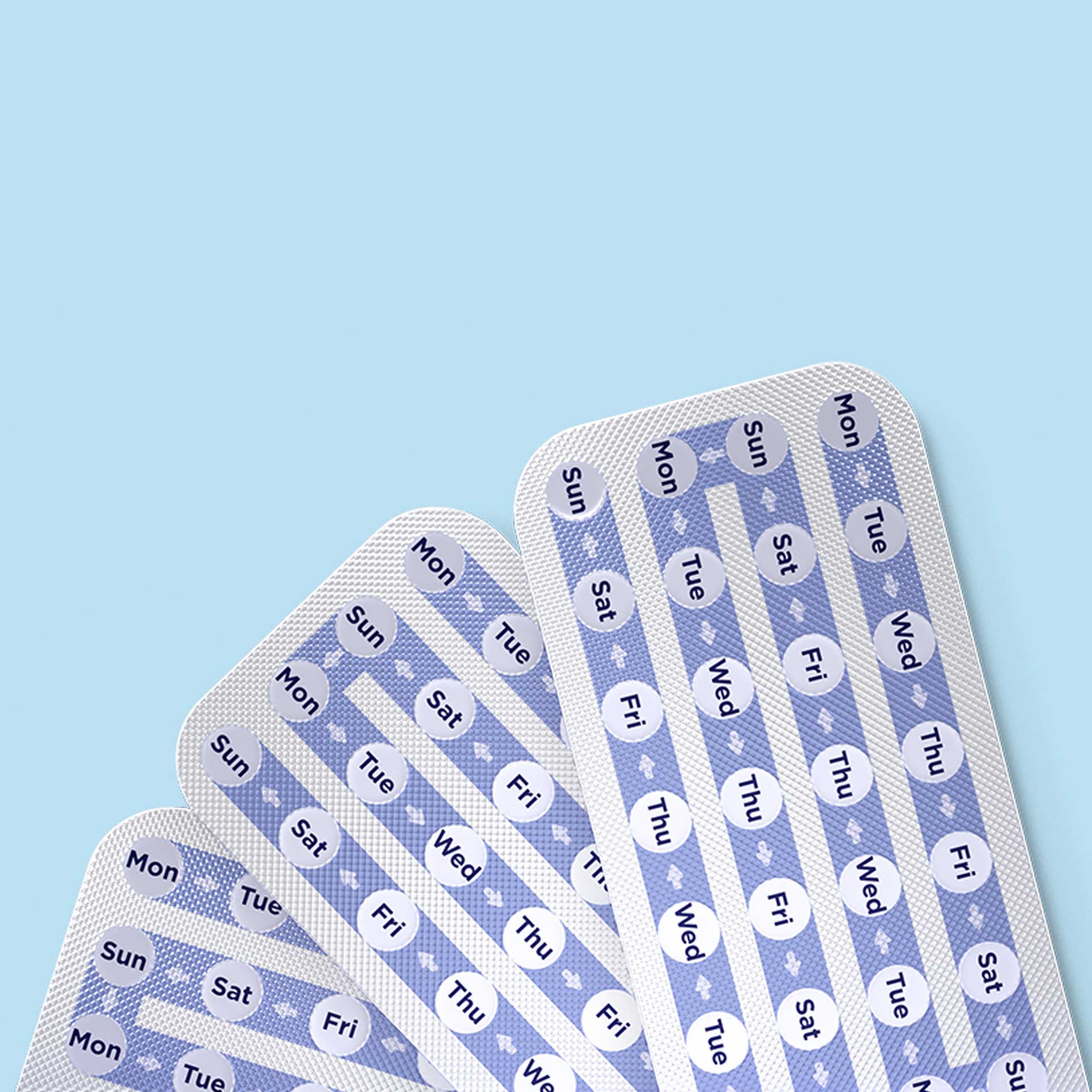
Hana — fan of blue and white product blister packs arranged on a light blue background.
MinervaX — close-up of clustered blue and white cells on a vibrant blue background.
MinervaX — “We are developing a GBS vaccine that will save millions of lives” message on a blue geometric background.

PHARMACEUTICAL BRANDING SERVICES

SCALE CREATED THE
BRAND. SCALE IS NOW
THE PROBLEM.

scientist in a laboratory examining a sample using a microscope.

The portfolio
grew. But the
story didn’t.

The acquisitions made strategic sense. The therapeutic areas expanded as planned. The sub-brands launched on schedule. But ask anyone inside the business to describe the company in one sentence, and no two answers match. Let alone anyone outside it. That is where established pharma brands start to fracture. Not in the portfolio.

close-up of pharmaceutical bottles moving along a production line beneath filling equipment.
MinervaX — close-up of white spherical cells clustered together on a light grey background.
MinervaX — “Towards a life-saving vaccine” message over an abstract blue and purple graphic background.

It fractures in the gap between how the business was assembled and how a market needs to read it. Between an org chart and a story people can follow. Our pharmaceutical branding services don’t start with the logo. They start where the fracture shows. How many naming conventions run in parallel. Whether your architecture clarifies the portfolio or reflects how it was built. Whether the brand system absorbs the next acquisition, or buckles. Structural questions. The kind that surface only when the damage does.

gloved hands handling small pharmaceutical bottles in a laboratory setting.

The rebrand
reflex. It’s
rarely the fix.

Commission a refresh. Modernise the palette. Tighten the logo. Update the guidelines document nobody reads. Announce the new brand internally. Watch the regions ignore it within six months. It looks like progress. It is usually expensive repetition. The refresh is the safe move. That is the problem.

MinervaX — four-panel collage featuring close-up images of cells, tissue and biological research imagery in blue tones.
Slamcore brand background texture
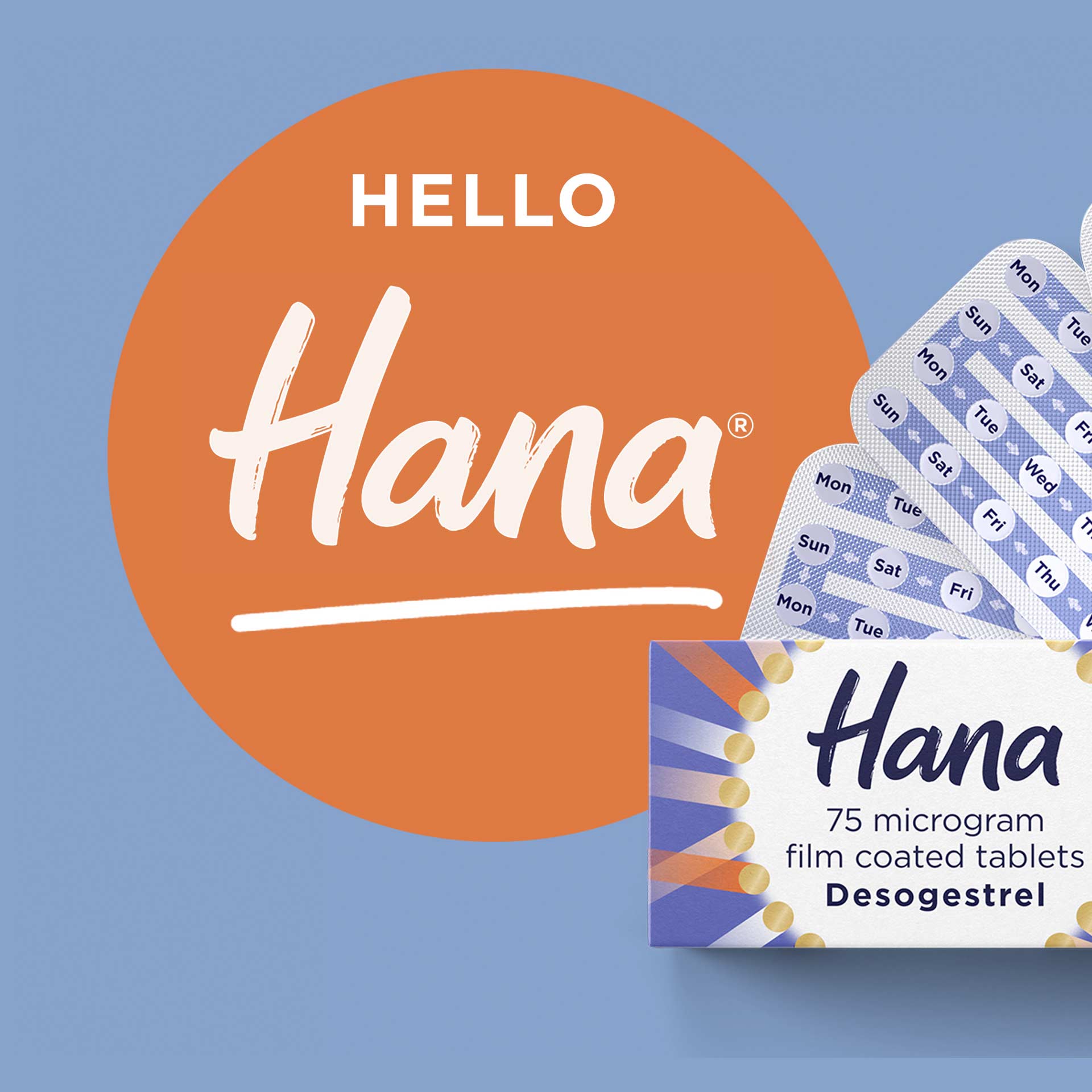
Hana — “Hello Hana” graphic featuring a product package on a light blue background.

Work with enough established pharmaceutical companies and the pattern stops looking like coincidence. The same governance gaps papered over with a new visual system. The same architecture problems hidden behind a cleaner corporate identity. The same tension between global consistency and regional autonomy resolved by pretending it isn’t there. The work that holds starts somewhere less comfortable. Questioning whether the portfolio structure still reflects the strategy. Watching the architecture collapse under scrutiny. Then rebuilding around something the business can implement, not just admire.

HANA
Product naming for a global
self-care healthcare leader.

Pharmaceutical branding services. Seven disciplines. One system.

Seven disciplines. One integrated system. Applied to established pharmaceutical organisations where portfolio complexity, multi-market operations, and stakeholder governance all demand coherence.
Pharma brand strategy

Growth isn’t a strategy. It’s what broke yours.

Therapeutic areas acquired on different rationales. Sub-brands created to solve internal politics. A corporate narrative written before half the portfolio existed. We develop pharmaceutical brand strategy by confronting what the current structure communicates. Not what the leadership deck claims. A strategy that accounts for the portfolio you have, not the one the board approved five years ago.

Pharma brand architecture

Your portfolio has a structure. Just not yours.

Branded house. House of brands. Endorsed. Hybrid. The framework matters less than whether anyone outside the brand team can explain how the pieces connect. We build pharmaceutical brand architecture that clarifies the relationship between corporate, therapeutic, and product brands. Naming architecture that scales with the next acquisition instead of collapsing under it.

Pharma brand positioning

Scale doesn’t equal clarity.

Therapeutic areas with different market positions. Acquired brands with competing narratives. A corporate story that predates half the portfolio. We build pharmaceutical brand positioning by identifying what holds true across the complexity. A position sharp enough for investor communications, credible enough for HCPs, and clear enough that regional teams can articulate it without a brief.

Pharmaceutical naming architecture

Twelve brands. Four conventions. No logic.

Legacy names from acquisitions. Product names that contradict the corporate positioning. Therapeutic area brands that overlap. The naming made sense at the time. It doesn’t now. We develop naming architecture for pharmaceutical portfolios. A system that governs how brands relate, how new names are created, and how the whole thing holds together when the portfolio changes again.

Visual identity for pharmaceutical companies

Consistency isn’t a style guide. It’s a system.

Regulatory submissions. Conference presence. HCP communications. Patient-facing materials. Corporate reporting. Five contexts with different requirements and different compliance expectations. We design pharmaceutical visual identity systems that maintain brand equity across all of them. Without requiring a brand team review on every piece of collateral that leaves the building.

Verbal identity for pharmaceutical companies

Five audiences. One voice. No contradictions.

HCPs need precision. Patients need clarity. Regulators need compliance. Investors need confidence. Internal teams need something they can use. Pharmaceutical verbal identity has to serve all five without defaulting to the lowest common denominator. We build tone of voice systems for pharmaceutical organisations that flex across audiences and markets without losing coherence. From global brand narratives to regional implementation guides.

Brand guidelines for pharmaceutical organisations

Built to be used. Not filed.

The guidelines exist. The PDF is 200 pages. The brand team can navigate it. Nobody else does. Pharmaceutical brand guidelines need to survive the reality of multi-market teams, third-party agencies, regulatory reviewers, and the colleague in a regional office who needs an answer now. We build governance systems designed for adoption. Structured for the people who implement the brand, not just the people who designed it.

MINERVAX
Visual identity brings clarity
to a biotech breakthrough.
close-up of hands selecting or handling pharmaceutical products in a pharmacy or laboratory setting.

Complexity isn’t
the problem.
Incoherence is.

Pharmaceutical companies integrating acquisitions with no brand architecture to absorb them. Global organisations rolling out identities that fracture the moment they reach regional teams. Portfolio brands competing for the same audience because nobody mapped the overlaps. Therapeutic area brands needing governance without rigidity, and consistency without uniformity.

Hana — white handwritten-style logo on an orange background.
close-up of hands preparing a medical injection using a syringe and vial.
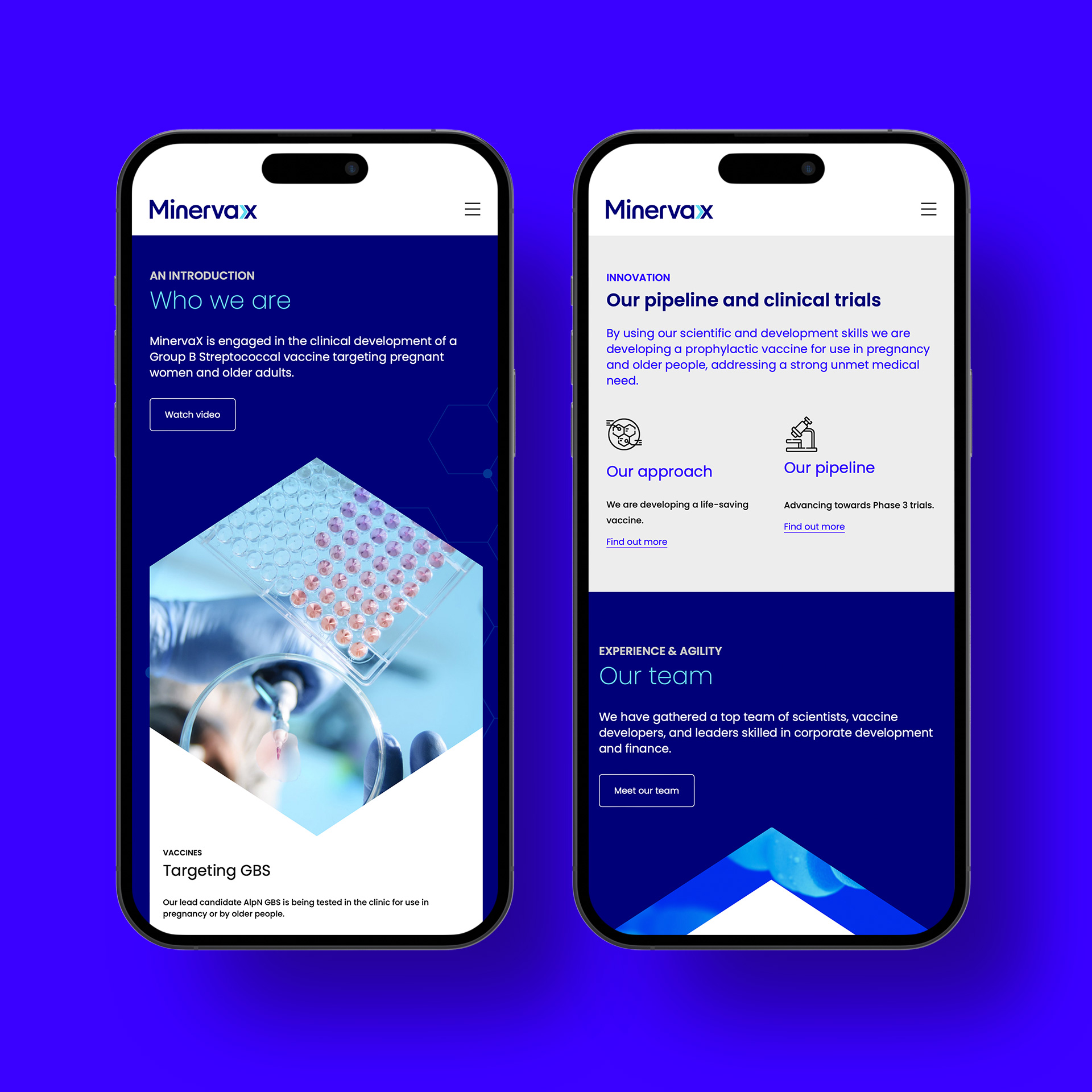
MinervaX — two mobile website screens displayed on smartphones against a blue and purple background.

Mature brands repositioning for a market that has moved on while the internal narrative hasn’t. Regional teams quietly running different versions of the same company. The work varies. The problem holds steady. Make the business read as one company, not the several that growth left behind. What it costs is never just a rebrand. A governance gap that widens every quarter. A portfolio that confuses the people it should serve. The equity you built, diluted by the growth that was supposed to strengthen it.

pharmaceutical worker in protective clothing operating industrial processing equipment in a sterile facility.

Pharma branding
specialists. Still
doubting the brief.

Fabrik is a London-based branding consultancy that has spent decades in and around life sciences. Established pharmaceutical companies. Multi-market portfolios. Strategy, architecture, naming, visual identity, verbal identity, positioning, and guidelines, delivered as one system rather than a menu of parts. What we know, we learned in the room. Not from a framework.

scientist in a laboratory examining a sample using a microscope.
ZurichOne — abstract blue graphic featuring overlapping circular shapes in dark blue, light blue and cream.
Hana — fan of blue and white product blister packs arranged on a light blue background.

The brief usually arrives as a visual problem. A refresh. A portfolio that needs tidying. Guidelines that need updating. It almost never is. The problem is usually architectural. Too many brands without a governing logic. Too many naming conventions without a system. Three decades hasn’t made us more efficient. It’s made us less willing to take the brief at face value. We’ve worked with global healthcare organisations and emerging biotech. The briefs change. The instinct to question them doesn’t.

Not yet established? When the brief is building credibility from scratch, that is a different conversation entirely.

Minervax
Visual identity brings clarity
to a biotech breakthrough.
No marketing jargon – just insightful strategy, fresh creative thinking, and a collaborative approach. Fabrik crafted a distinctive new visual and verbal identity, including a logo design, tone of voice, and brand guidelines. They struck the perfect balance between familiarity and innovation.
Per Fischer, M.Sc. D.Phil, CEO, MinervaX
View