
Causeway
25 YEARS OF GROWTH.
A BRAND THAT HADN’T KEPT PACE.


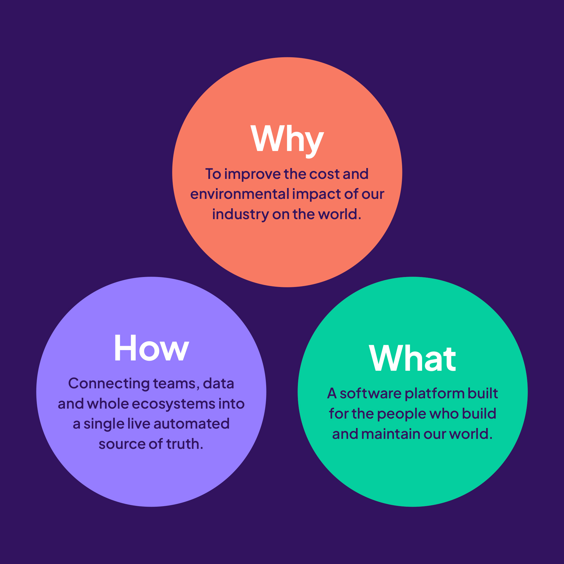
APPROACH
RATIONALISE FIRST. THEN REBUILD WITH CLARITY. We started with a comprehensive audit – visual identity, verbal identity, competitors, and audience – understanding what was working and what was creating friction.
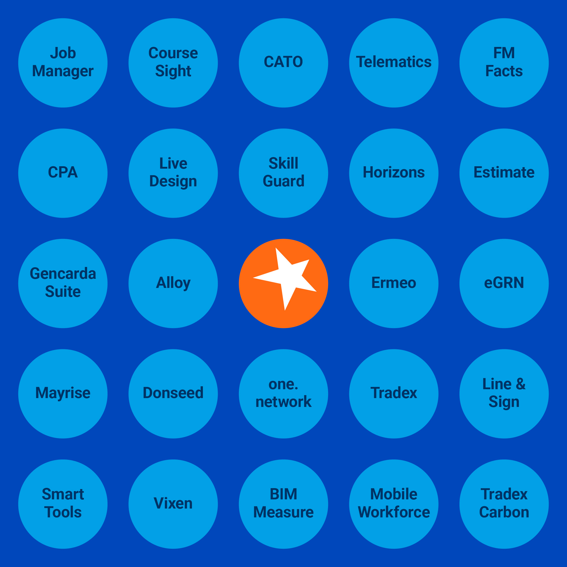
From there, we developed a simplified brand architecture, rationalising product names and creating a coherent system under the CausewayOne platform.
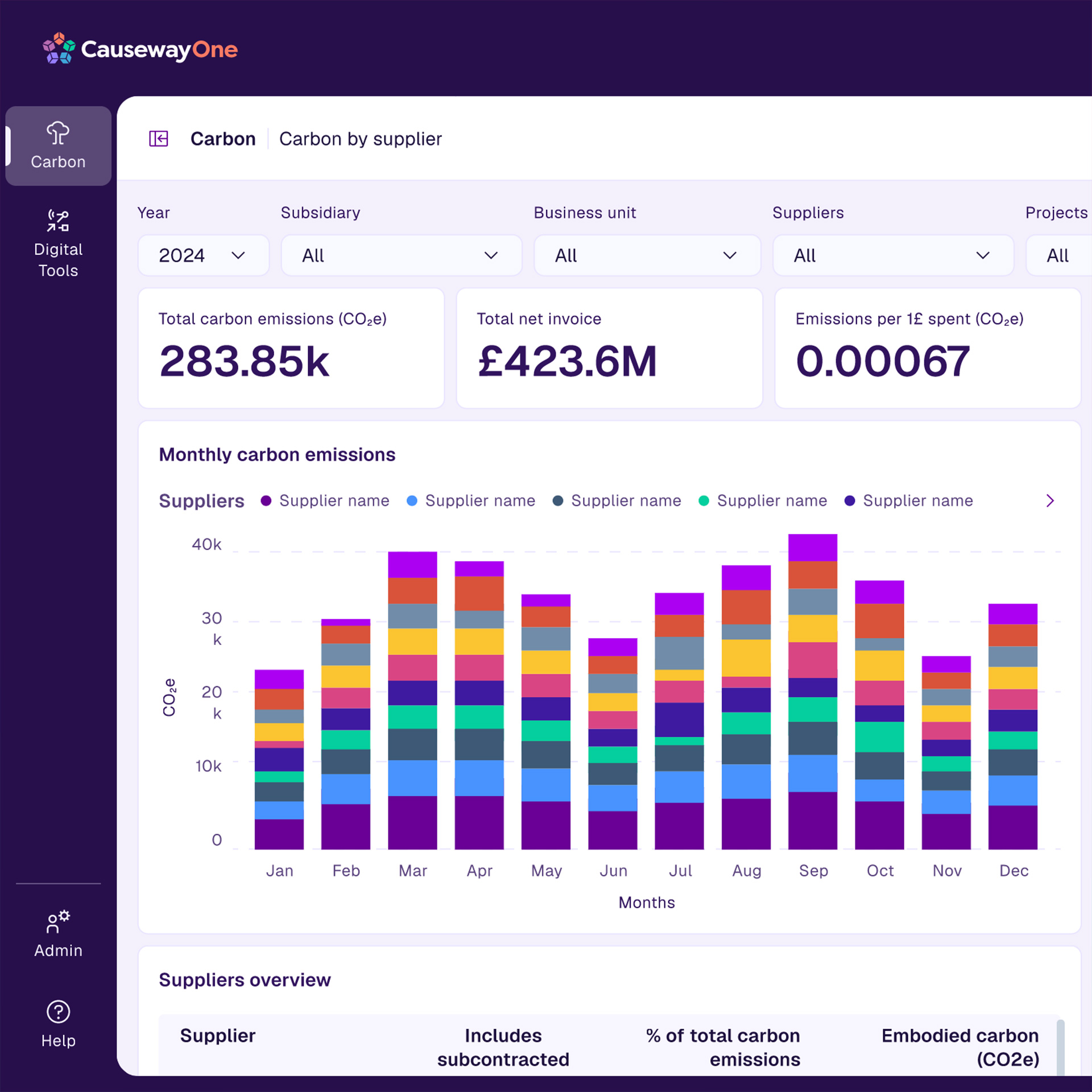
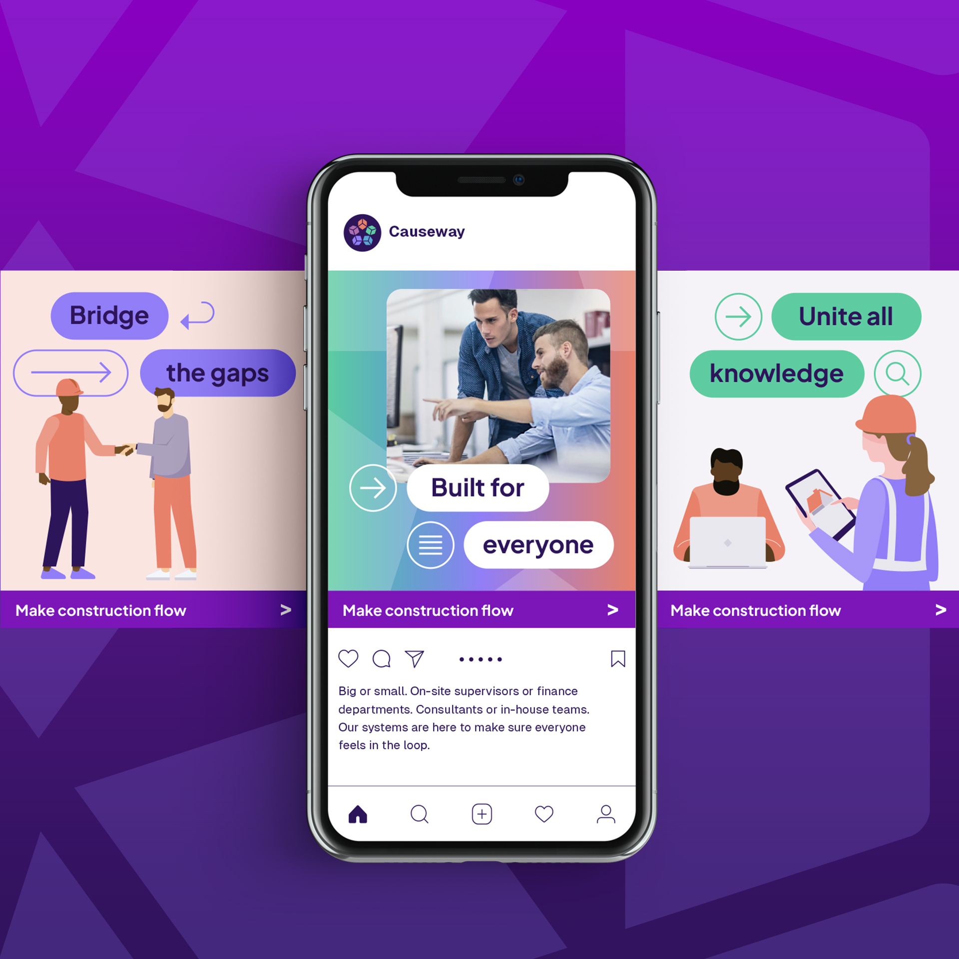
A refreshed visual identity followed. A refined logo, a distinctive purple palette, and a modern design system that positioned Causeway as a technology leader, not just a software provider.

impact
Complexity out. Clarity in.
A simplified brand architecture supporting continued growth, acquisitions, and the launch of a unifying platform.
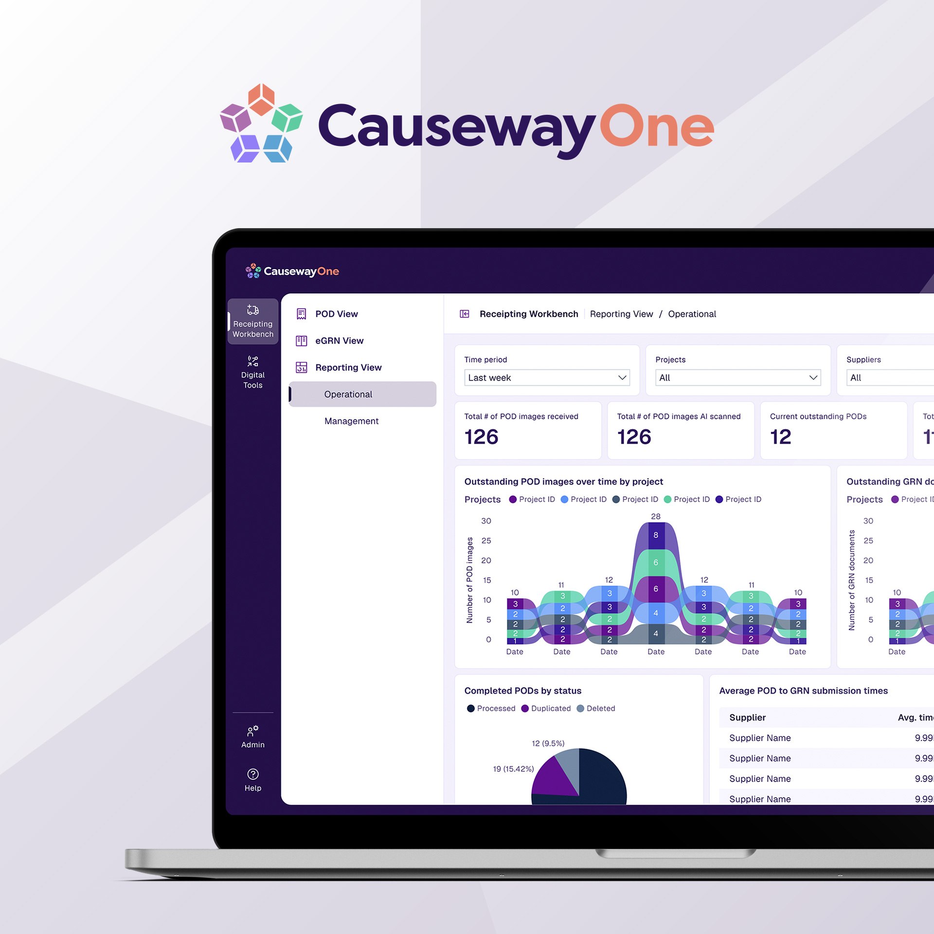
CausewayOne
Platform launched
A connected ecosystem uniting 20+ years of product development under one coherent brand and naming system.
Architecture
Rationalised
Complex product portfolio simplified into clear categories. Design, Workforce, Supply Chain, Commercial, Infrastructure.
Acquisitions
Integrated
Brand framework designed to absorb new acquisitions – including one.network, Yotta, and Buchanan Computing – without adding confusion.
What we did
Strategy & architecture
- Visual & verbal audit
- Research & positioning
- Competitor analysis
- Brand framework
- Product architecture
- Product naming
Identity & implementation
- Visual identity refresh
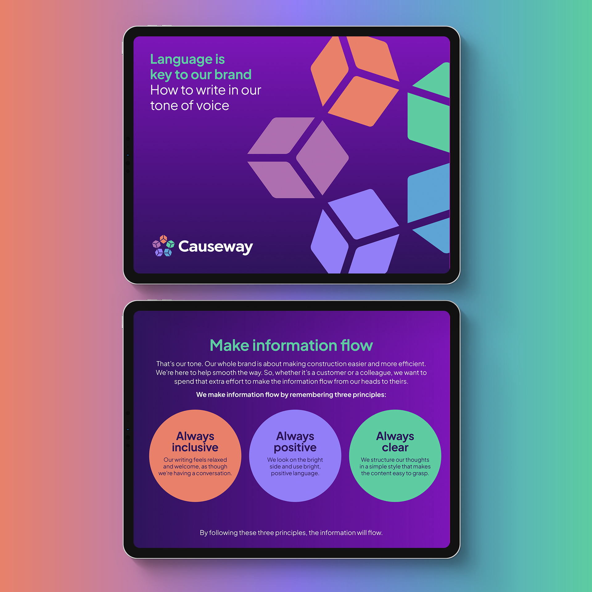
- Tone of voice
- Top-level messaging
- Editorial guidelines
- Training & workshops
- Launch programme
Our Work