Charting RCoA's evolution and impact.
Established in 1992, the Royal College of Anaesthetists (RCoA), epitomises innovation in the UK healthcare landscape. Representing the largest hospitality speciality in the NHS (Anaesthesia), RCoA has emerged as a cornerstone in British medical education. Its members, working at the intersection of medicine and technology, spearhead ongoing advancements in patient care.
As one of the most recent medical royal colleges to emerge in the UK, RCoA is committed to maintaining its modern, cutting-edge image. The group decided to pursue a brand refresh, designed to revitalise its image and value in the eyes of members, fellows, staff, and stakeholders.
Reinventing RCoA's brand and identity.
Positioned as a pioneer in the British medical landscape, the RCoA approached Fabrik to help review its brand strategy, visual identity, and plan for success. The goal was to encapsulate the essence of the college in an updated selection of brand assets, aligning its image with its stature as a leader in anaesthetic practice and education.
The RCoA needed to fortify its reputation as not just an authority, but the fuel behind a thriving community. They wanted a sustainable, future-focused image, and a personality that would inspire, and stimulate both existing and future members.
Crafting a distinctive brand persona.
The beginning of our quest was focused on finding the ethos of RCoA. We conducted extensive research to map the tangible and emotional appeal of the RCoA brand. The Fabrik team analysed existing documents, conducted meetings, workshops and one-to-one interviews, and discovered the spirit, values, and mission that drives the RCoA group.
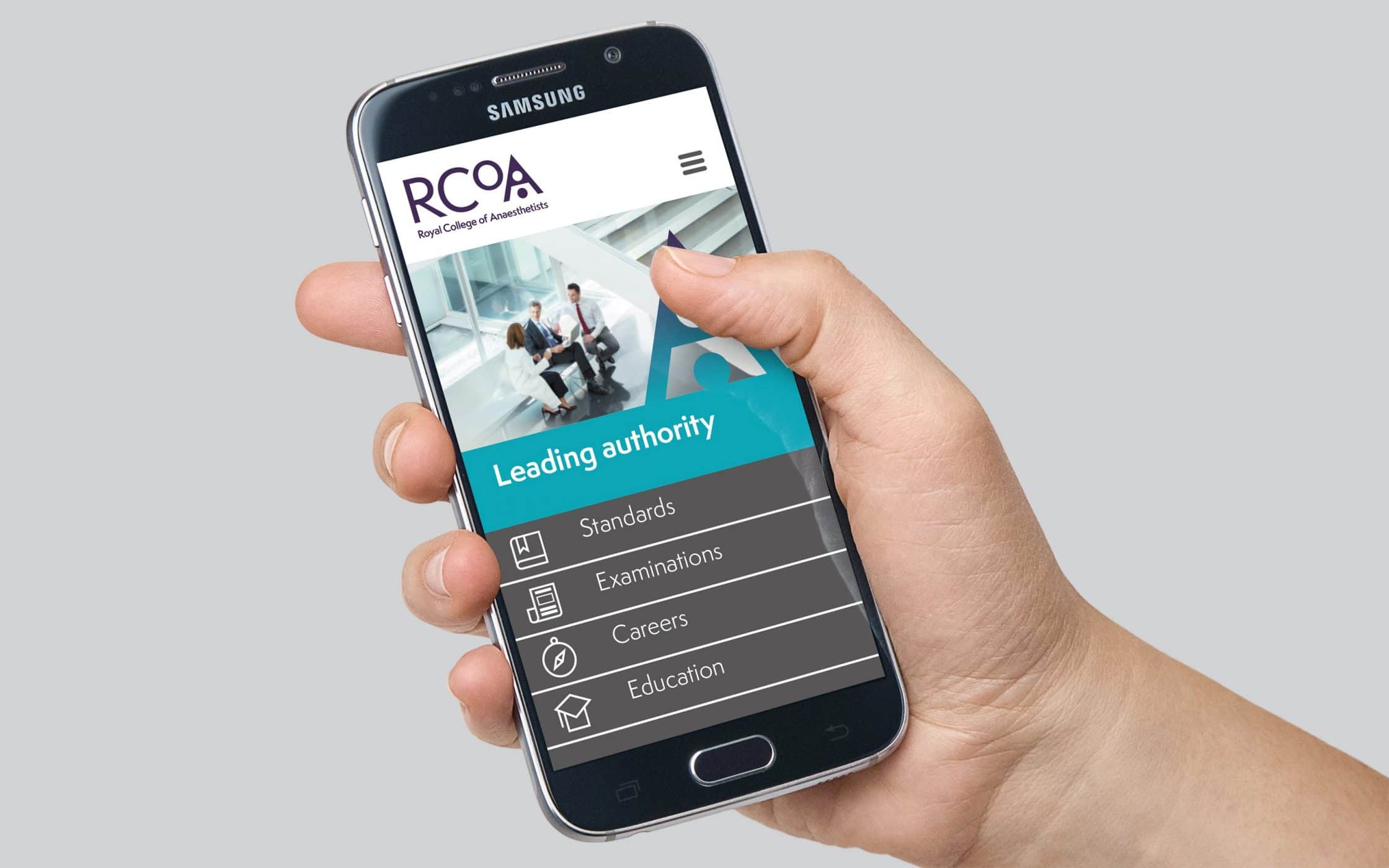
We positioned RCoA as the leading authority on the art and science of anaesthesia – a modern and forward-thinking organisation committed to transforming the future of healthcare. Defining the distinctive personality of the college led to the formulation of a reassuring, inclusive tone of voice, to support the brand’s marketing messages, and the design of a powerful new brand logo.
Delivering a cohesive brand experience.
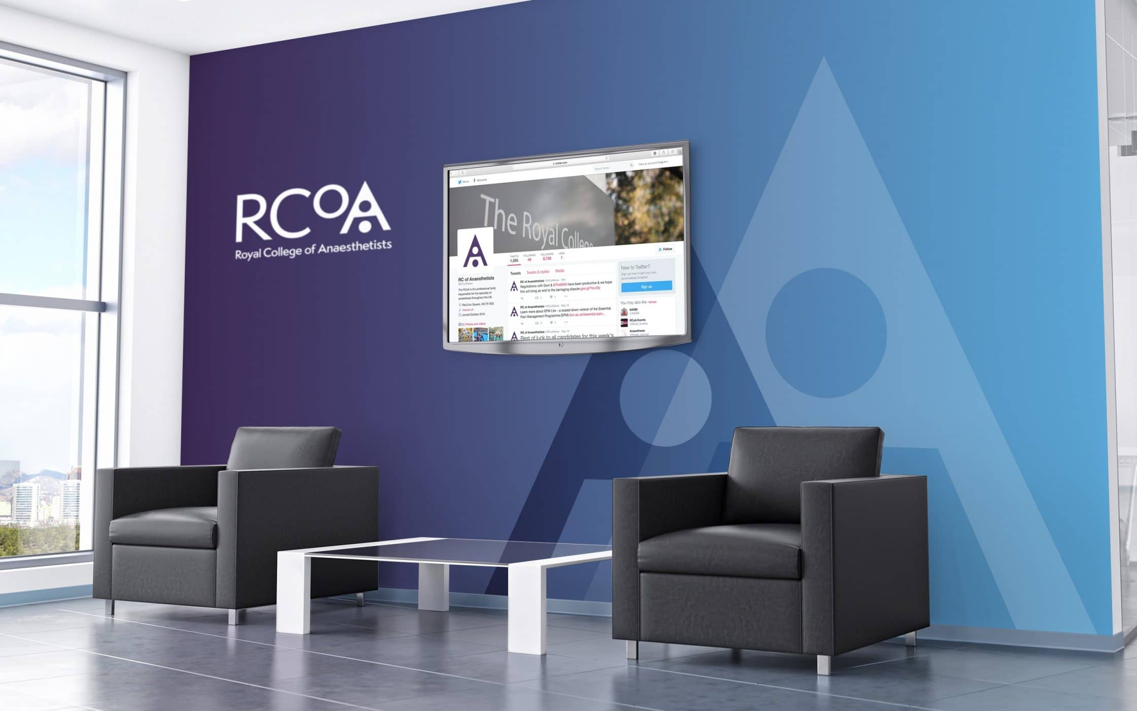
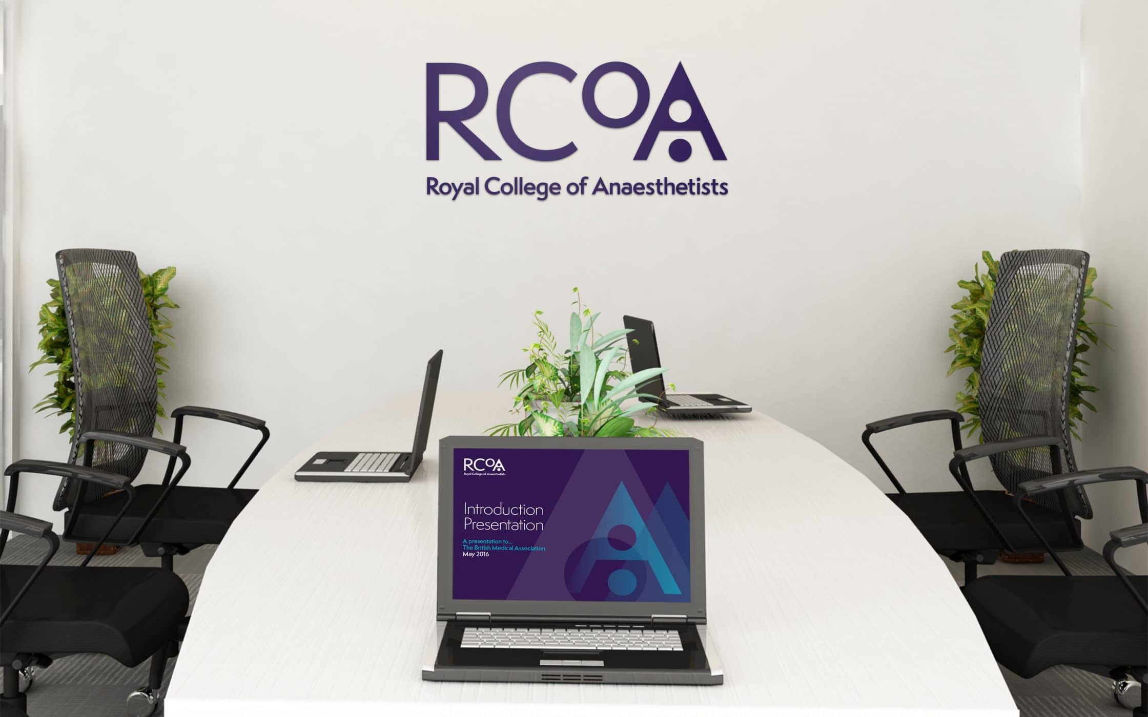
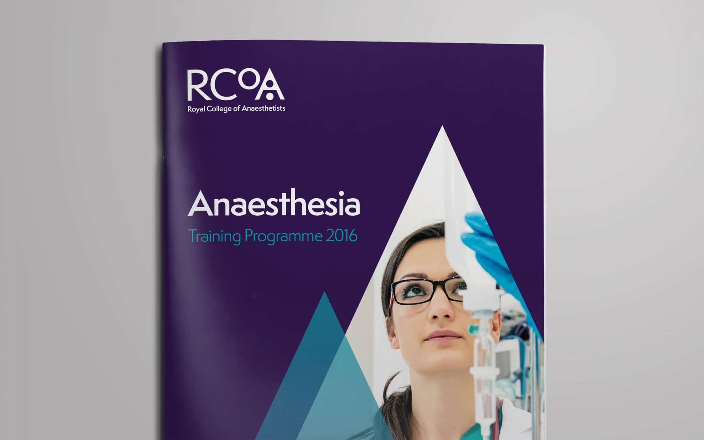
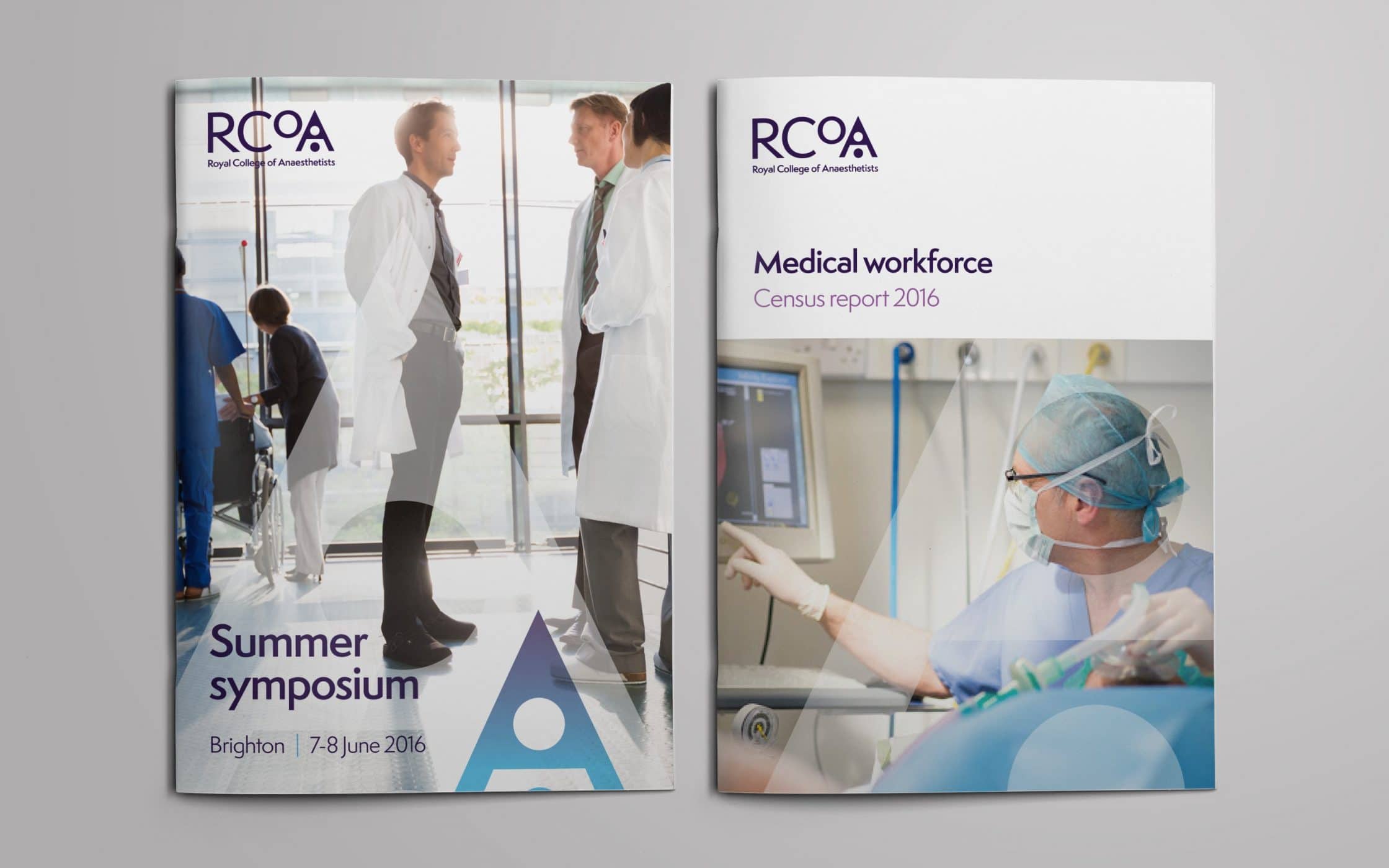
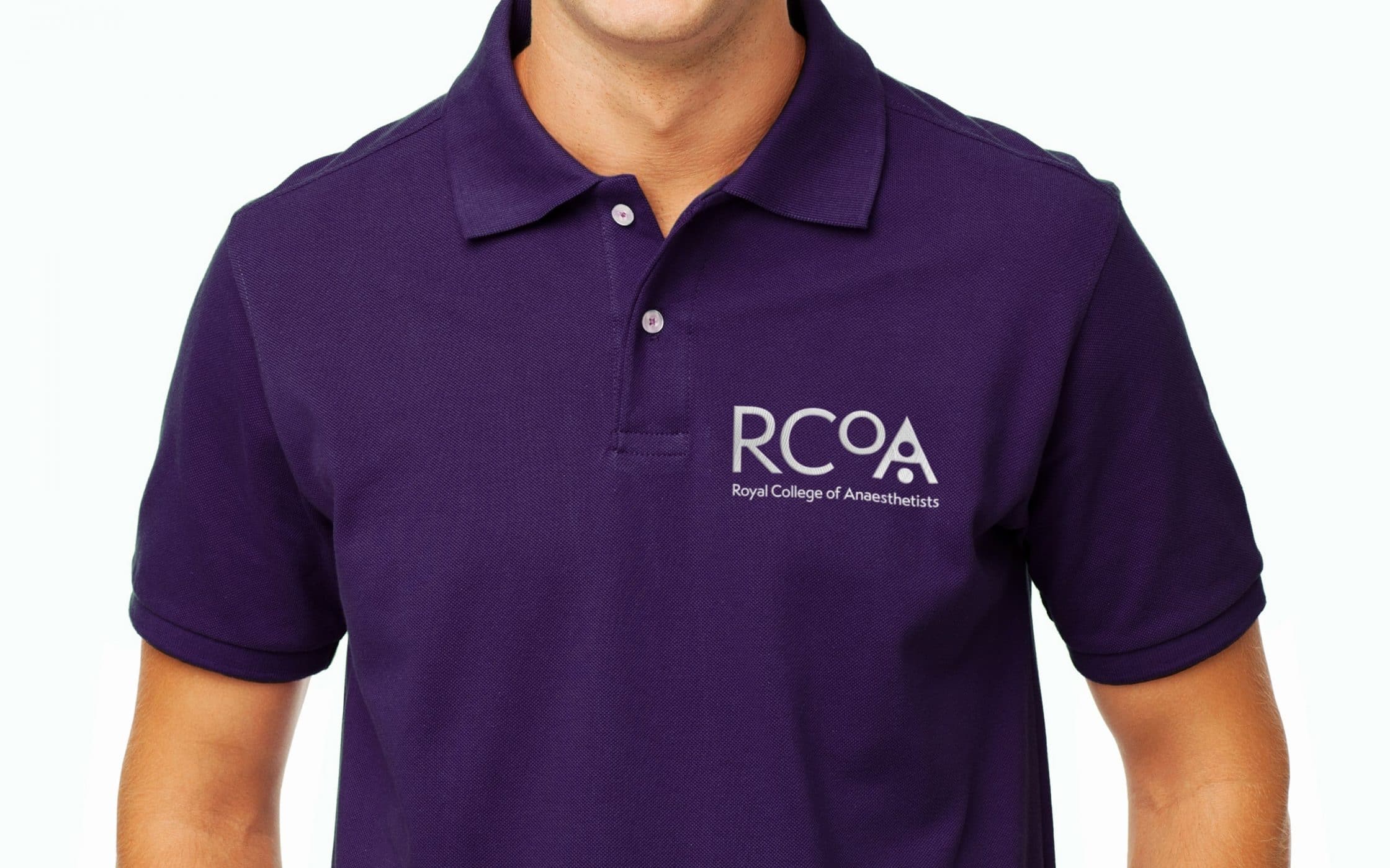
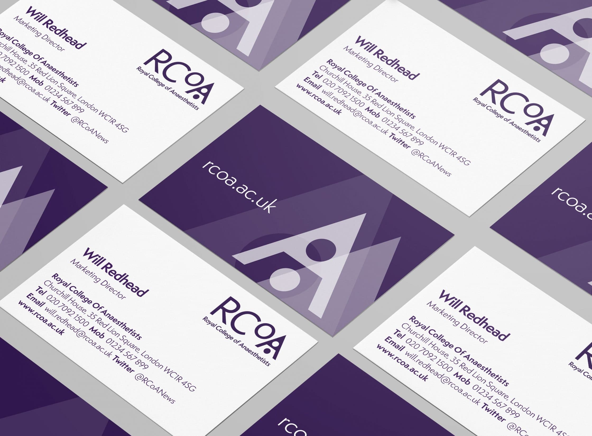
The culmination of our work with RCoA was a fully revitalised brand identity, shaped by an unforgettable personality, and a striking new visual identity. At the heart of this transformation, was the powerful RCoA logo, based primarily on the letter “A”. The symbol epitomises ambition and the pursuit of excellence, while demonstrating the relationship between a patient and anaesthetist.
This new design spotlights the vital role of anaesthetists in the medical landscape, and RCoA’s part in guiding the experts of tomorrow. With its new brand toolkit, the RCoA has the resources it needs to reinforce its relationship with members, enhance its connection to the medical community, and strengthen its position as a leader in excellence, innovation, and care.
What we did:
| —Research & analysis —Strategy & branding —Logo development —Visual identity |
—Tone of voice —Identity guidelines —Template design —Internal training |
More from our portfolio...


What do you need?
Please tell us about your requirements, and we'll be in touch.
"(required)" indicates required fields