Elevating human experiences on Zendesk.
Specialising in human experience at scale, Cloudset is a digital innovator with a unique mission. The certified Zendesk partner crafts systematic, process-driven solutions for one of the world’s most popular customer service tools. The firm ensures business users can get more value out of the Zendesk suite, with complementary apps, web services, and automation.
With such a niche focus, the firm needed a way to immediately highlight its unique proposition to an evolving audience. They knew the right brand was crucial to convey their focus on process-first customer service, and digital transformation. Fortunately, Fabrik was on-hand to offer our support.
Building a framework for strategic growth.
Cloudset is a problem solving company. It examines the challenges businesses face when implementing and using tools like Zendesk, and creates intuitive solutions. Unfortunately, the company struggled to effectively capture and engage its target audience with its existing identity. It needed a more robust, cohesive strategy, and brand framework.
The firm’s founder turned to Fabrik, for assistance identifying the brand opportunity, creating a set of strategic guidelines, and designing an enhanced visual identity. We were asked to deliver all of the essential assets and resources the firm needed to differentiate itself in its market.
Elevating the Cloudset offering to new heights.
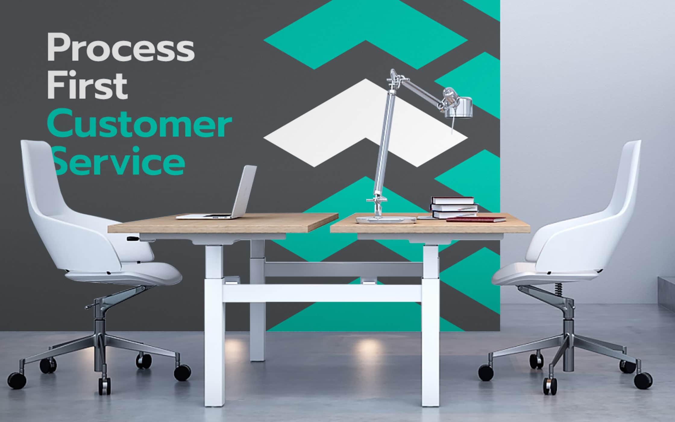
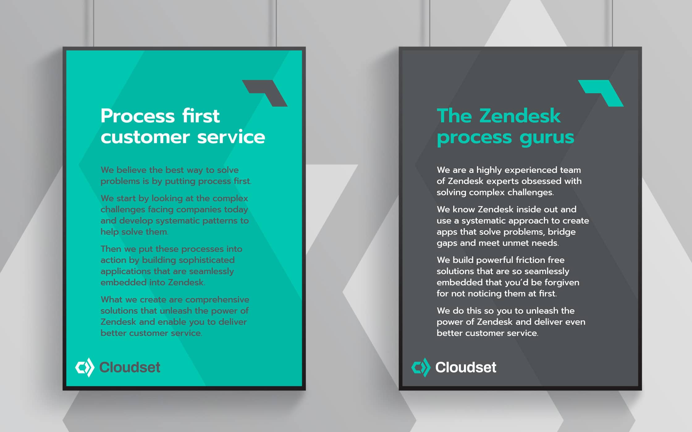
We began with an immersive brand sprint process, identifying the how, what, and why of the business, and the core values behind the Cloudset brand. Our team developed a tone of voice, and a series of messages centred around the firm’s expertise as Zendesk gurus, and a process-first approach. With these guidelines in place, we moved onto the visual identity.
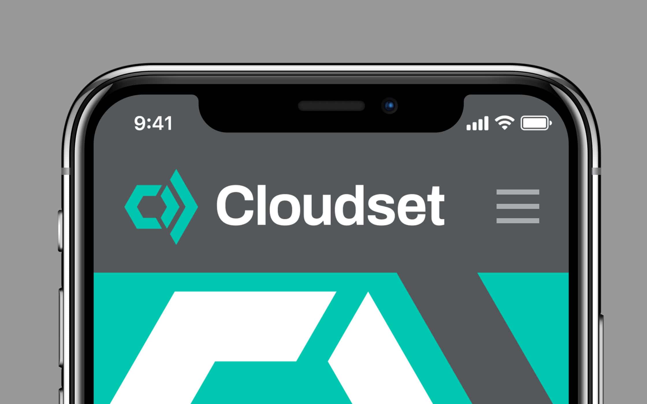
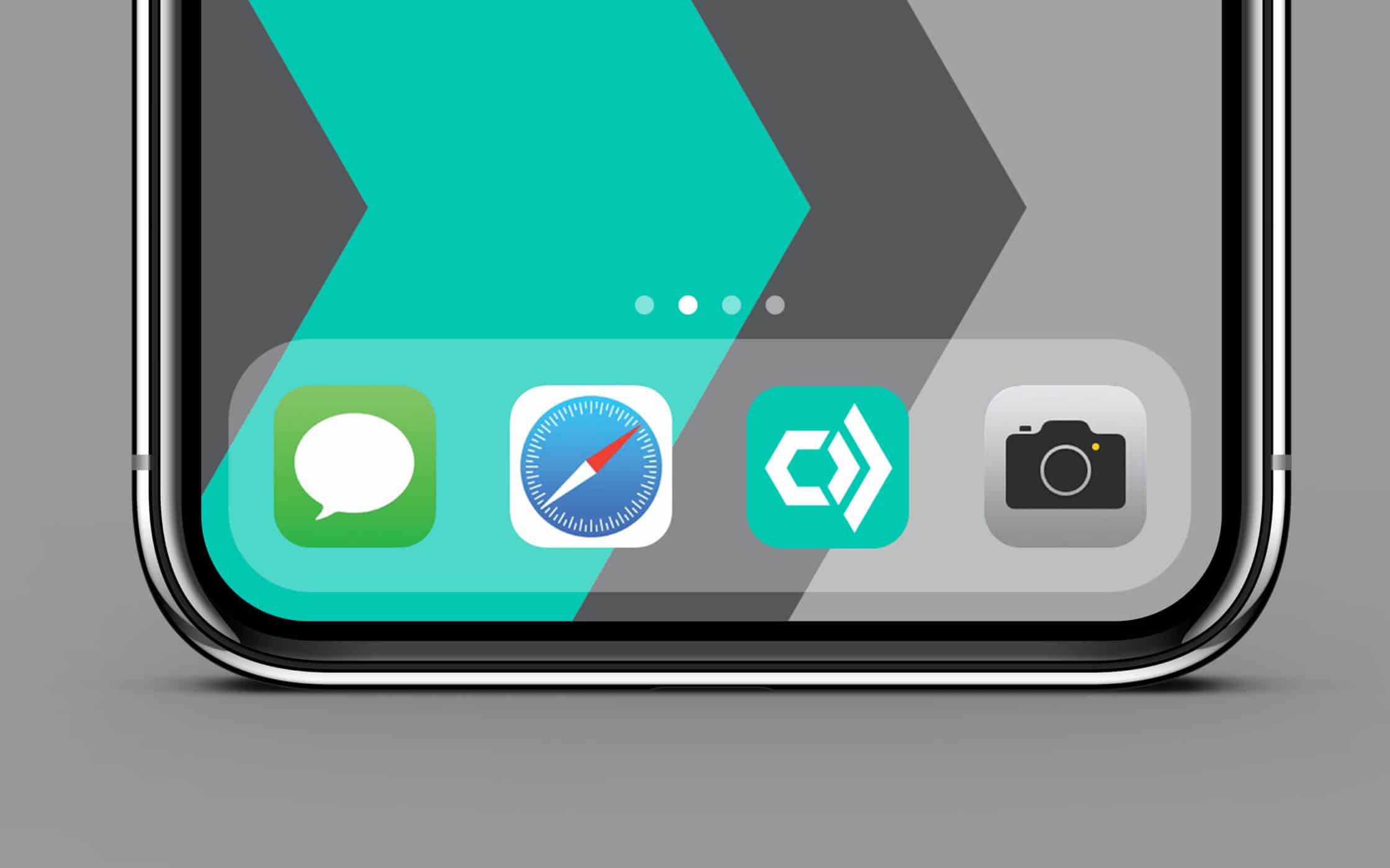
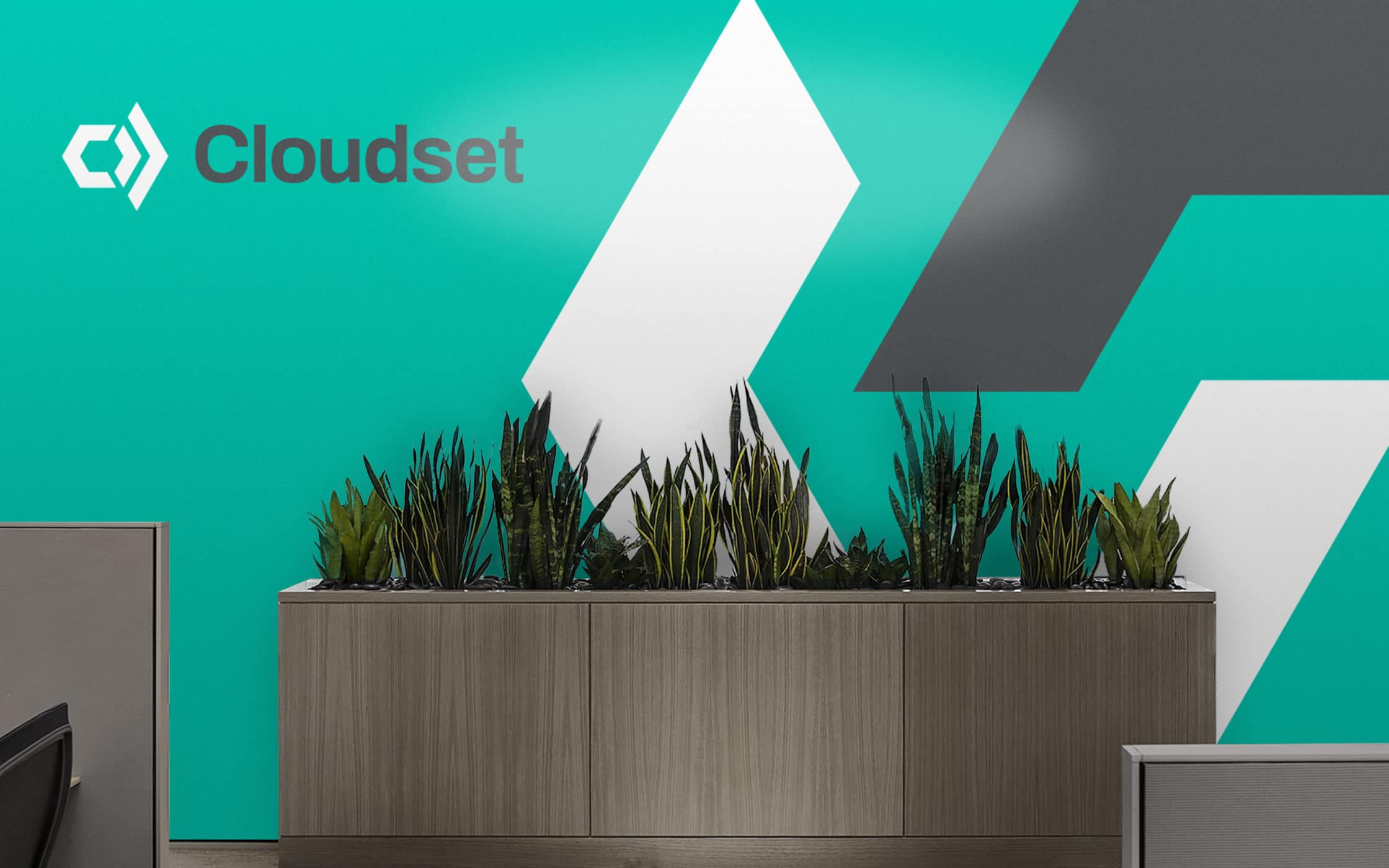
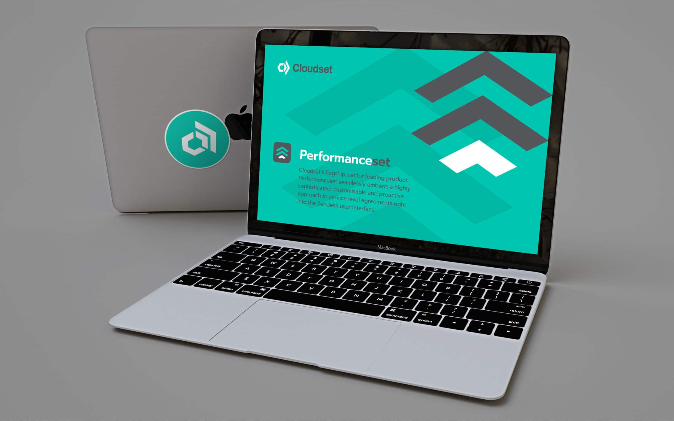
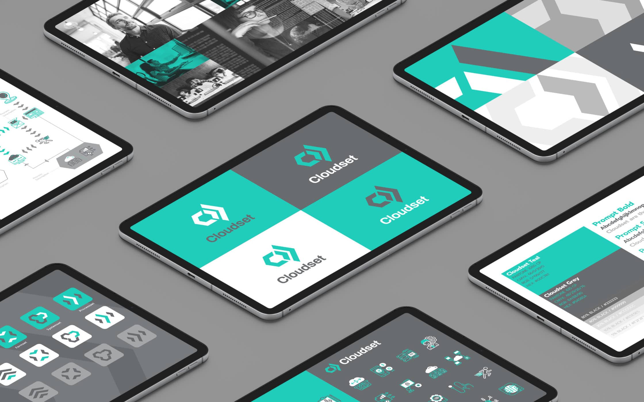
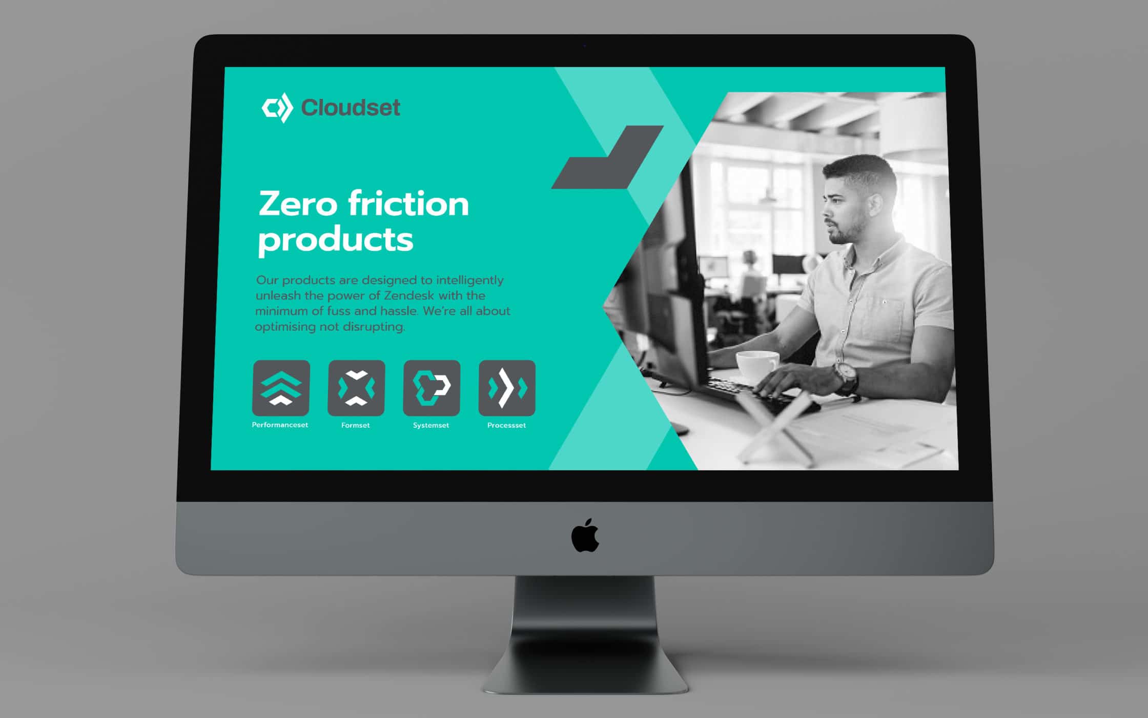
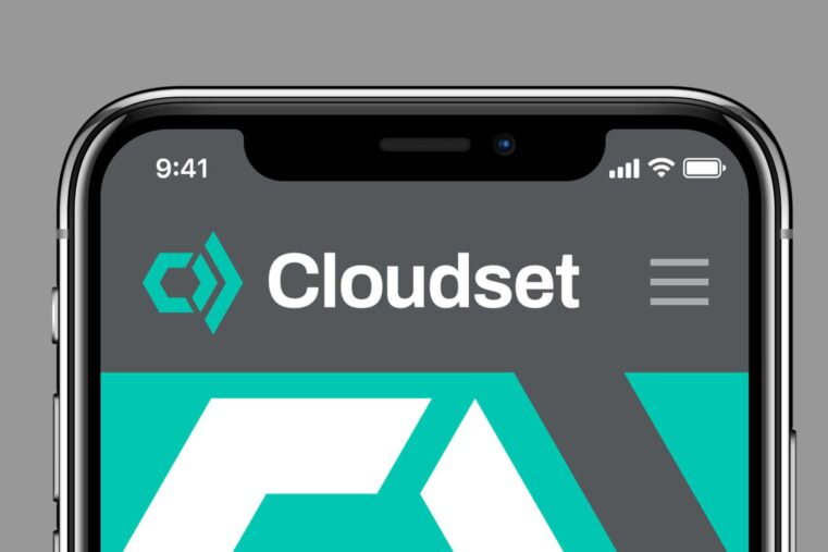
Fabrik crafted a new geometric logo, encompassing the ideas of strategic alignment and forward movement. The colour palette of grey and teal was chosen to symbolise a unique blend of technical prowess and human empathy. We also crafted a series of process illustrations, highlighting the benefits of Cloudset’s services, as well as a complete kit of brand guidelines.
A cohesive and evocative identity for Cloudset.
Our work with Cloudset went far beyond designing a new logo. We dove into the spirit of the brand, to surface a clear and consistent identity, and provide the company with the direction it needed for growth. Exploring everything from tone of voice and personality, to product positioning, we ensured the brand could accurately showcase its value to a modern audience.
Our comprehensive approach to this project gave Cloudset the resources it needed to transition from its position as a tech services startup to a niche pioneer. Today, the firm has everything it needs to capture and engage its target audience, differentiate its business, and power strategic growth.
What we did:
| —Brand strategy —Positioning —Tone of voice —Messaging |
—Logo-mark creation —Illustrations & iconography —Visual identity —User guidelines |
More from our portfolio...


What do you need?
Please tell us about your requirements, and we'll be in touch.
"(required)" indicates required fields