A visionary approach to asset management.
An innovator in asset management, Adelio Partners is a unique force in the European entity market, created by a team of seasoned investors. Driven by a pioneering investment philosophy, the company empowers its clients to unlock new levels of growth, with rigorous research and strategic insights. When it began, the company was keen to differentiate itself from its peers.
The team is propelled by more than just traditional performance metrics. Adelio Partners is fuelled by integrity, and alignment with their clients’ interests. The inception of the company marked a departure from conventional asset management practices, and the firm needed a brand that would reflect that pioneering spirit. That’s where Fabrik stepped in.
Designing a distinctive identity for Adelio Partners.
Impressed by their underlying ethos and passion, we dove into a comprehensive discovery process with the firm’s founder. We learned about the company’s core focus on building relationships with its clients, centred around honesty and trust. The Fabrik naming team used this insight to guide our collaborative naming process, exploring various potential titles.
The group agreed on a European-sounding name, to reflect the core focus of the business. However, they also wanted something that felt human, and meaningful. To build on this name, they also wanted an impactful image, and a logo that resonated with their core values.
Creating a comprehensive identity from name to image.
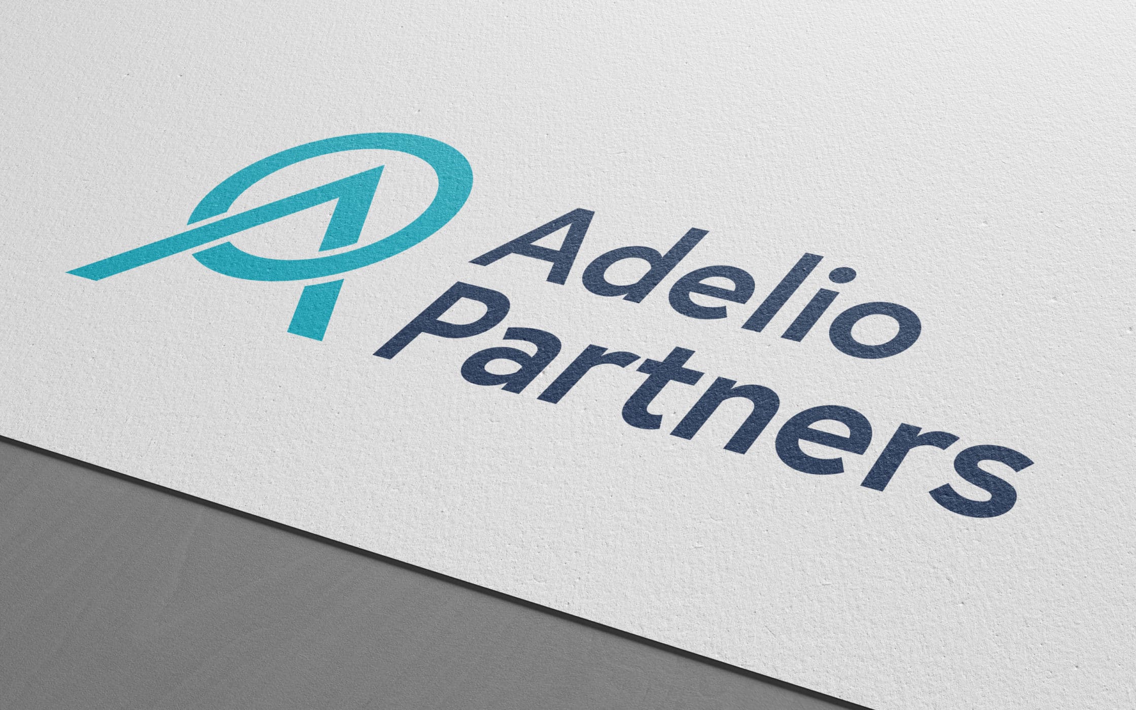
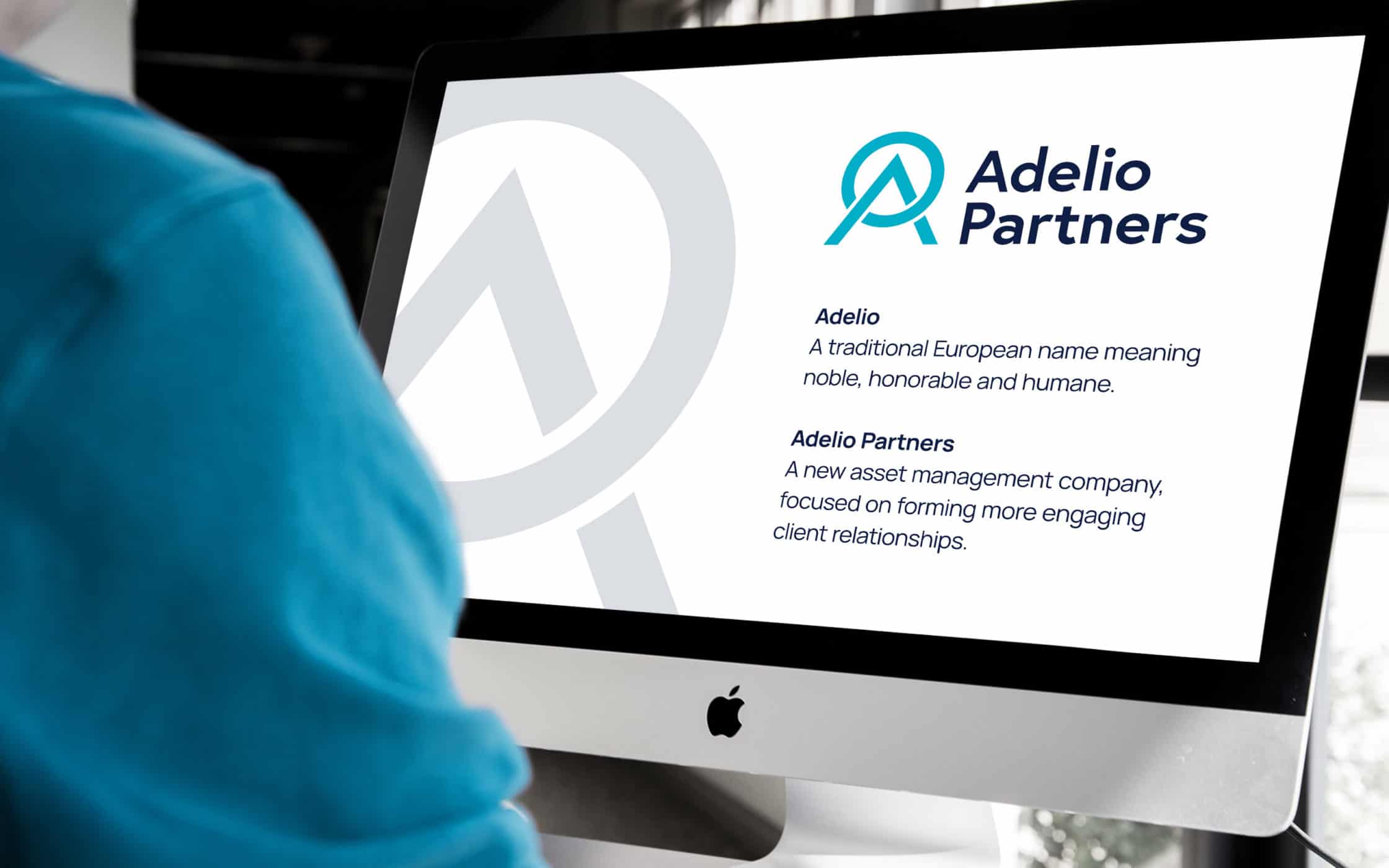
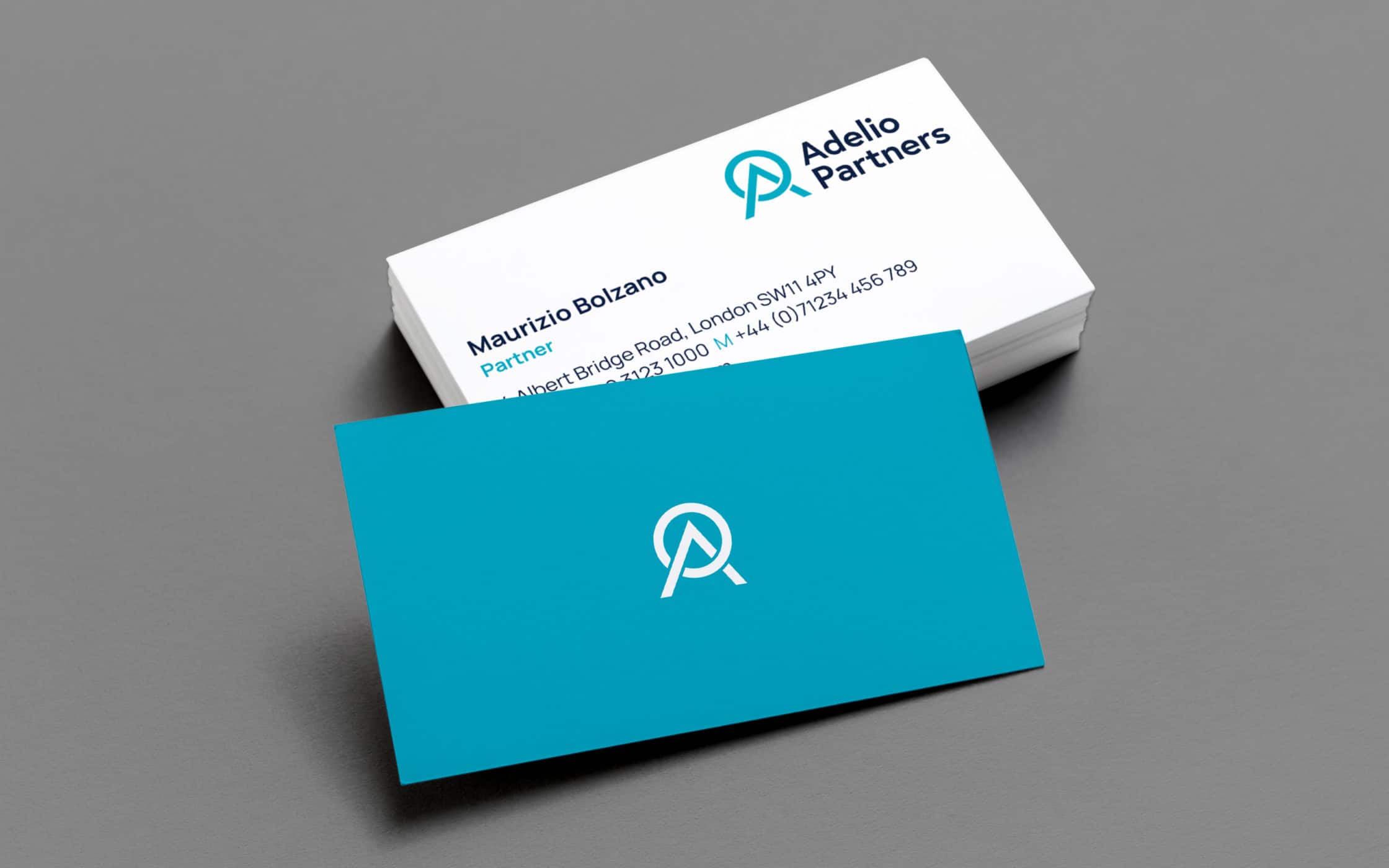
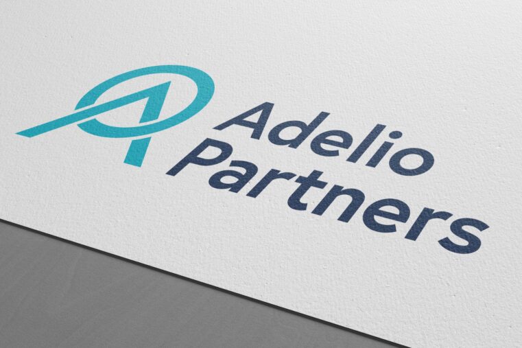
The name “Adelio,” meaning “noble,” was chosen as the first part of the company’s new title, reflecting fine moral and personal qualities. The suffix “Partners” highlighted the company’s approach to customer-centric service. With the new name in place, the Fabrik team began working on the company’s visual identity, conceptualising a simple symbol built on the “A” from Adelio.
The graphic chosen conveys ideas of achievement and growth with its pointed peak, and community spirit with the surrounding circle. Out of a series of potential colour palettes, Adelio settled on a blue scheme, symbolising trust and reliability. We accompanied the symbol and colour scheme with sleek, modern typography, perfect for a range of mediums.
Delivering a sophisticated brand experience.
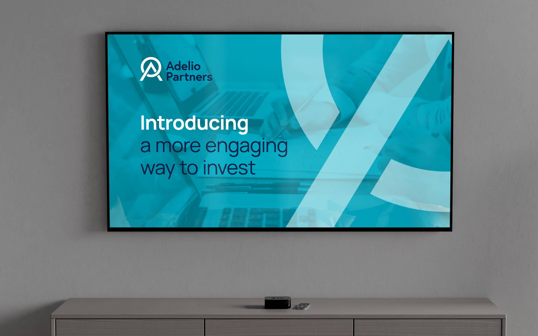
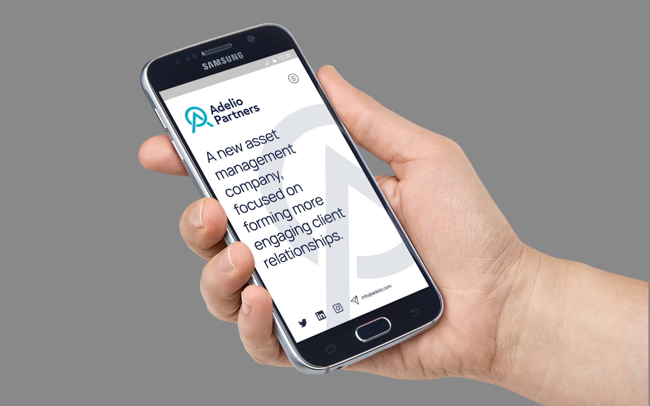
Our work resulted in a comprehensive new identity, perfectly encompassing the expertise of the Adelio team, and their humanised approach to asset management. The company’s distinctive name highlights its values and focus, while reminding consumers of the firm’s collaborative approach to growth.
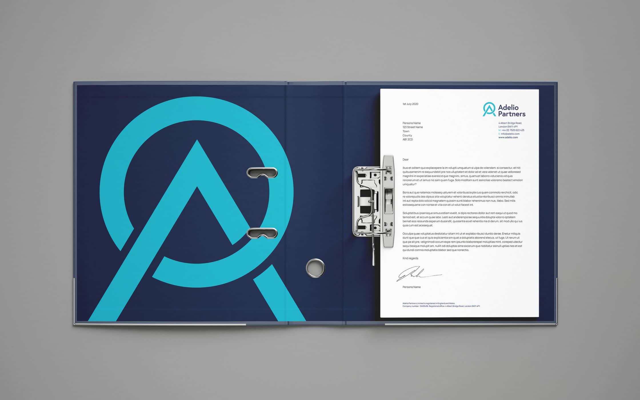
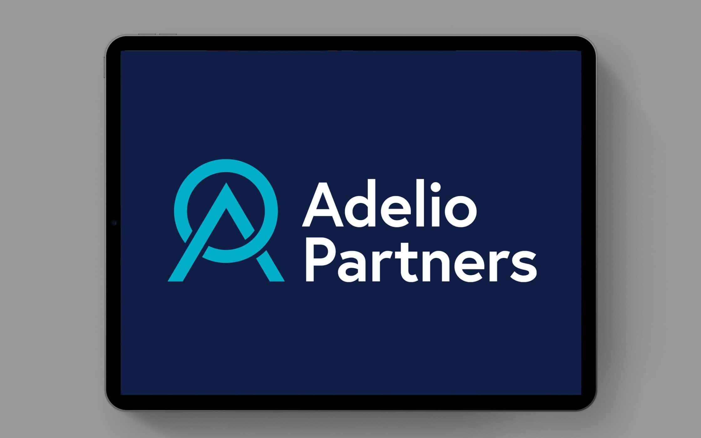
The accompanying visual identity, with its serene colour palette and simple shapes, demonstrates sophistication, expertise, and ambition. We also created launch templates and a marketing deck to ensure Adelio were prepared to introduce their new brand to the world.
What we did:
| —Brand positioning —Name development —Logo-mark creation |
—Visual identity —Marketing deck —Launch templates |

More from our portfolio...


What do you need?
Please tell us about your requirements, and we'll be in touch.
"(required)" indicates required fields