


ing time
Barclays logo history: A guide to the Barclays symbol
How much do you know about the Barclays logo? You may have spotted the iconic blue eagle on branches and debit cards if you live in the United Kingdom, where the bank has its headquarters. Or perhaps you’ve noticed Barclay’s growing presence in regions all over the globe.
But do you know how the memorable symbol was created or where it came from?
The Barclays logo is one of the most recognizable symbols in the banking landscape today. In the UK, it ranks alongside other well-known logos for banks like Halifax, Santander, and the Royal Bank of Scotland. However, few people know what the eagle means.
Today, we will take a closer look at Barclay’s logo history, discuss the bank’s origins, and explore how the brand identity has evolved over the years.
What does Barclays stand for? An introduction
Barclays is a multinational “universal bank” with British origins and a headquarters in London. The bank was originally founded more than 300 years ago, in 1690, making it one of the longest-standing financial institutions in the UK.
Today, Barclays operates under two separate divisions: Barclays International and Barclays UK. It’s also supported by a service company named Barclays Execution Services.
The Barclays brand traces its origins all the way back to a goldsmithing venture in the 1960s when Thomas Gould and John Freame launched their company on Lombard Street.
However, the name “Barclays” only emerged for the business when James Barclay, the son-in-law of John Freame, became a partner in 1736.
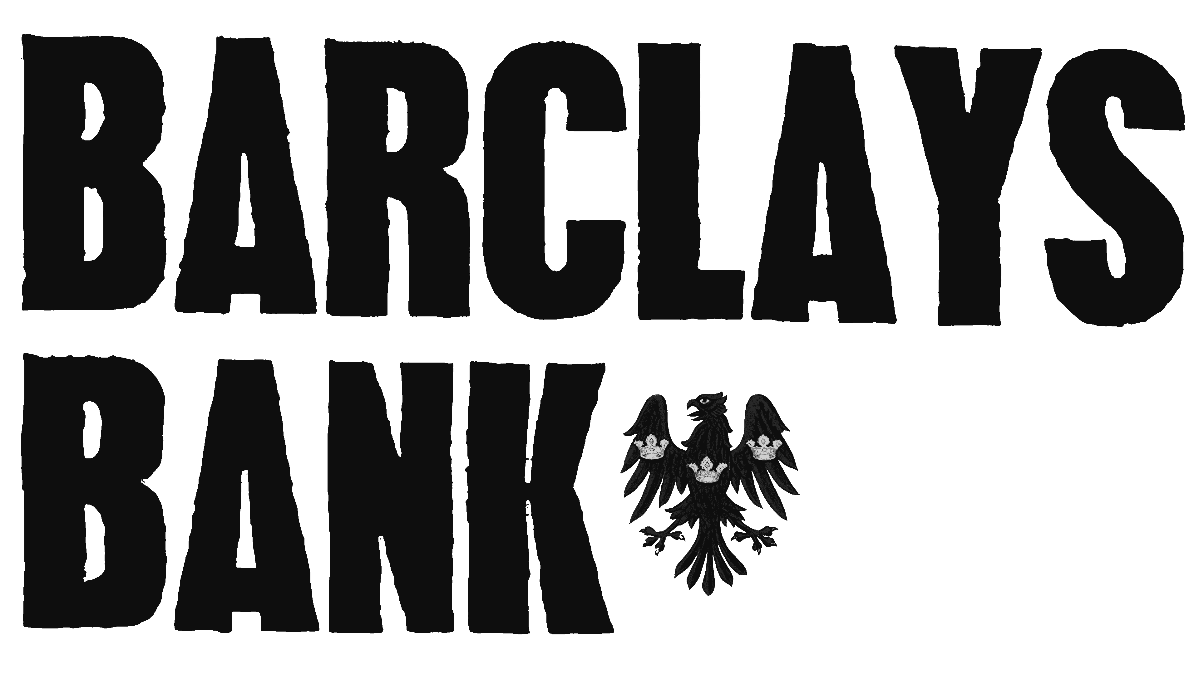
Even in the 1700s, Barclays bank was already establishing a visual presence. It was identified by many with the sign of the black spread eagle on its signage.
By 1896, twelve banks in the English provinces and London all united as a joint-stock bank to create the updated “Barclays and Co.” In the years following, Barclays expanded its footprint as a nationwide bank.
Throughout the 1900s, Barclays made numerous corporate investments, purchasing other organizations to help it expand. It was also the first bank to introduce a “cash dispenser” in the UK.
Currently, Barclays is present in 40 countries worldwide and is one of the world’s most powerful businesses in terms of corporate impact on financial stability.
What is the Barclays slogan?
Barclays has had a handful of taglines and slogans associated with its brand over the years, including “A big world needs a big bank” and “Fluent in finance.” The company has also used the phrase “Now there’s a thought” in many of its marketing campaigns.
Barclays logo history: The evolution of the Barclays eagle
The Barclays eagle dates back a lot further than most people realize. It was one of the first images associated with the company in the 1700s and remained with the organization over the decades as it established its unique visual presence.
The heraldic bird has always been a symbol of excellence, power, and ambition for the organization.
Let’s take a closer look at its evolution.
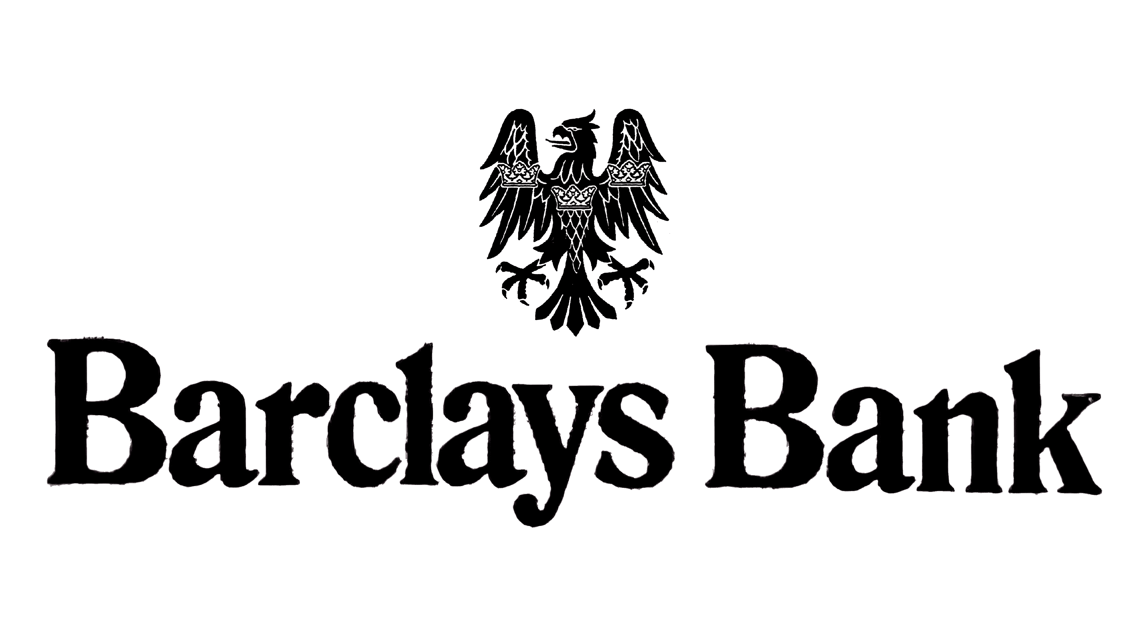
One of the earliest versions of the Barclays Bank available to view today was introduced in the 1960s, at a time when many banks were first beginning to develop their own brand assets. Before this, many financial institutions rarely used specific branding icons.
The logo here featured the words “Barclays Bank” on two levels, in bold, sans-serif font, written all in uppercase. Next to the “Bank” portion of the wordmark, there was a small image of an eagle, with a few basic details, though they were quite difficult to make out.
Later in the 1960s, Barclays refined and updated its logo to make it more balanced. The wordmark was written on a single line, this time in normal sentence case, with a more serif-style font choice. The lettering was still quite bold but a little less aggressive than in the previous design.
The eagle, placed above the wordmark, was slightly larger, with clearer details. The heraldic eagle was still very similar to the previous design, but it was possible to see its feathers, face, and eyes.
1970
In the 1970s, Barclays introduced a relatively modern logo for the time, with a change of color palettes. A sea-blue shade became the primary tone for the logo, alongside a white font and symbol. The blue stood for loyalty and reliability, while the white symbolized power and excellence.
The logo featured a horizontal rectangle as the background for the wordmark, with a separate square for the eagle emblem. The letters of the Barclays wordmark returned to all uppercase, though they maintained their sophisticated serifs.
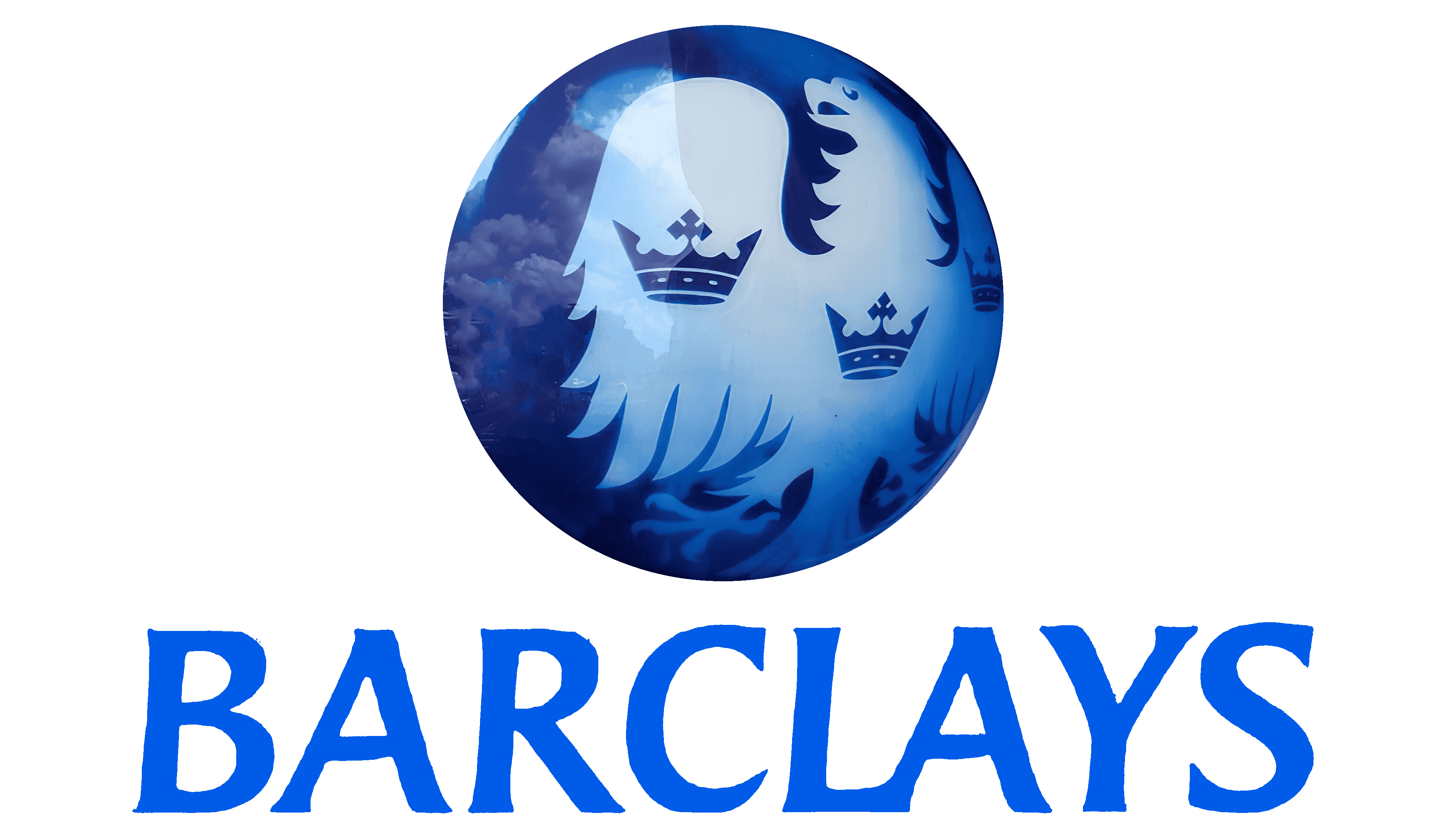
In the latest 90s, Barclays adjusted its color palette again, removing the green elements from the logo for a brighter, more obvious blue. The eagle was stylized and placed within a blue gradient circle, in white, with blue crowns on the bird’s wings and body.
The Barclays wordmark once again appeared in the logo, written in a smooth italicized typeface with shorter serifs.
The image was well-balanced and modern, highlighting the evolution of the Barclays brand identity.
2002
At the turn of the millennium, Barclays introduced its new symbol, one most people associate with the bank today. This image removed a lot of the detail of the Eagle, transforming it into a simple silhouette shape.
The design helped to position the bird in the shape of a shield, which the company used to convey ideas of security and protection.
The color palette of the design evolved yet again, and the company switched to a much lighter shade of blue, perhaps to convey concepts of simplicity and innovation.
Barclays symbol meaning, colors, and typography
Throughout the decades, Barclays has maintained one of the strongest visual brands in the banking sector. Barclays chose the eagle as a symbol for its company at a very early stage in its life and maintained the design across the centuries.
The heraldic bird was originally chosen with reference to the British coat of arms and had a traditional, sophisticated design.
Eventually, however, Barclays updated its logo to make the bird more modern.
Today, the eagle appears in a sleek, abstract form, with a simple light blue color palette and clean lines. The shape of the bird is similar to that of a shield, which builds on Barclay’s identity by highlighting the company as a protector or defender of wealth.
Alongside the eagle symbol, the serif-style wordmark of the Barclays logo is another eye-catching component of the design.
Written in a sleek font, matching the color of the bird, the typography choice helps to further classify Barclays as a leader in its field. If you’re interested in exploring the Barclays logo in greater depth, you can find some useful resources here:
What color is the Barclays logo?
For some time, Barclays was known specifically for its black spread eagle emblem.
However, as the company evolved, it began experimenting with new color palettes, specifically focusing on the popular shade of blue. In the color psychology space, blue is commonly associated with reliability, trust, and credibility, making it a great choice for many banks.
The Barclays logo color today is a light shade of blue, which distinguishes the brand as fresh and modern, despite its extensive history.
Vivid Cerulean:
Hex: #00AFE9
RGB: (0, 175, 233)
CMYK: 1, 0.248, 0, 0.086
What font does the Barclays logo use?
Like the Barclays logo colors, the typography choices of the brand have also evolved over the decades, becoming increasingly more refined. The Barclays logo font today is a specific typeface chosen for the company, which combines short serifs with sleek lines and curves.
The lettering is slightly slanted towards the right, indicating forward motion and progression.
Although Barclays hasn’t shared the specific font used in its logo, the Baker Signet Std font is very close in style.
Discovering the incredible Barclays logo
Throughout Barclays logo history, we can see an incredible level of consistency. The Barclays bank logo may have changed in style, font, and color choices, but it has always maintained its key emblem: the symbol of the heraldic eagle.
The eagle has long been a sign of strength, excellence, and innovation for Barclays. As the design has evolved over the years, adopting a shape similar to a shield, it now also helps the company to convey ideas of protection and defense.
Fabrik: A branding agency for our times.

As Fabrik’s creative director, Stephen oversees complex branding programmes. He advises our clients on their tone of voice, creates logos and visual identities and crafts names for companies, products and services. Writing for Brand Fabrik Stephen reflects his love for logo design and visual identity.