

Feeling the squeeze: What is a squeeze page and how can you create one?

Squeeze pages, landing pages, splash pages…
Feeling lost in a jungle of marketing jargon?
Don’t worry, by the time you’ve finished reading this article; you’ll know exactly which pages you need to get a better grip on your target audience.
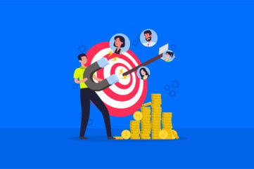
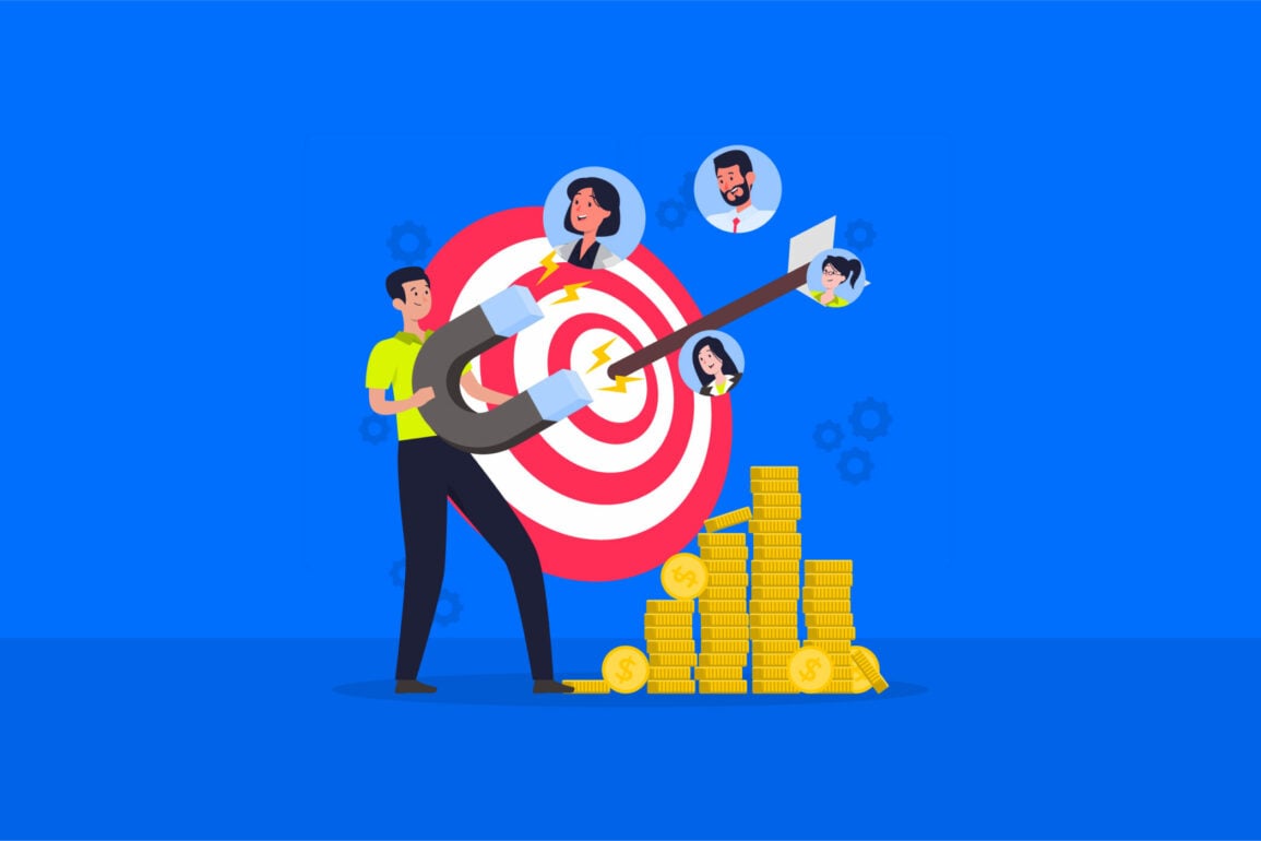
We all know that lead generation is crucial to the success of any business. The more leads you collect, the more opportunities you have for sales.
Most of the time, leads are captured through opt-in email addresses. Thanks to GDPR, you can’t just buy an email list anymore, you need your customers to actively agree to receiving messages from you. Unfortunately, convincing would-be clients to hand over their personal details isn’t easy. After all, no-one wants more spam in their inbox.
A squeeze page is how you convince your prospects that the value you have to offer is worth their email or contact details. With a high converting squeeze page, you push, motivate and convince a visitor into agreeing to join your conversion list.
The better your squeeze page design, the more likely you are to mold visitors into potential customers. Over time, your squeeze pages will help you to build your pipeline, reach out to a more targeted audience with your marketing campaigns, and turbo-charge your profits.
Here, you’re going to learn what these unique online assets are, how they differ from landing pages, and how to set up a squeeze page that resonates with your audience.
Let’s get squeezing.
What is a squeeze page? Your squeeze page definition
So, what is a squeeze page?
At its core, a squeeze page is a form of landing page, but not all landing pages are squeeze pages. Most squeeze pages are inherently simple, short, and have very few form fields to fill in.
Most importantly, there should never be anything on your squeeze page that allows your customer to go elsewhere. That means no links to your home page and no navigation bar. With a squeeze page, your customers either opt-in or they go elsewhere.
With a website squeeze page, you’ll have a very specific objective: offer something your visitors can’t resist. Accomplish that goal, and you’ll have clients lining up for you to email them.
It doesn’t matter what you want to accomplish online; whether you’re selling products, services or building a reputation for your brand, a squeeze page is how to set yourself up for future success. When you learn how to create a squeeze page, you discover how to:
- Increase readership or subscriber opportunities for your blog.
- Create a dedicated audience for marketing campaigns.
- Get repeat visitors and loyal fans for your site.
- Increase your chances of generating more sales.
- Track conversions and improve your online presence.

Squeeze page vs. landing page: What’s the difference?
So, what’s the difference between a squeeze page and a landing page?
As we mentioned above, your website squeeze page is a sub-type of landing page.
Landing pages are a critical part of your digital marketing strategy, and they’ve been around since the dawn of internet marketing. A landing page is a standalone domain on your website that aims to achieve a specific goal. For instance, you might have a page that asks people to sign up for a free trial of your new product or a page that asks for subscribers for your blog.
A landing page conversion can be something as simple as a click onto the next page of your website, or something as personal as asking for credit card information.
If we look at a squeeze page definition in closer detail, however, we find something far more focused. Squeeze pages only exist to collect the name and email address of a potential lead. The way your squeeze pages collect this information is by using a ‘lead magnet’ or offer to provide customers with value in exchange for their details.
Squeeze pages are similar to landing pages, but they concentrate specifically on lead generation. The concentrated nature of squeeze page design is why these assets are so clear and concise. When your customer lands on a squeeze page, they should have only two options: follow the call to action or hit the ‘back’ button on their browser.
Squeeze pages are valuable for many reasons. First, they give your customers the extra push they need to take positive action on behalf of your brand. Secondly, a great WordPress squeeze page makes it easy to calculate your conversion rate. All you need to do is look at two things:
C: The number of people who ‘converted.’
V: The number of visitors on the page
To find your website squeeze page conversion rate, use the formula: C/V*100. For instance, if 25 people filled out your form, and 100 visitors landed on the page, your conversion rate is 25%.

How to set up a squeeze page & capture conversions
Now you know the answer to “What is a squeeze page?”, it’s time to learn how to make a squeeze page that delivers results for your business.
The perfect squeeze page needs the right combination of simple, uncluttered design and engaging copy. While there’s no one-size-fits-all squeeze page template, there are a few key elements that brands need to include to get conversions.
For instance:
Squeeze page component 1: Your core offer
Before you can learn how to build an effective squeeze page, you need to find something you can give your prospects in exchange for their information. Otherwise known as your ‘lead magnet’, your core offer thanks your potential client for joining your email list by giving them something in return.
Common lead magnets include:
- eBooks.
- Training and seminars.
- Templates.
- Worksheets.
- Case studies.
To create a compelling core offer, you’ll need to know as much as possible about your target audience and what they want from you. For instance, a music website collecting leads for its new guitar selection might use a video that teaches customers the basics of how to play as a lead magnet. Unfortunately, the same magnet wouldn’t work for an audience on a finance website gathering leads for business accounting. Know your customer before you get started.
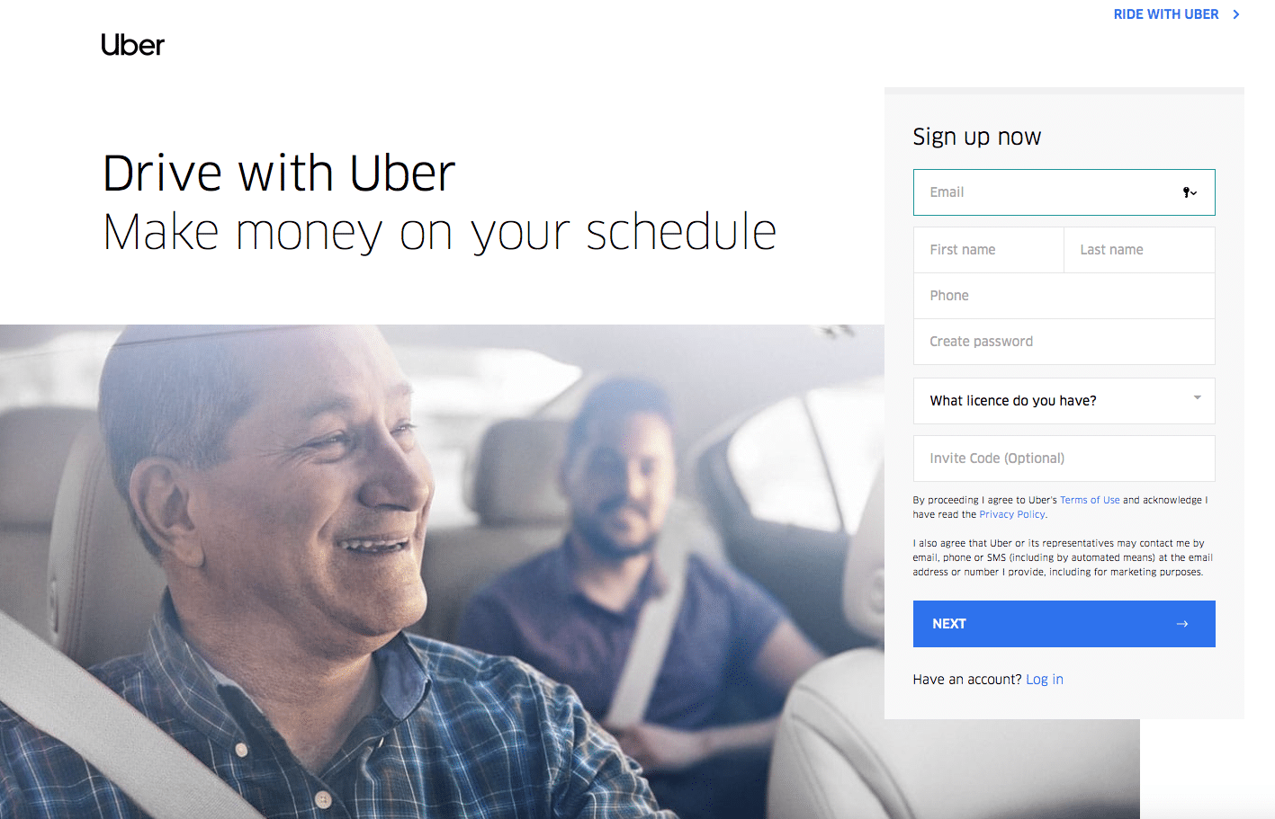
This sign-up page for Uber is simple, straight to the point, and it outlines an critical benefit: “Drive when you want, earn what you need.”
Squeeze page component 2: A click-worthy headline
A high converting squeeze page entices your audience and convinces them to support your business. However, today’s customers have limited attention spans. You need to earn their attention and hold it fast. A fantastic headline can give you the focus you need. Think of it like shorthand for your value proposition. The best headlines are:
- Short (under 15 words).
- Impactful (use actionable language).
- Descriptive (explain the problem you’re going to solve).
For example, your headline for an eBook may look like this: Losing Leads? These Landing Page Strategies Improve Conversions by 67%! – This headline addresses a problem and offers a measurable solution.
Some squeeze pages also use subheadings to reinforce the original problem and further explain how you can help. For instance: “Stop Losing Customers With 5 Simple Landing Page Tips”.
Squeeze page component 3: Hero images
A good squeeze page design is clean and uncluttered. However, that doesn’t mean it should be boring. Make your page more compelling with visuals that highlight the hero offer you promise to deliver. Ideally, you want to use something that represents what your customer is going to get in return for their personal information.
Look at this squeeze page popup from WordStream.com for instance:
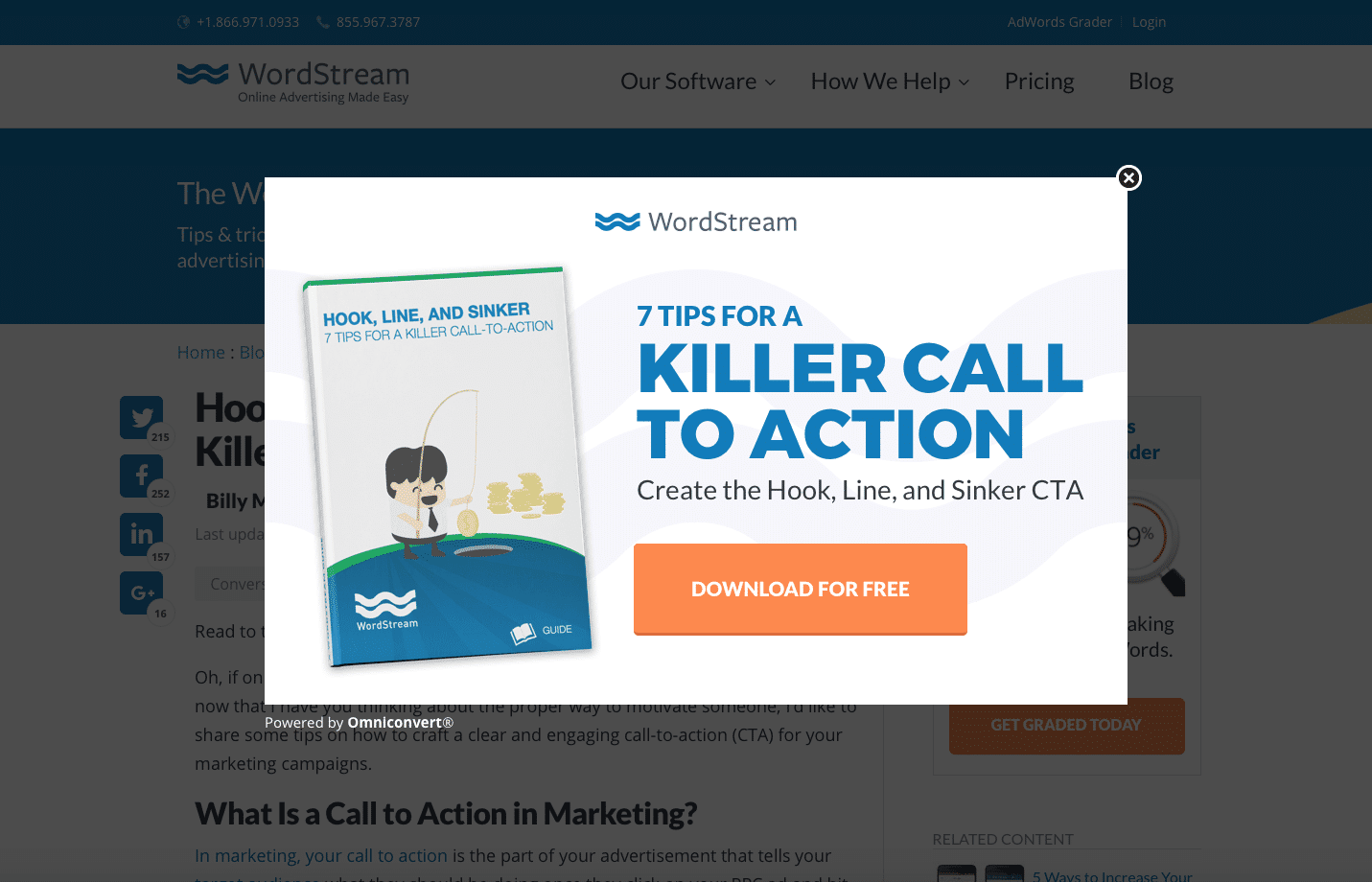
The image of the book cover next to the headline shows someone fishing for money and reaping the rewards of their hard work.
Just think about how weight-loss products show before and after pictures. The aim of a hero visual is to help customers visualize what they could be with your help.
Squeeze page component 4: Optimized ‘call to action’ content
The fourth essential element to pay attention to on your squeeze page is your call to action.
Like everything in your squeeze page design so far, simplicity is key. Wherever you can, remove extraneous form fields and information that aren’t essential to the conversion. Remember, you don’t have to worry about things like SEO on a squeeze page, because these assets don’t need to rank on Google.
All you want to do on a squeeze page is convert. That means that your call to action needs to be something your customers can’t refuse. Keep it short, sweet and focused on value. Effective calls to action reaffirm what your audience is going to get. Instead of asking your leads to do something, ask them to collect something. For instance:
- Instead of “Sign up” try “Get my free eBook.”
- Instead of “Click here” try “Give me access!”
- Instead of “Subscribe” try “Sign me up!”
Remember, the CTA button itself needs to be vibrant, easy to click on any device (including a smartphone), and it should stand out from the rest of your page.
Squeeze page component 5: The form
Finally, every fantastic squeeze page design needs a form. This is where your visitor submits their personal information in exchange for your lead magnet.
At a minimum, you’ll need a single field (to collect email addresses) and a ‘submit’ button. However, you can also include fields for a clients name, their location, and their occupation.
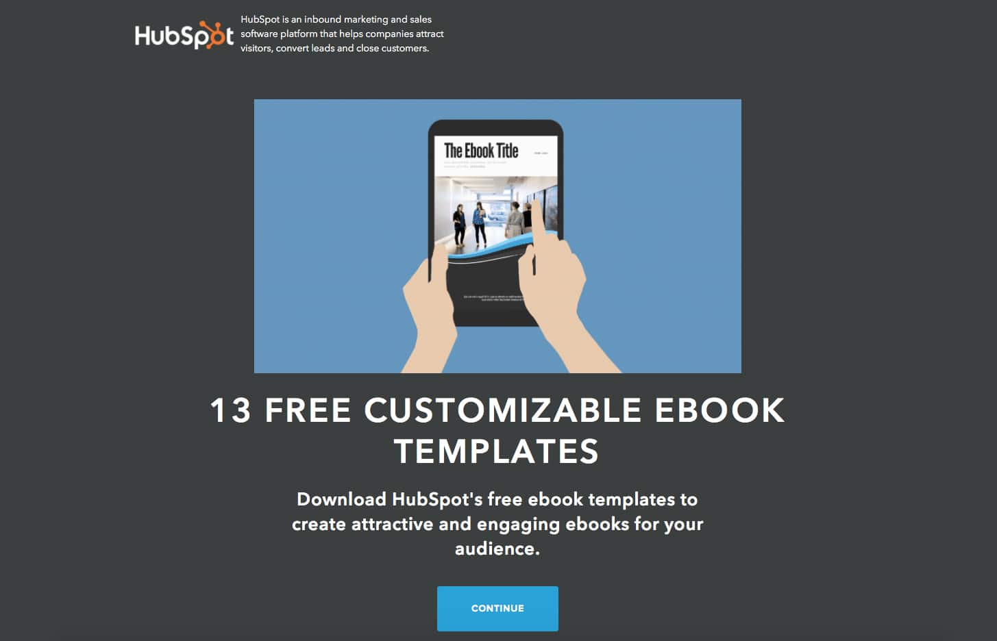
In today’s data-driven world, it’s tempting to ask for as much info as you can get about your target customer. However, be careful not to ask for more than you realistically need. Studies show that reducing the number of form fields on a squeeze page by just one can lead to a 50% increase in conversions. Check out this high converting squeeze page from HubSpot; it effectively offers 13 useful templates in exchange for 3 pieces of information. That’s an excellent ratio:
Quick tips for a high-converting squeeze page
Figuring out how to create a squeeze page doesn’t have to be complicated.
In fact, at their core, squeeze pages are inherently straightforward. They’re intended to take your target audience from one stage of the buyer funnel to the next as quickly and seamlessly as possible. However, just like with any other aspect of your website design, there are elements you can add to the perfect squeeze page to increase your chances of success.
Here are our top tips.
1. Always use social proof
The easiest way to convince someone new to trust you is to show that you’ve already earned the trust of others.
Even if you’re only asking for an email address on your squeeze pages, your customers still want to know that they’re giving their information to someone they can rely on. With that in mind, show them you’re worth the risk with a brief quote from a client testimonial, or a selection of 5-star reviews.
Don’t go too in-depth with your social proof. A link to a case study, for instance, is no good because it sends people away from your squeeze page.
2. Choose actionable words
Since squeeze pages are all about conversions, it makes sense to use language that will convince your customers to do something. For instance: “Read our new eBook” or “Download your free course.”
While you’re working on using actionable language, make sure that the copy in your squeeze pages is compelling, and that it addresses the real value that customers can get from signing up with your business. Check out PayPal’s squeeze page for instance:
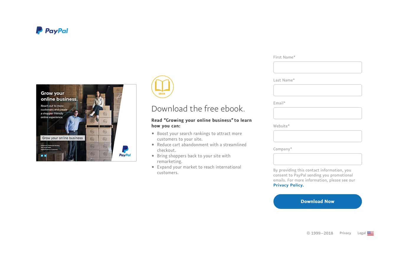
This squeeze page uses actionable language to describe the benefits available in PayPal’s eBook. For example: “Boost your search rankings” and “Reduce cart abandonment.”
Think about how your lead magnet will benefit your customers, how they’ll feel after they’ve signed up, and how you’re going to make their lives easier.
3. Consider going beyond words
We’ve already discussed how hero visuals can help to improve your squeeze page design. However, some companies also increase conversions by adding videos to the mix.
Video content isn’t an essential component of a winning squeeze page, but it could be a great way to increase conversions. One study found that using video on your website can increase conversions by up to 80%.
A well-designed video helps to convey a lot of value in a short period. Just make sure that the content summarizes your primary message, and answers any of the questions that might be stopping your customers from clicking on your call to action.
4. Regularly test and improve your squeeze page design
As mentioned above, one of the great things about squeeze pages is how easy they are to measure. Finding the conversion rate for any squeeze page is simple, which means that you can continuously test your campaigns, and learn more about what you need to do to improve your conversion numbers.
Some businesses enhance their squeeze page templates by downloading heatmap services that show precisely what visitors do when they arrive on your page. Others, simply split-test variations of their squeeze pages over time, changing small elements like the color of a call-to-action button, or the language in a headline.
The more you test and optimize your pages, the better your results will be.
Creating squeeze page templates: Examples to learn from
Designing the perfect squeeze page is a highly variable process.
Your audience, the nature of your product, and even the stage your customers are at in their buyer journey can all dictate how you should structure your page.
That being said, there are a few elements that tend to stay the same on most squeeze page templates. For instance:
- Keep your content above the fold for pages without scrolling.
- Focus on an exceptional headline.
- Use easy-to-read font and a background that isn’t distracting.
- Remove all navigation, social share buttons, and hyperlinks.
- Make your CTA stand out.
To help you build your own custom squeeze page templates, let’s look at some of the things that other companies have done right, and what they’ve done wrong.
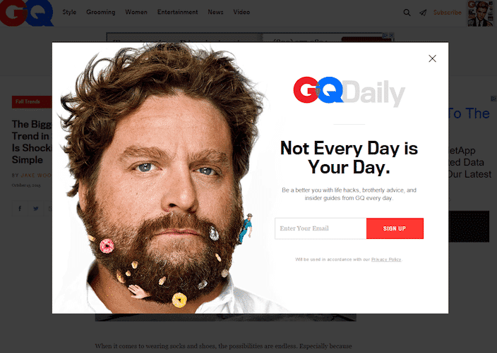
1. GQ Daily
GQ’s squeeze page includes a fun picture of Zach Galifianakis which acts as social proof by aligning the magazine with an authority figure. The celeb picture also demonstrates GQ Daily’s unique brand personality. What’s more, the ultra-short form only asks for a single piece of information, and the red ‘sign up’ button contrasts well with the rest of the page.
The only issue? The headline doesn’t convey much of a benefit. There’s nothing in this headline that tells you what you’re going to get from converting. You could also argue that the CTA copy is pretty boring.
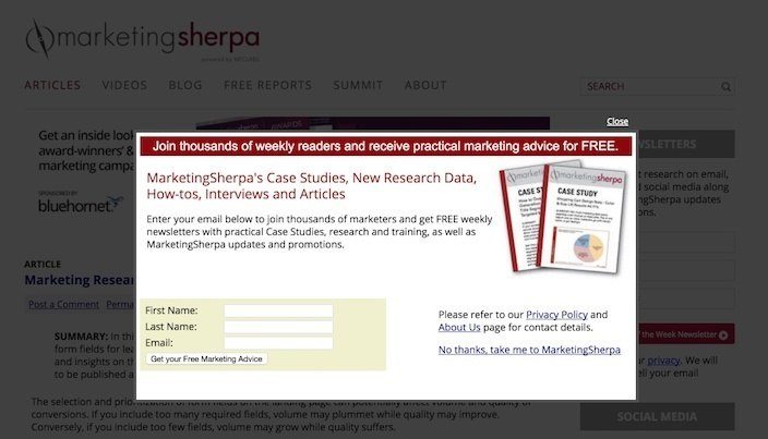
2. Marketing Sherpa
In Marketing Sherpa’s squeeze page, the digital advertising company asks you to join “thousands” of weekly readers receiving practical advice for “free.” Notice how the headline demonstrates social proof and promises tangible value.
Unfortunately, Marketing Sherpa also gives their customers a way out of the squeeze page, by allowing them to go back to the main website. Links away from the content, including “No thanks, take me to MarketingSherpa” and the “About Us” page makes the page instantly less effective. Additionally, the CTA button barely stands out at all.
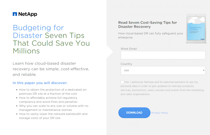
3. NetApp
Finally, this NetApp squeeze page is excellent for encouraging conversions. Although the CTA button is pretty dull, the headline is benefit-oriented and gets straight to the point, and the copy is valuable and concise. The form only asks for two pieces of information in exchange for a free eBook, so there’s a good risk to reward ratio. What’s more, to comply with GDPR and privacy standards, the opt-in box hasn’t been pre-clicked, so you get to make your own decision about whether you want to connect with the company.
This squeeze page conveys value and ensures that the leads the business gets in return will be people who are genuinely interested in the company and what it has to offer. There’s even a hero image of the eBook to help visitors visualize their rewards.
Is it time to invest in squeeze page design?
Leads are the lifeblood of any successful online business.
Without leads, you wouldn’t be able to run a profitable organization for very long. That’s why so many marketers consider prospect email addresses to be the most potent asset they can get their hands on. While a one-off visitor to your website is great, most of the time, those people aren’t going to convert into paying customers.
It’s the people who keep coming back to your website, reading your emails, and interacting with your brand that end up rewarding you with lucrative loyalty.
Squeeze pages are just one of the many ways that today’s brands can initiate and maintain a relationship with their target customers. Fortunately, squeeze page design isn’t as complicated as it seems. If you still need some extra help after you’ve read through all the advice in this guide, then the Fabrik team can help.
Reach out for more advice on how to connect with your target audience, improve conversions and start building your brand reputation.
If you enjoyed this article, you might enjoy these too:
—I spy ROI: Measuring your content marketing metrics
—Better, faster, stronger: Conducting a SWOT analysis

As our digital producer, Will regularly contributes to the pages of Brand Fabrik, our online publication dedicated to branding, marketing and design. Will enjoys relaying his enthusiasm for technology and its impact on the creative services sector. He also relishes the opportunity to review the latest design-related products and gadgets.