


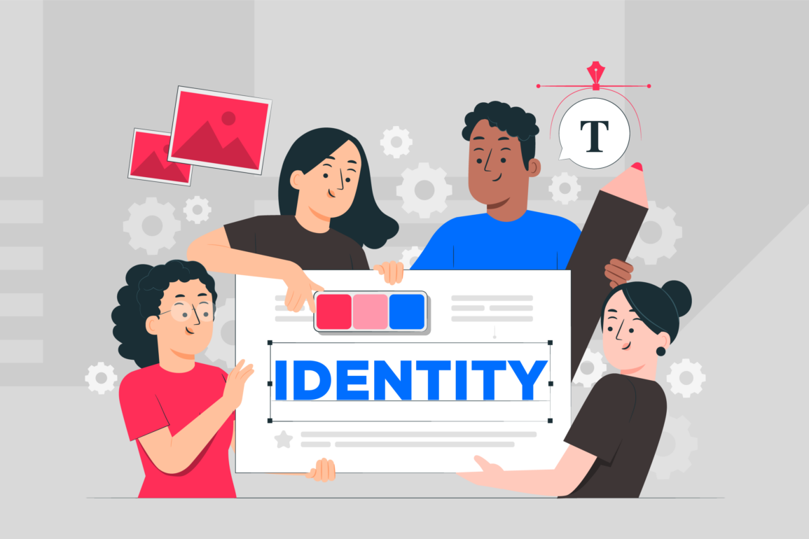


Do you know the meaning of your corporate colours?

Are your corporate colours sending out the right signals? Is your business on red alert, or do you have a serious case of the blues? And, while your corporate colour combination look great on paper, are they equally appealing online?
A life without colour would be, quite frankly, pretty grey. Colour brightens up your day and helps get messages across instantly and memorably. Research by Xerox showed that colour in branding and documents makes people more likely to read them and increases recall of information by a staggering 82%. Design without colour would be like a pencil with no lead – pointless. But with so many options, it can be difficult to make the right choice: the corporate identity colour combo of purple and orange that your MD finds so fetching, might not be doing your company any favours. Which is why it pays dividends to consider the true meaning of colour…
It’s no secret that colours have hidden meanings. Ever since the days when flags were used to elude or deceive enemy warships, using colour to reveal one’s identity (or even hide it) has been common place. Even Cyndi Lauper knew the score when she sang about not being afraid to show her true colours back in the early 80’s. But, what about the use of colours in branding?
Business buyers, the wisdom goes, make decisions purely on price and performance. Wrong. Branding and imaginative b2b marketing strategies are as important for businesses and services as they are in consumer markets. Business buyers may be looking for a different set of brand values from consumers – primarily, they want to know what a product or service can do for their business – but everyone feels more confident buying from a reputable company. And the quality of an organisations b2b marketing strengthens its reputation, generating exposure and word of mouth.
Understanding the psychological power of colour can be good for business. Arguably not as deceptive if you’re in the business of warships, but a powerful strategic tool nevertheless. While there are no hard and fast rules, there are some basic considerations that can help you navigate through the complexities of colours, and how you might apply these, and their impact on your corporate image.
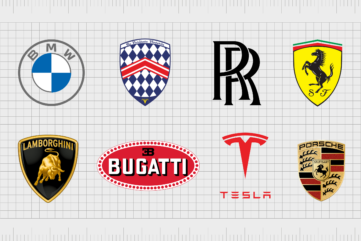
Whether red for danger, excitement or prosperity; or conservative blue for regal, credible and authoritative, the subtle cultural differences associated with the meaning of colour can really make or break a brand. Virgin being the perfect example of a game-changing business who weren’t afraid to go against the grain of the standard corporate colours of blue and black of their time.
The use of colour in branding speaks volumes: it can describe what you do and give a suggestion of how you do it. Of course there are only so many known colours within our spectrum so although there’s no formula for success, it’s an exercise that needs careful consideration as part of any brand identity review. As visual identity specialist ourselves, we know first-hand how fickle and dangerously subjective corporate identity colours can be. But then for us that’s half the fun of it…before the big reveal of course…
Taste and the desire to make an impact aren’t the only factors dictating your choice of corporate colours, of course. Fashion will always play a part and its role has to be considered carefully. Fashionable colours in branding quickly become over-used, diluting their impact, and then just as quickly date.
There are also practical constraints. Corporate identity colours must work on everything from websites to billboards, bus stops and across the whole marketing communications mix. Other logos might have to be used alongside yours, instantly ruling out some colours in your corporate identity. Visibility may be an issue if, for instance, your audience is visually impaired. While designing for screen-based applications has its own set of constraints.
But these considerations can often overshadow by another important and powerful factor in choosing your corporate colours: psychology. Colours have a universal language that can be harnessed to strengthen our own design messages. The psychology of colour is all about the connections and associations we make subconsciously when we see a certain shade, as well as their measurable physical effects. Ignore it, and you could unwittingly send out completely the wrong message.
It helps to have an understanding of the main colours in branding…
Red represents fire, passion, power, desire, love and sex as well as danger, debt and the Devil. It quickens the pulse, raises blood pressure and encourages risk taking.
Yellow is associated with sunlight, warmth and happiness. It is extrovert, creative, inquiring and loyal. Negatively, it conveys cowardice, sickness and disease.
Blue is the colour of calm, lowering the pulse and aiding concentration. It represents safety, reason, strength and authority, as well as sadness and introversion.
Green stands for regeneration, recycling, ecology, balance, tranquillity and freshness. But beware – it’s also the colour of envy, aliens, slime and is an unlucky colour for cars.
White represents purity, chastity and innocence. It is modern, hi-tech and associated with space, infinity and spirituality, but it can be cold and sterile. But, white doesn’t reproduce well on anything other than a strongly coloured background.
Even armed with this knowledge, colour psychology is a complex subject and there are no hard and fast rules as to what works where. But with a few key pointers and consideration of the successes and failures of other companies, you can begin to get a handle on it. Before signing-off your new identity, take care not to act in haste. Once you’ve moved into the implementation phase, the expense to change your corporate identity colours are likely to be prohibitive.
Even armed with this knowledge, colour psychology is a complex subject and there are no hard and fast rules as to what works where. But with a few key pointers and consideration of the successes and failures of other companies, you can begin to get a handle on it. Before signing-off your new identity, take care not to act in haste. Once you’ve moved into the implementation phase, the expense to change your corporate identity colours are likely to be prohibitive.
Make positive associations
Sometimes the meaning of a corporate colour is obvious, and can also be directly linked to the bottom line. Supermarkets Asda, Waitrose and Spar use green because it screams fresh and natural and is the colour of health-giving vegetables. See some green signage by the fruit and veg counter and you might just pop some broccoli in your weekly shopping.
Use colour cleverly
Orange may seem a much less likely choice for a food retailer than green, but research shows that orange doesn’t just make you think of food because it’s the colour of fruit and carrots – it actually stimulates the appetite, making it the perfect choice for Sainsburys.
Target your audience
The use of colours in branding may be more or less appealing to different age groups. Older people are more likely to feel comfortable with safe, reliable colours like blue or various neutrals. The young may have more adventurous tastes. A survey by Pantone found orange to be the least-liked colour overall, but the favourite of young people and trend-setters. Decades ago (sorry to remind you!) when a mobile phone operator declared the future to be Orange, it cleaned up – particularly among the young who loved the brand’s energetic, optimistic overtones.
The red of the Virgin mark perfectly matches the company ethos and values of its target market. In this instance, red doesn’t so much mean danger (or else who would fly with them?) but it does imply a spirit of adventure, excitement and passion for whatever they do – whether travel, finance or gyms. We distinguish the meaning of colour in branding, in the same way we process verbal identity and tone-of-voice.
Watch those double meanings
Double meanings, and different meanings in different cultural contexts, need to be carefully considered or you may send out the wrong messages through your corporate colours. HSBC’s red logo, with its connotations of debt and risk, may seem too close for comfort for some. But in the East, where the Hong Kong and Shanghai Banking Corporation started, red is synonymous with luck and good fortune. HSBC’s reputation overrides this, but a new bank might not get away with it.
Beware of the boringly obvious
Blue is valued for its safe, reliable overtones, which is why it’s the colour of conservative politics. That’s also why so many big computer companies, who trade on their reliability, use it. The colossal IBM revels in its safe-as-houses corporate blue identity – it’s not called Big Blue for nothing. But do we really need another company that chooses blue to convey safety, dependability and downright worthiness? Our imaginations need not be constrained by standard conventions when it comes to corporate identity colours.
Live a little… bend the rules
Changing your company’s corporate identity colours isn’t a magic formula, and it’s not an exercise that should be taken without careful consideration. Your corporate colour is unlikely to change the fortunes of your business overnight. But as part of an identity overhaul, choosing a corporate colour scheme that speaks volumes about your business ethos, expectations and aspirations can have a surprisingly positive effect. It’s like getting a new haircut or swapping your usual dull grey suit for something a little racier. People will see you in a whole new light.

Our co-founder, Steve Harvey, is also a regular contributor to Brand Fabrik, a flagship publication covering topics relevant to anyone in branding, marketing and graphic design. Steve shares his enthusiasm for brand naming through his articles and demonstrates his knowledge and expertise in the naming process.