


Sensational startups: Appetising branding and advertising with Primal Joy

Bringing a new startup into an already saturated marketplace is no simple feat.
If you want to become a breakthrough brand, you need a lot more than the ingenuity required to come up with an impeccable product, and a fantastic marketing plan. New organisations need to find their place within their industry, defining their identity, and positioning themselves in the right areas to access the best possible opportunities.
Since there’s more to a world-changing organisation than great company name and a colourful logo, the brand enthusiasts here at Fabrik have decided to pay homage to some of the smaller ventures in the world right now, that have started to earn success and recognition thanks to their unique products and branding strategies.
Today, the “sensational startup” we’ll be taking a bite out of is “Primal Joy”, a British food company designed to give UK customers a luxurious option when it comes to healthy, grain-free snacks. Though the Primal Joy brand was only baked into life a few years ago, in 2013, it’s already making a tasty profit thanks to a friendly brand identity, and a carefully-structured marketing strategy.
Let’s taste-test the Primal Joy branding journey together.
A taste of success: The Primal Joy brand story
As most businesses, large and small, already know, it’s pointless to waste time or money investing in a brand, before you know for certain that you have a USP and an idea that’s going to resonate with your target market.
For any organisation to succeed, it needs more than just passion, enthusiasm and drive – it also needs a strong connection with a particular demographic. Knowing who your audience will be when you’re jumping into an industry, can help to pave the way for the branding and advertising decisions you make as you begin to grow your startup company.
When the Founder of the Primal Joy brand, Sarah Mace, began gathering the ingredients for her new company, she clearly had a strong vision of her user persona in mind. Sarah wanted to create an organisation based on a pain-point that she, her family, and people like her were facing.
After a period of injury and illness pushed her to change her dieting habits, Sarah was sick and tired of not being able to find the dairy, refined sugar, and grain-free substances she needed in the average supermarket, shopping centre and health store. She felt that she couldn’t be the only person who wanted healthy products, free from common allergens, and untainted by potentially damaging substitutes, so she created a product entirely of her own.
Sarah’s strong focus allowed her to create a set of clear brand values for “Primal Joy” from day one. She decided that no matter what she made, all her ingredients had to be nutritionally valuable, and healthy. That meant no additives, no preservatives, and no compromise when it came to taste either.
As most organisations know, developing a startup brand that has so many different restrictions in place is no easy task. However, Sarah managed to use a little bit of branding magic to earn a position for her company in the food industry. Today, the company has earned two separate “Free From” food awards, and its customer base is growing too.
The Primal Joy brand identity: Homemade goodness
Perhaps one of the elements that makes the Primal Joy brand so compelling, is the fact that it’s built around a heart-warming “home-made” story. Food is one of the many purchases that we make based on emotional factors. The truth is that when you go to the supermarket, you probably see at least ten different types of bread on the shelf.
Most of this bread tastes the same because it uses the same ingredients and production techniques. Yet, we choose a specific loaf based on emotional considerations. Maybe we like the colour of the packaging or the last advertisement we saw on TV. Maybe you chose a loaf of bread because it’s the same one your mum used to get when she was making your school packed lunches.
Primal Joy’s branding power comes, in part, from this emotional concept. The company has a story, and that makes it instantly more appealing than all the faceless snack manufacturers in the world.
Sarah didn’t just wake up one day and decide to make baked goods for extra cash. As the “About Us” page on the Primal Joy brand website tells us, the organisation was born out because Primal Joy wanted to give people a choice when it came to buying allergen-free foods.
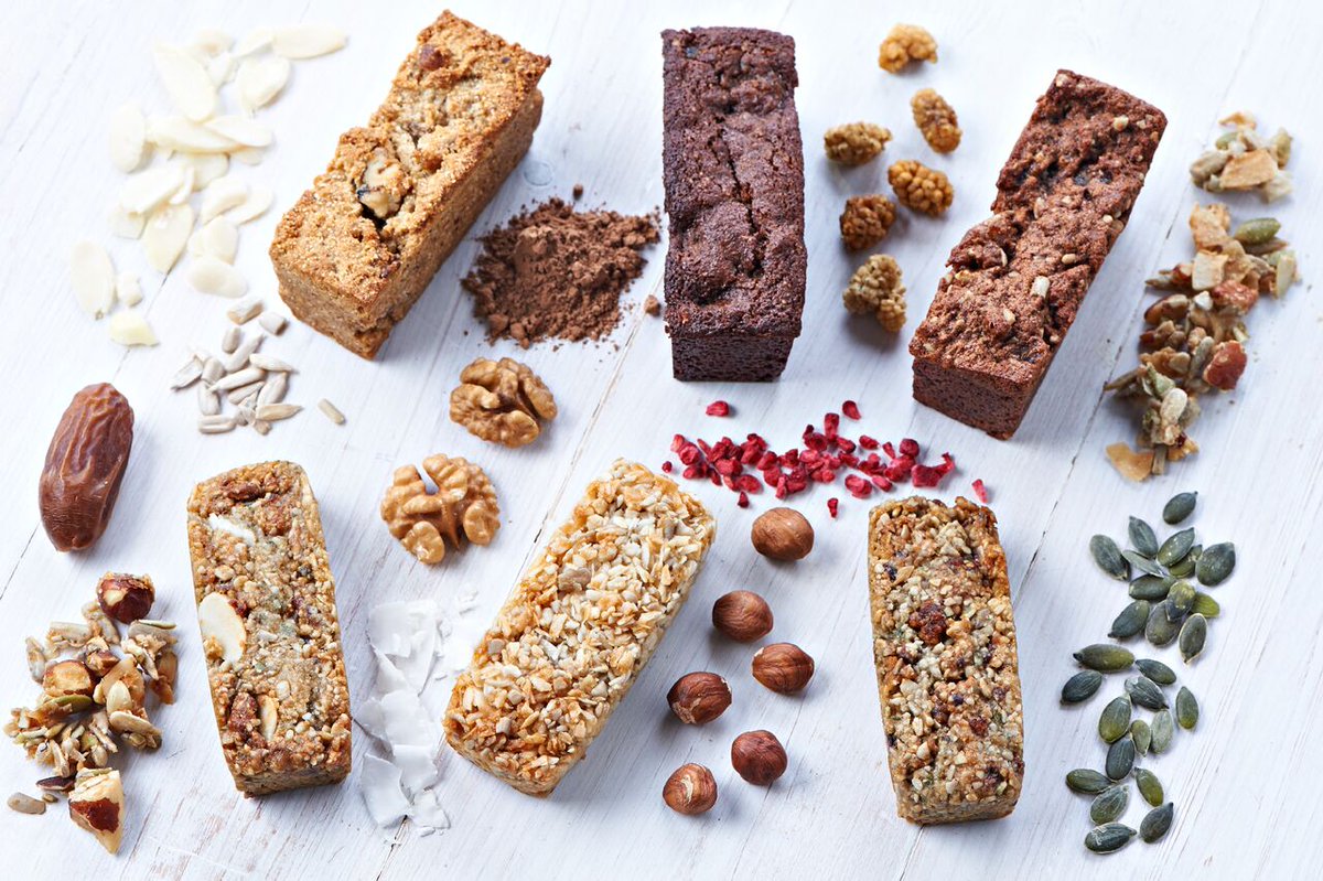
To maintain that emotional element in their brand identity, Primal Joy draw attention to the fact that every product continues to be “hand-made” and packaged by Sarah’s team. They combine this emotional element with a promise of quality – a combination that we’ve seen in bigger brands throughout the years, like Coca-Cola, and Marks & Spencer.
Primal Joy branding: Snacks that are thoughtful and flavoursome
The Primal Joy brand purpose is obvious enough. The company simply wants to give the UK access to food that’s free from grains, gluten, soy, dairy, and refined sugar – without asking them to compromise on taste. You might think that a purpose so refined would restrict the Primal Joy brand to advertising their products only to people with dietary issues.
However, as Primal Joy states on the company’s website, its aim is to make food appealing to anyone who wants to cut down on sugar, eat healthier, and reduce their exposure to dangerous chemicals and preservatives – without having to live a life filled with cardboard-flavoured granola.
To give life to its brand identity as a simple, friendly, and home-made company, the Primal Joy marketing team has thought carefully about how it should portray the business both online and offline.
The tone of voice, for instance, is fun and light-hearted, perfect for a millennial audience who are now more concerned about keeping their diets healthy, and their foods free from preservatives. In fact, if you go to the Primal Joy brand Twitter page, you’ll find happy, friendly updates, packed full of heartfelt messages and emojis:
The company’s thoughtful personality is evident on the brand website, where you can find a regularly-updated blog, brimming with helpful recipes and meal ideas for those who want to make the most out of the Primal Joy product. The blog posts alone are evidence of the fact that this organisation is trying to highlight itself as an all-inclusive company.
Knowing how to speak to your audience is important in any industry, not just for brand awareness, but also because if you can get the tone right for your marketplace, then you can potentially build an affinity with your customers that makes them more likely to buy from you in the future.
While the Primal Joy brand wants to portray itself as a luxurious and indulgent company in the food industry, it also wants to embrace as many potential customers as possible, which is why it has stuck with a friendly, home-made attitude across various online channels.
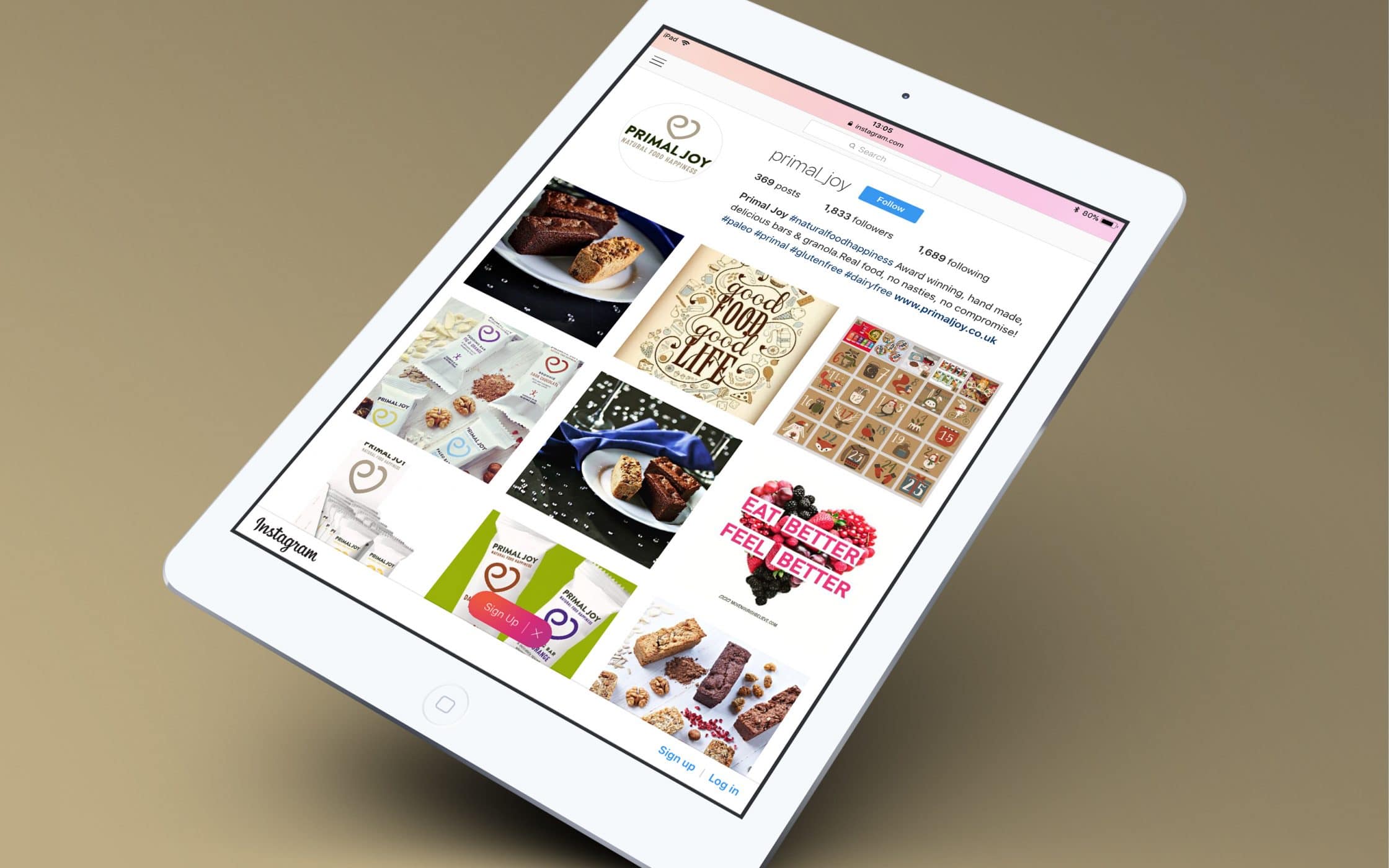
Even the company’s Instagram page is brimming with pictures that use soft, natural tones – highlighting the brand’s focus on organic, chemical-free products, and creating an almost nostalgic experience at the same time.
Primal Joy Brand image: Logo, typography, and website
While there’s more to a sensational startup brand than a logo, it’s worth noting that your visual identity is one of the first encounters your customers will have with your brand – so you need to make sure you’re making the right impression.
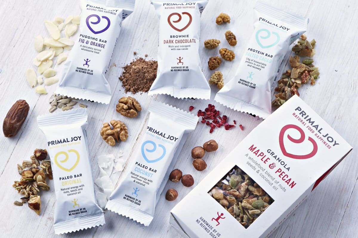
Ideally, the visual elements of your company should reflect the unique parts of your personality, as well as highlighting some of the most valuable features that make your company special. Since the Primal Joy brand is known for making handmade, natural, and healthy snacks, it needed to develop its identity and packaging efforts to highlight those characteristics.
To begin with, both the company’s logo, and packaging efforts were a little lack-lustre.
It didn’t do anything to demonstrate the potential of the company, that’s why the organisation recently decided to rebrand itself from a visual perspective, changing both the appearance of the product and logo.
The previous Primal Joy logo used a serif-font graphic in deep orange.
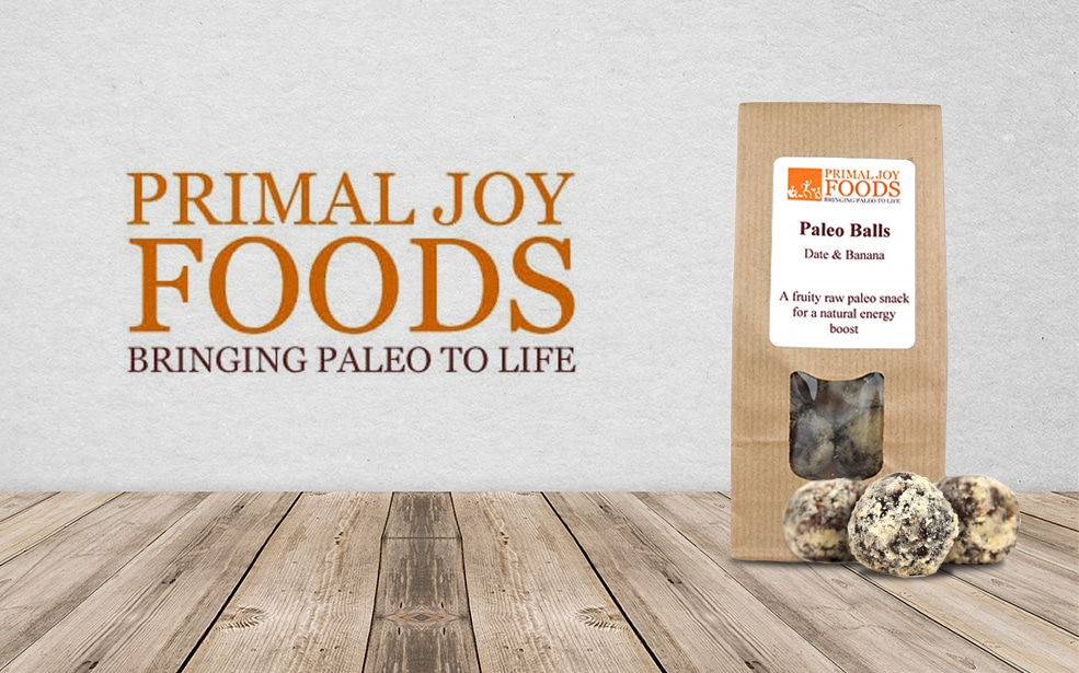
While it announced what the company did to the world, it seemed completely out of line with the rest of the organisation’s brand identity. After all, serif typography is known for being inherently formal and sophisticated. When the logo was re-imagined, the Primal Joy brand got to the heart of what its venture was all about and came up with a new image to better reflect the quality of the products and experiences it has to offer.
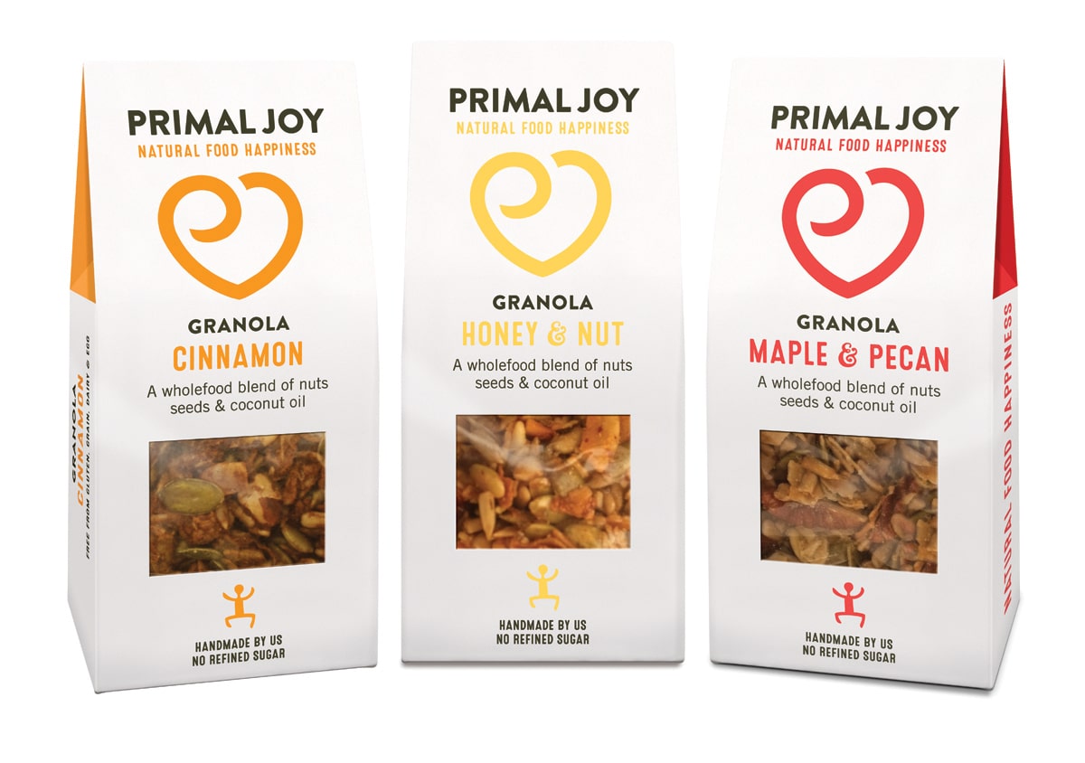
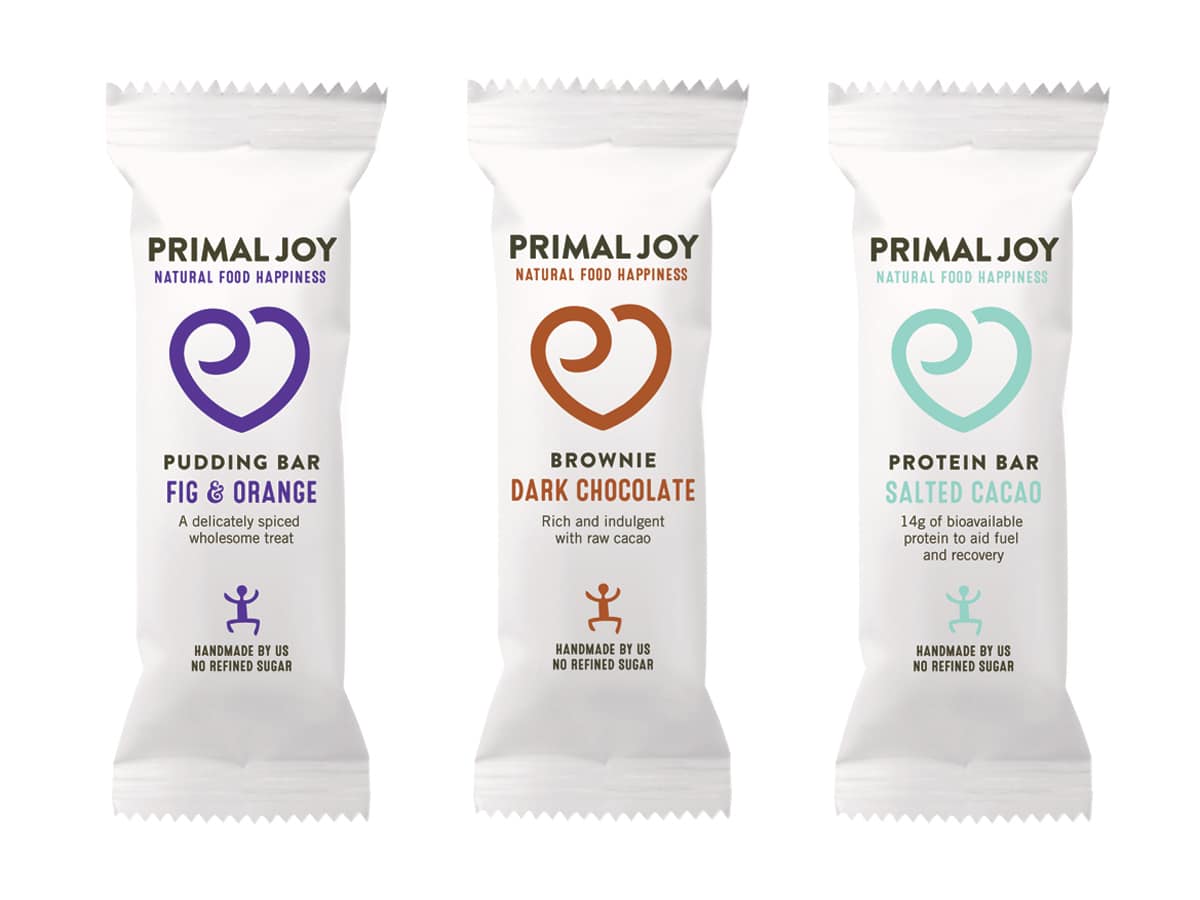
The new logo is a bold sans-serif typography piece, combined with a fresh slogan “Natural Food Happiness”. It’s welcoming, clear, and concise, and it highlights what the venture offers, without being overly blunt. The heart symbol also merges the initials for the company in a unique and invigorating way – using a sort of hand-drawn charm to highlight the nature of these home-made products.
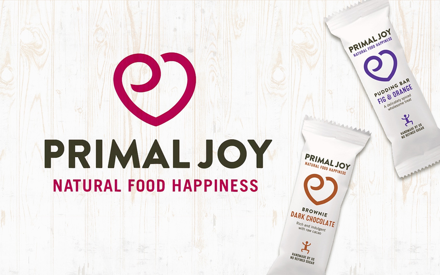
The packaging is cleaner and more appealing too. Combined with the strong typeface, the white background allows the important visual elements of the packet to shine through, drawing attention to the company’s unique personality.
At the same time, splashes of vibrant colour have been used throughout the range, to help capture the eye of customers on supermarket shelves, and highlight the “fun” side of the company’s overall personality. Even the copy on the packaging hints at the organisation’s tone of voice, which is luxurious, and friendly all at the same time.
Taking a bite out of branding: Could you be a sensational startup?
While the Primal Joy brand might have a long way to go before it achieves the online presence of food companies like Naked and Innocent, it has certainly started its journey on the right foot. By understanding exactly what target customers are looking for, and staying true to its identity and tone of voice wherever possible, Primal Joy has created a brand that’s based around a home-made sense of comfort and luxury.
Though the organisation has had to adapt its visual identity in order to really make the most out of its position in the food industry, a little bit of careful rebranding was all it took to make sure that everything from the company’s product packaging, to its logo design, was enough to capture the hearts and minds of an audience dedicated to healthier living.
If you can get to know your identity, and your audience in the same way as the Primal Joy brand, then who knows, maybe you could become our next sensational startup.
If you enjoyed this article, you might enjoy these too:
— Distinctively Danish, the Bang & Olufsen brand story
— It’s not just branding, it’s Marks & Spencer branding

Our co-founder, Steve Harvey, is also a regular contributor to Brand Fabrik, a flagship publication covering topics relevant to anyone in branding, marketing and graphic design. Steve shares his enthusiasm for brand naming through his articles and demonstrates his knowledge and expertise in the naming process.