


The psychology of landing page design that converts leads into customers
A lot goes into a landing page that converts.
Of course all the elements have to be in place, but to get a dazzling result, you need to infuse psychology into your landing page design.
Truth is, it’s tough to imagine a successful online campaign without a dedicated landing page. For a real surprise, take time to study your competition – you will most likely find them using a high converting landing page to drive their business.
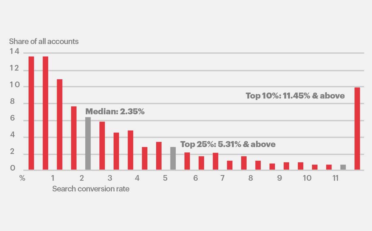
Moz, for example, generated $1 million in revenue with one landing page and a few emails. Sadly, most landing pages don’t work. In a research by Wordstream, they found that 25% of landing pages convert at 1% or less. The average across all industries is 2.35% and the top 25% of landing pages convert at 5.31% or more.
The gap between the best and the worst is only a few percentage points, but how much are those percentage points worth to your business. If a thousand people visit the page, 3% is equal to 30 conversions. Oftentimes, those thirty conversions could be a five figure difference. There are many reasons your landing page design may not convert visitors into customers. When it’s out of sync with the real wants and needs of your visitors, conversions can decrease by as much as 266%.
You can tweak the headline, create a compelling subheadline, A/B test button colors, and a host of other actions, but those will only give you short term gains. To truly increase your conversion rates and keep them there over the long term, you need to move beyond trying out the next shiny object. Instead, go back to the root of it all — human psychology. Not just human psychology, but specific psychological triggers — stimulants that elicit a response — that’ll increase your conversion rates, create happier customers, and add more to your bottom line than you thought possible.
In this post, we’re going to look at the psychological triggers that will improve your conversions.
1. Pleasure and pain
At the root of everything we do is the promise of pleasure. Even when our actions don’t seem to be directly related to pleasure, that’s the end result.
Imagine you went backpacking across Africa for 6 months this year with nothing but a laptop, a duffle bag, and an iPhone. You endured blistering heat, tropical illness, and strange living conditions. At the same time you experienced a rich culture, established true friendships, and learned about the history of the great continent. You endured the hardships because of the pleasure you knew you’d experience.
To use pleasure effectively, you need to understand what your visitor considers pleasure and the pain they’ll endure to get there. I’m sure most people wouldn’t backpack across Africa to make a few friends. They’ll endure other things like parting with a few dollars so they can save time on important tasks.
Once you understand what they consider the pleasure inherent in your solution, your goal is to move them as close to that point while reducing the pain they feel to a bare minimum. Instapage does this well.
Instapage moves you closer to your goal of creating high converting landing pages without the need to code. At the same time, they allow you to test out and become familiar with the service. After 30 days, you’ve made a few pages which are live on your site. You like the service, it’s become intuitive for you, and you’ve got a few pages live on your site. It’s much less painful for you to pay for their service after the 30 days is over.
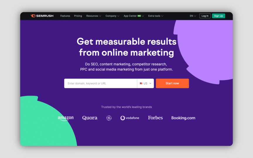
SEMrush allows you to use their service with no credit card. They don’t even ask for an email address. You get a limited amount of data, just enough to make minor comparisons. If you create a free account, you get even more data. They use successive approximations to move you closer to the ultimate goal of signing up for a premium account.
2. Reciprocity
Here’s a case scenario: The robed devotees of Hare Krishna flocked to public places in droves to solicit donations they would use to buy food and supplies for the homeless. The only problem was that people wouldn’t part with their hard earned cash. That’s when they devised a simple yet extremely effective tactic. Reciprocity.
Instead of asking for donations, they’d offer travelers in major airports and public places a flower — a gift. As a result, their income skyrocketed and influence spread because they gave before they took. In 1971, Dr. Dennis Regan of Cornell University performed a simple experiment with two people:
A laboratory experiment was conducted to examine the effects of a favor and of liking on compliance with a request for assistance from a confederate. Liking for the confederate was manipulated, and male subjects then received a soft drink from the confederate, from the experimenter, or received no favor. Compliance with the confederate’s request to purchase some raffle tickets was measured, as was liking for the confederate. The results showed that the favor increased liking for the confederate and compliance with his request, but the effect of manipulated liking was weak. Detailed ratings of the confederate as well as correlational data suggested that the relationship between favors and compliance is mediated, not by liking for the favor-doer, but by normative pressure to reciprocate.
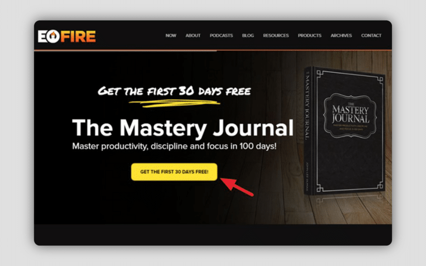
The most common approach for using reciprocity on your landing pages is to teach something or give away something. If you have a shorter landing page design then giving away an ebook, tool, training, or free consultation works well. John Lee Dumas, founder of Entrepreneur on Fire gives away his Mastery Journal free for the first 30 days. In other words, he gives value before asking for money. Great!
Neil Patel equally uses the psychology of reciprocity on his landing page by offering a high value webinar. At the end of the webinar, he pitches his product. He gives away a lot of value and leads the customer closer to their goal before asking for something in return. Venture Harbour uses a free workshop to achieve the same goal through reciprocity. They also add another incentive — a 35-part framework — to further improve conversions.
3. Specificity
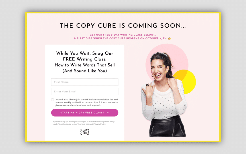
Does your landing page design offer a clear and specific value? Ideally, your headline or main topic should be specific. A typical example is The Copy Cure’s landing page. Did you see how specific it is?
Be specific. You can’t blame your prospects for not taking your words at face value. They’ve been lied to in the past and not gotten what they’ve expected. It’s even more difficult to build trust online. The more specific your landing page is, the more trust you’ll build with people. For example, which one of these statements is more believable?
- Statement one: John lost 150 pounds in six months.
- Statement two: John lost 147 pounds in six months.
Both statements are the same except for the weight lost by John. In the first statement, the number is rounded up and isn’t as compelling as the second statement. That’s because it’s hard to believe someone lost exactly 150 pounds. 147 pounds on the other hand, rings true. What do you think?
In a recent research, Dan Schley found people are more likely to believe the specific number over the rounded figure. On your landing pages, make it easy for visitors to understand your offer. Instead of one month, say 30 days. Instead of about $1,000 say $997. Not 12,000 subscribers but 11,997 subscribers.
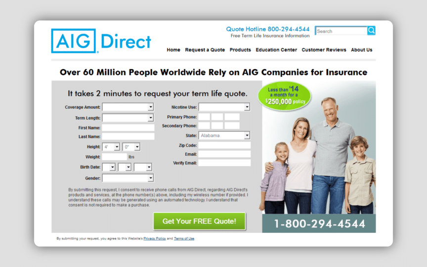
This page by AIG uses specificity well. At first glance, the form is intimidating but the text above shows you exactly how much time you’re going to need to fill it out. That’s not the part that caught my eye.
To the right of the form is a green bubble that says $14/month for $250,000 life insurance coverage. That’s specific, but when you go to the bottom left of the page, they get more specific. They tell you the exact amount, age, and gender that qualifies for the $250,000 life insurance. It’s those details that seal the deal.
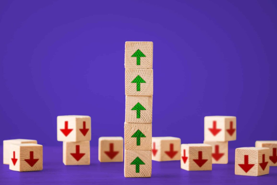
4. Scarcity
Scarcity is one of the most powerful psychological triggers available. Diamonds are expensive because they’re scarce. The same is true of gold.
In the Psychology of Scarcity, Prof. Eldar Shafir gave an example of two people, one a dieter and one a non-dieter. They were given a word puzzle and asked to find food related and non-food related terms. The dieters took a significantly longer time to find words when the preceding one was food related. The experiment concluded that scarcity draws our attention to things related to it and leaves the person distracted until the scarcity is alleviated.
On landing pages, there are a few ways to use scarcity. One is through countdown timers that instantly draw the attention of the prospect and compels them to take action.
A more subtle way is to limit the availability of spots or items. For example, you can use wording on your landing page design saying “Only 25 spots left” or “only 25 pieces available, act now.”
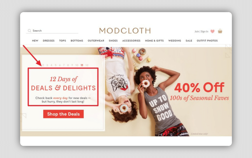
Modcloth uses scarcity on their product category landing pages. In the image above, they list the number of pieces left in stock with red so it stands out.
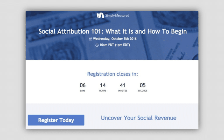
Simply Measured uses a prominent countdown timer and a specific date to show real scarcity to people visiting their page. If you don’t act within a few days, the opportunity will be gone forever.
5. Authority
Does your landing page design show a form of authority? Well it should. One of the six keys to persuasion by Robert Cialdini is authority. As humans, we’re attracted to authoritative voices and experts more.
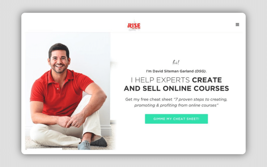
Why? Because authority figures help people achieve better results. To initiate authority on your landing page, use your best photo, and use clearly highlight how you’ll help people. David Siteman Garland’s landing page is a good example.
In fact, a single expert-opinion news story in the New York Times is associated with a 2% shift in public opinion nationwide, according to a 1993 study described in the Public Opinion Quarterly. According to Political Science Review, when it’s aired on national television, the shift in opinion rises to 4%.
You don’t need to be a celebrity to use this psychological trigger on your landing page design. But you need to be trusted to a degree. In lieu of that, you can display any awards you’ve gotten from relevant bodies or mentions you’ve had on larger publications.
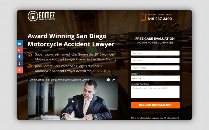
The Gomez Firm uses authority. The landing page begins with the term “award winning” then goes on to mention a few of the awards he’s gotten.
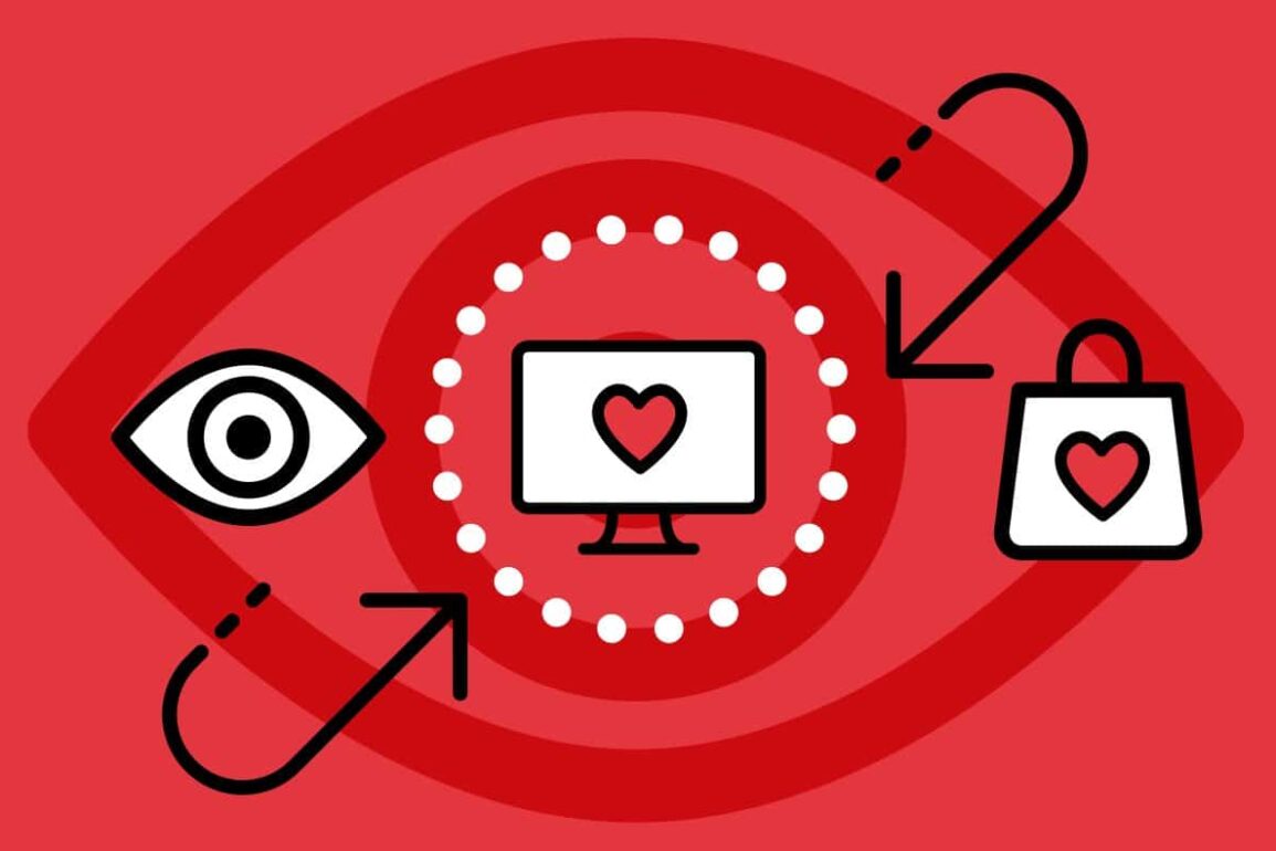
6. Visual Cues
There are two major types of visual cues that you can use on your landing page design to convert leads into customers. The first type is the explicit visual cue and is the one most people are familiar with. They focus on the objects you can notice such as arrows, line of sight, pointing, and lines.
In a study by ConversionXL, it was found that arrows outperformed human line of sight cues and resulted in visitors viewing the form longer.
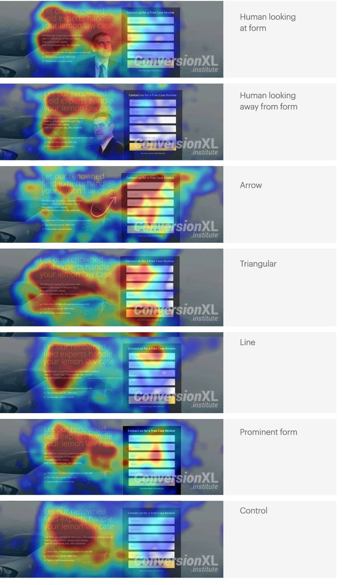
Look at the third image from the top labeled arrow. The visitor’s eyes followed the full length of the arrow and spilled out over the page. To make the most of explicit visual cues, add arrows pointing to your most important conversion action.
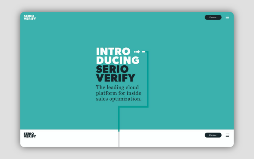
Serioverify.com uses both white space and great visual cues to get visitors to the right place on the page. Their landing page design is interactive and fun to use.
The second type of visual cue is called an implicit cue. These are elements that go unnoticed by visitors, but are effective. They include the use of contrasting colors and white space.
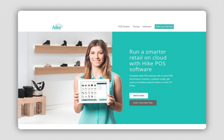
Hike uses ample contrast to lead visitors to the correct area of the screen. On the left, they have a white backdrop with a bit of clutter while on the right they have a solid background devoid of clutter and clean descriptive text.
7. Social Proof
Social proof is the concept that people will conform to the action of others under the assumption that those actions are indicative of the correct behavior. You can use social proof to influence visitors and turn them into customers. Social proof is such a powerful psychological trigger because we don’t know what we’re getting into with a new product or service.
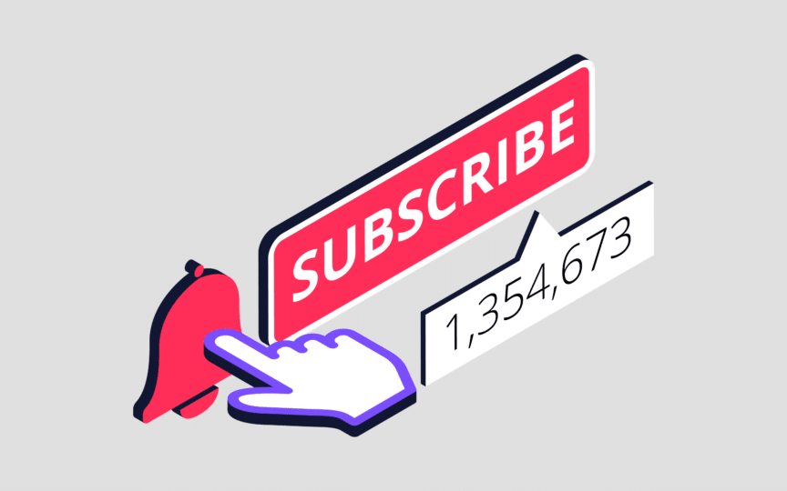
If you can show what others are saying or that thousands of people have participated in a cause, or purchased a product, then the prospect is more likely to take the desired action. McDonald’s does this with their signs which let you know they’ve served billions of people. Marketers do it all the time when they ask you to sign up by displaying the number of email subscribers they have.
There are many types of social proofs. For example, there’s social proof that comes from your friends and peers. Think about the way Facebook shows you that your friends already like a page.
There’s social proof you get from large numbers or the crowd like the McDonalds sign stating they’ve served billions. You also have social proof from current customers or users of a product like Amazon reviews. These psychological triggers take advantage of implicit egotism — we value things that remind us of ourselves in some way.
They also tap into FoMO which Przybylski and colleagues (2013) defined as: “a pervasive apprehension that others might be having rewarding experiences from which one is absent…the desire to stay continually connected to what others are doing.” Whichever aspect of social proof you use, it breeds trust. 68% of consumers trust other consumer opinions posted online. For your landing pages, you can mix and match different types of social proof to make the most of this psychological trigger.
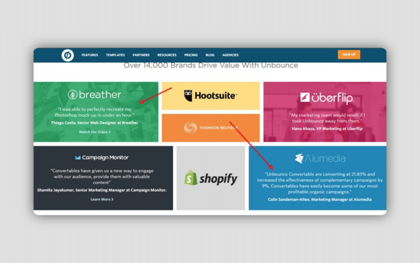
Unbounce uses social proof and specificity together to boost conversions. There’s another thing they do with their testimonials, they speak to different groups. In the image above, the green testimonial speaks to a different group of people – web designers – than the blue testimonial. Depending on which type of customer you are, each testimonial will speak differently to you.
Conclusion
Psychological triggers are an important aspect when it comes to increasing conversions over the long term. Although button copy and other small tweaks will help give you an initial boost, they’re short lived.
Think of those changes as curing the symptoms while implementing psychological triggers are a cure for the disease. Implement them one at a time and always test the changes against a control until you arrive at your desired conversion rate.
If you enjoyed this article, you might enjoy these ones too:

As our digital producer, Will regularly contributes to the pages of Brand Fabrik, our online publication dedicated to branding, marketing and design. Will enjoys relaying his enthusiasm for technology and its impact on the creative services sector. He also relishes the opportunity to review the latest design-related products and gadgets.