


The history of political party logos
Political party logos have more meaning than you think. From the deep blue of the Conservative party to the bold red of Labour, each component is chosen for a reason.
Over the last few years, we’ve seen a lot of evolution in the history of political party logos. Some groups have attempted to update their image, others have dropped out of the race entirely, and new parties have emerged to take their place.
Today, we’re not going to bore you with political opinions or controversy. We’re looking at the British political party logos for what they really are: a tool of marketing and branding.
While choosing your political stance might be a lot tougher than picking a new brand of cereal, the visual branding strategies are similar. Just like leading companies around the world, political parties choose their logos to convey meaning, and influence voters.
So, why did the Lib Dems choose yellow for their primary colour? And what was the deal with the UKIP logo design?
Here’s everything you need to know about political party logos…
Political party logos: Branding for politics
You’re probably pretty familiar with the concept of logos. A logo is a visual representation of the mission, values, and vision of a brand.
Like the Nike logo aims to convey success through a depiction of Nike’s wings (the Goddess of victory), or Amazon shows a smile linking products from A to Z, every logo has meaning.
For consumers, logos are sources of valuable information. Usually, they show what an entity does, evoke certain emotions, and act as an easy way to remember a brand. Political parties use logos for all the same reasons as companies.
Just like a business, political groups want people to remember their name and feel an affinity when they see their colours plastered on the side of busses and trains. Of course, since the political opinion of the public often changes quite rapidly, political parties update their assets quite frequently.
Who could forget when the Tories changed from a “freedom torch” to a “scribbly tree”?
Sometimes, other political parties even take inspiration from other contenders. Remember when Labour tried to use an altered version of the Lib Dem dove during 2010?
Ultimately, politicians know, just like businesses, they need a visual way to represent their brand, which will stick in the minds and hearts of votors for years to come.
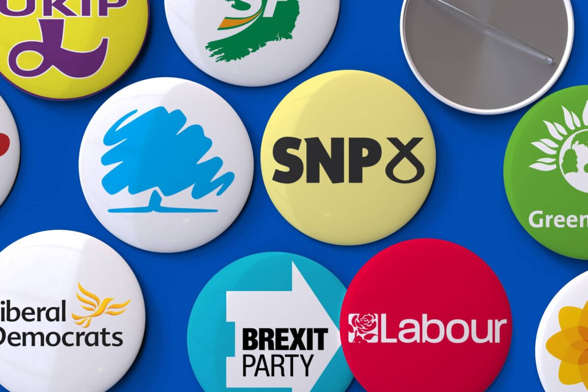
Exploring British political party logos
We know logos are important. People retain 40% more visual data than audio or written information, and 90% of the information processed by the brain is visual.
While many people do their best to remember the unique policies and promises each political party makes, it’s much easier to remember a single logo.
The more you learn about each political choice, the more meaning you can assign to the logo, until even a certain set of colours leave you feeling patriotic.
Let’s take a look at some of the most well-known British political party logos.
Political party logos: The Conservatives
The Conservatives have been in power in the UK for some time at the time of writing this article. Like most centre-right parties around the world, the Tory logo is primarily blue, as are the “brand colors” for the party.
Over the years, the Tories’ logo has shifted from a torch to a torch being held aloft by a muscular arm, and finally to a scribbly tree. It’s not just any tree, of course, it’s an oak tree – the national tree of England.
The “oak tree” logo caused a little controversy when it first emerged, with many people feeling it looked like a used scratch card, or child’s drawing.
Though intended to represent strength, growth, and endurance, the Tory logo hasn’t always had the best reception. Many followers are still waiting for it to change again.
Compared to the patriotic flaming torch in red, white, and blue, the tree was an odd choice. It started with green leaves, during 2006, and the Tories swapped this with a Union Jack after losing some of their followers to the heavily patriotic UKIP.

Tories and the colour blue
It’s not just the odd tree which makes this political party logo stand out.
As mentioned above, Tories have chosen the primary colour of blue for their branding. Although the Conservatives use the full Union Jack colours from time to time, their main shade is “Tory blue”.
The group adopted the colours of the Union Jack back in 1834 but dropped the red for the most part when Labour started using it.
Blue, in marketing, is used to invoke feelings of reliability, success, and confidence. That’s just the kind of image you want as a political party.
Find out more about the Conservative Party logo here.
Political party logos: Labour
Reports claim when the Prince of Wales first met Peter Mandelson, he said “Ah, the red rose man”. However, if Neil Kinnock’s claims are correct, then the prince was mis-informed.
Rather, Kinnock boasts it was him, not Mandelson who invented the logo for Labour’s red flag in the 1987 election.
The rose is an iconic image for Britain, as it’s the national flower of England. It’s been a symbol of anti-authority since the middle ages, frequently associated with socialism.
It’s almost ironic Labour began using it in 1980, after they attempted to move away from socialism.
Apparently, the original design for the labour party logo (like anything in politics), saw a lot of controversy. During a radio show, Kinnock commented the only contribution Mandelson made to the rose was to use a longer stem.
The stem for the labour party logo has obviously gotten shorter over the years.

Labour and the colour red
Just like the Conservatives have “Tory blue”, Labour has “Labour red”.
In various parts of the world, red is the common choice for left-wing parties. In years gone by, people even referred to the choice of “red” in a logo as a representation of the blood of angry workers.
Back in the annals of history, British sailors mutinied beside the mouth of the River Thames during 1797. At the time, they used a red flag on numerous ships, designed to represent “martyrs’ blood” for the people killed.
When it was first formed, Labour used a plain red flag as their emblem. However, in 1986, it was upgraded to a far less bloody, and morbid red rose. Interestingly, the party used purple instead of red for their election in 1997.
Red is used by global brands around the world, like Coca-Cola and Kellogg’s to invoke feelings of self-assurance and expertise. The colour is bold, confident, and great for driving action.
Find out more about the Labour Party logo here.
Political party logos: The Liberal Democrats
The Liberal party logo looks a lot like a bird made from banana skins.
It’s actually meant to be the “bird of liberty”. The Lib Dems adopted the dove back in 1989, where it was instantly called out by Margaret Thatcher for being uninspiring, or “dead”.
When the Liberal Party was reformed by those opposed to the SDP merger in 1988, they adopted an interim logo looked a lot like a road-sign. Though the group eventually petered out, the current “Liberal Party logo” is still the golden and orange bird used by the Lib Dems.
Birds are generally associated with feelings of liberalism, freedom, and development, so it makes sense the “Liberal” Democrats would want to use this icon for their brand.

Lib Dems and the colour orange
Though the colour choice for the Liberal party logo is referred to as “gold” by some, it’s officially described as amber. From a designer perspective, it’s this colour:
#FDBB30
The Liberal Democrats are the child of a merger between the Liberal party of the UK, which are historically yellow, and the Social Democratic Party, marked by red.
Orange isn’t a long-standing colour in political history. The Liberal Party logo, designed in gold, was intended to show a move away from the old ways. Lim Dem’s orange aims to inspire confidence, friendliness, and cheerfulness.
Companies around the world, like Amazon and Harley Davidson, have used the colours for similar reasons. The Lib Dem dove is often combined with a black wordmark, showing sophistication.
Political party logos: UKIP
The UKIP party has risen and fallen in England over the years. As British political parties go, this is perhaps the most controversial.
Originally grabbing attention for their right-wing and Eurosceptic views, UKIP has divided cities in the UK. The combination of gold and purple in their logo seems to covey a sense of royalty and luxury, while the Pound sign in the centre represents the quest to stay away from the Euro.
Though UKIP got its wish to separate the UK from the European Union, they’ve largely lost favour with the public since. Though some people still appreciate the “thoroughly British” essence of UKIP, some associate the Party with racism and aggression.

UKIP and the colour purple
So, let’s delve into the UKIP logo and its colours for a minute. The primary colour of UKIP’s logo is purple, a colour often associated with royalty.
Most experts believe the combination of yellow and purple in the logo are intended to showcase wealth and high class. Some also believe the purple comes from UKIP’s desire to draw voters from every party.
Purple is a combination of red (Labour), and blue (Conservatives). The official UKIP logo even throws a little yellow in there for the Liberals.
Political party logos: Reform UK (the Brexit Party)
Sharing a similar desire to separate the UK from the European Union, the Reform UK Party was originally the Brexit Party. Launched in 2018, the Party came from Catherine Blaiklock and Nigel Farage, and aimed to advocate for Brexit.
Prior to the withdrawal of the UK from the EU, the party had 23 members in the European parliament.
Perhaps a little different to any standard political party, the Brexit Party was all about pulling the UK out of the EU, and helping the country move onto World Trade Organisation rules. This was described as a “clean break” or “no-deal” Brexit.
The Brexit Party logo shares the colour blue, commonly associated with the Tories. Within a blue circle, there’s a white house turned on its side, to represent an arrow. Within the arrow, the Brexit Party name is spelled out in thick, bold capital letters, demonstrating strength.

Brexit Party and the colour blue
The Brexit Party blue is a little brighter than the Conservative blue, but it conveys the same feelings of authority and reliability.
The use of white and black also help the party to come across as well-established and professional.
When the Brexit Party changed to the Reform party, they maintained the same colours. The only things to change were the name inside the logo, and the arrow/house graphic. The Reform Party uses a full arrow as its symbol, perhaps indicating the path ahead.
Political party logos: SNP
The National Party of Scotland (1928) became the Scottish National Party after merging with the smaller, Scottish Party in 1933. The Group’s logo has been a point of conversation for some time.
Some see the graphic in the logo as a ribbon, while others see a Celtic symbol.
The truth is the SNP logo actually a stylised combination of the “Saltire”, the diagonal cross on the Scottish flag, and a thistle, the national flower of Scotland.
While the Saltire is the shape of the cross St Andrew was apparently crucified on, the thistle is their ancient symbol of nobility. In other words, they’re going for heritage, culture, and dignity.

The SNP and the colour yellow
The use of political yellow actually traces back to around 1928, when David Lloyd George published: “Britain’s Industrial Future”.
The report is still known today as the “Yellow Book”, perhaps because during the second half of the nineteenth century. A lot of adventure and fiction stories were published with yellow covers, to help represent they were something “new”.
In other words, yellow doesn’t just represent wealth, as it might have done with the Liberal Party logo, it also indicates freedom, development, and new-ness. It’s about modernity.
Although a more obvious colour choice might have been blue and white, the “blue” was already taken.
Political party logos: Green Party
The Green Party uses a green planet earth, surrounded by sunflower petals. The earth obviously represents environmentalism, while the sunflower has been internationally associated with the green movement for a number of years.
If you take the time to look up plant symbolism, you can see sunflowers are intended to symbolize “pure and lofty” thoughts.
In other words, the Green Party logo is encouraging us to look towards a healthier, more unified global future.
Though the Green Party isn’t the most well-known of the UK political logos, it does have an impact.

The Green Party and the colour green
The history of political party logos in green goes back to the 6th century. The shade was then used by a political faction in the Byzantine Empire.
When they first began, the Green Party were originally called “The Ecology Party”, and they changed their name in 1990. The Green Party logo has always been green, to focus followers on the environment.
In marketing, as in politics, green logos often invoke feelings of environmental friendliness, and sustainability.
They can also be associated with wealth, durability, and “freshness”, like fresh new ideas.
Political party logos: Plaid Cymru
Now let’s look at one of the political party logos from Wales. The Plaid Cymru party of Wales was established during 1925
Founding members wanted to fight back against the “sense of injustice” facing the Welsh people. On their website, the Party explain each of the founding members had different political motivations. Fortunately, they all wanted to eradicate the feeling of anxiety the people of Wales had about the future.
“Plaid Cymru” actually means “The Party of Wales”.
During 2006, constitutional changes were voted into place by the party. At the same time, the Group also decided to rebrand and radically change their image.
They opted to start using “Plaid” as the party’s name, though “Plaid Cymru, the Party of Wales”, continues to be the official title.
Additionally, the logo changed from a traditional red and green “triband”, to a Welsh poppy in yellow.

Plaid Cymru and the colours yellow and green
The colours yellow and green help to represent modernity, freshness, and growth.
This combination of hues is potentially the ideal way for the Political Party to establish themselves as a movement for positive change in Wales.
While green represents nature (just like the poppy itself), and growth, yellow represents the positivity of a new future.
Political party logos: DUP
The Democratic Unionist Party, or DUP from Northern Ireland, is a political party favouring British identity. This may be obvious from the Group’s political party logo, with its lion graphic.
The DUP has quite a lot of history, going back to the “Troubles” in 1971. Currently, the DUP has the most seats in the Northern Ireland Assembly.
The DUP party logo is accompanied by a lion’s head, conveying the animal best associated with England and the UK. The lion conveys strength and has been used by various parties over the years, including UKIP.
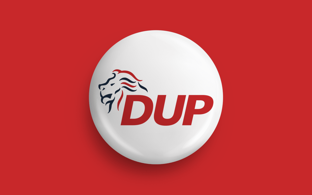
DUP and red, white, and blue
Evolving from the Protestant Unionist Party, the DUP group is a centre-right, to right-wing party. It’s probably no surprise then, the logo features the colours of red, white, and blue.
DUP’s colors are similar to the original selection from the Conservative Party.
It is a little odd the primary colour of the DUP logo is red, like Labour, however, considering some of the Groups views on same-sex marriage, and anti-abortion laws.
Political party logos: Sinn Fein
On the other side of the coin to DUP, we have Sinn Fein.
This Irish Republican and Democratic socialist party are a left-wing to centre-left political party, launched in 1905 by Arthur Griffith.
Sinn Fein is one of the two largest parties in the Assembly for Northern Ireland, though it’s less popular than the DUP at the time of writing. The logo of the Sinn Fein party is clearly focused on Ireland, and the growth of the Country.
The image in the logo is the shape of Ireland on a map, while the colours follow the Irish flag in green, white, and orange.
The phrase Sinn Fein means “We ourselves” or just “Ourselves” in Ireland, making it an excellent choice for a party dedicated to helping Ireland govern itself.

Sinn Fein and green, white, and orange
The colours of the Sinn Fein Political Party logo mimic the colours of the Irish flag. The combination of green, orange, and white set this political party apart from many other parties throughout UK history.
The logo for Sinn Fein sometimes includes the wordmark for the party alongside the depiction of the Irish country. Most of the time, there’s simply and S and F in the centre of the land mass graphic.
The evolution of political party logos
It’s safe to say political party logos have more depth than most people realise.
Business owners know they need a memorable set of visual assets if they want to maintain the attention of their target audience. Political parties are no different.
Although you should always make your political decisions carefully, the colours and images of a political party logo can easily catch the eye. If you feel a connection to the images and colours you see, you’re more likely to want to learn about the party.
Logos are designed to distil everything a company stands for, does, and produces, down into a single image, or collection of colours that can invoke specific thoughts and feelings. Logos can even help to convey some of the more complicated ideas of a political party, in an easier format.
The Green Party uses its logo to show togetherness and environmentalism, while the Liberal Party indicates freedom. The Conservative Party is all about endurance, while Labour claims to stand up for the rights of British citizens.
The right logo is just another crucial part of politics.
Fabrik: A branding agency for our times.
Now read these:
—The story of the Democrat donkey
—The Republican logo and symbol
—US political party logos and symbols
—Join the elephant vs donkey debate
—Flying the flag for British brands
—Guide to the Hewlett Packard logo
—The old eBay logo to the present day
—Microsoft logo history and evolution

Our co-founder, Stewart, is responsible for content strategy and managing Fabrik’s publishing team. It’s up to Stewart to bring Fabrik to busy marketers’ attention. As a regular contributor to Brand Fabrik, Stewart creates articles relevant to anyone in branding, marketing and creative communication.